Showing posts with label 4-way designs. Show all posts

Wednesday, August 5, 2020

New Geometric Patterns

Three small geometric patterns, graphed

A couple of years ago we began drawing some small, simple geometric patterns which could easily be repeated to make larger, more complex designs.  These were designs that could be adapted for many different crafts — not just needlecrafts.  Designs could be repeated a number of times just as they were in the picture, or they could be reversed, rotated, even taken apart and put together in new configurations.

First geometric pattern
Let's look at the three patterns at the top of the page. Here is the first one, a very simple design in a single color on white. In the larger version, the original pattern has been rotated to make a design of squares. This one can be continued outward as far as you want to go.

First geometric pattern, rotated
Now let's consider the pattern at the other end of the line. You may remember this one.  Later we showed you how to change the design from a square pattern to a rectangular one by elongating the internal squares either vertically or horizontally.
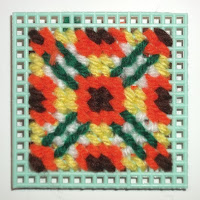
Third geometric pattern, rotated


Third pattern, vertical & horizontal  versions
Vertical & horizontal  versions
I was trying to make two points. First, that, since this was an all-over pattern, it was not necessary to start in the middle of the canvas. I started the piece on the left at the upper right-hand corner of the design and expanded it both horizontally and vertically as far as my canvas segment allowed. Second, the pattern can be worked to fit rectangular projects. They do not have to be square, as the 4-way bargello designs do need to be.  I suggested that viewers might want to do a sample using the 3-stitches-over-4-threads formula that I used for this sample, which elongates the squares into rectangles vertically. The third sample elongated the squares to rectangles horizontally. The result is definitely rectangular — and large. It is probably not a good design for a 4-way bargello unless you are using much smaller squares of canvas. It would probably work on # 14 needlepoint canvas, however.

Second pattern repeated, variation 1
The middle pattern can be repeated just as it is, of course, but I want to play with it a while. How you approach this pattern depends on whether you want to place the emphasis on the heavier "North/East/South/West" part of the square pattern or the more delicate diagonal components. I will start with the heavier aspects. Here is the result. You can change this from a square pattern to a horizontal one by simply adding another repeat of two of the smaller squares to any side of the original.

I returned to the design, this time concentrating on the slender lines that formed the diamond shapes inside the frames.

Second pattern repeated, variation 2

These designs made from the small corner squares have proven to be popular. For that reason, I am giving you some more of them to work with. In each case, the original square that was rotated is shown in its proper position and is emphasized by a black outline.
Three more corner patterns

Suppose you are ready to enlarge a design but are not sure how to proceed.

First corner pattern, expanded
Take a clean sheet of graph paper and mark its center both horizontally and vertically. Repeat your desired pattern (diagram above) on top of the horizontal line, starting just to the left of the vertical line. Now repeat your pattern in reverse to the right of the vertical line. Turn the paper upside-down. Repeat what you just did below the horizontal line above the horizontal line now. Now you have a 4-way starting pattern.  Each colored square represents a stitch or a square of stitches in your pattern. Empty squares can be worked in white, black, beige, etc. Work the four parts of your design in the center of your canvas, then decide how you want to "grow" your finished pattern.

Second corner pattern, expanded
The samples I usually show on these posts are done on #7 plastic canvas. I recommend this for practice and to make pattern samples that are meant to be filed in a box for future reference. If you are working in tent stitch, this is the pattern square, with one stitch for each square of the pattern. It is also done on #7 canvas. These patterns are very versatile. If you do latch-hook, for example, you can use a pattern like this one by putting in a knot for each square of the pattern. This would work as both a four-way pattern, perhaps for a pillow, and an all-over one for a mat or rug. Beading and mosaics could also be done with such a pattern.

When working a multicolored pattern like this, I recommend using a separate needle for each color. This cuts down on the time spent in threading needles and decreases yarn waste. Secure each color often on the back of your canvas. Do not carry long strands of yarn across the back of your canvas while moving from one colored segment to the next.

Third corner pattern, expanded

This two-color pattern is suitable for an all-over design, but perhaps is not as good for a 4-way design.

A word of caution about colors. What I see on my screen in the office is not necessarily what J.D. sees on his screen in the workshop or what you will see on your device. And if you are printing something out, there are even more possible differences. Use your own color choices on any of these designs.

Before we leave the 12-square designs above, here are the three designs as I have expanded them to 16-square designs.

Three 16 square designs

The first one is done in the same way I changed the smaller squares to 12-squares. I took more liberties with the second one, repeating some parts of the design and modifying others. Bear in mind that none of my designs are the only way to "grow" the designs. You need to find your own ways to do that to make designs that please you. I have taken even more liberties with the third design, repeating none of either the dark or light elements exactly as I expanded the design, while keeping the "feel' of the design.

Letter chart
Letter chart
There is another way to record graphed designs, and this one can be done in any color combination that you desire.  Instead of filling in colors on a design sample that you like, put in alphabet letters for each of the colors that you used.  You can then experiment with different color combinations and record alphabetically the ones you want to keep. This diagram will show you what I mean.

Each of the little squares in the design could represent a single stitch on canvas or even-weave fabric, a square of upright gobelin, a much larger square of fabric, or even a floor tile. Let's revisit one of those designs. Instead of taking one of the little squares as the basis of our design, this time let's consider the entire three-inch square as a single, repeatable part of our design. I chose to make this design in analogous colors (colors next to each other on the color wheel) because I wanted to make some points about color combinations. Analogous colors reflect wavelengths of colored light that are closely related Since these colors are closely related, we are pretty well assured of a pleasant design. I chose blue-green, blue, and blue-violet for my color combination, but you need not use those colors if you want to try others. For a trio of warm. bright colors, you might choose red-orange/ orange/ yellow-orange (the exact opposite of the three I chose), for example.

Analogous color 12 square designs

Notice that I have used one light color, one medium color, and one dark color (a tint, a tone, and a shade) in each design. I do this to make it easier to place each color when I begin "growing" the design. Each color is in the same set of squares on all three versions of the design; only the intensity of the colors changes. As you can see, which color is emphasized most does alter the design — a fact you will need to consider not only when "growing" your design, but also before choosing the yarns, fabrics, paints or other materials for your final project. Changing the positions of the colors as well as the intensity will give you even more varied results. I "grew" all three of the blue-green/blue/blue-violet designs. Here are the expanded designs.

Analogous color designs, tiled


Annake at work
Annake at work
Somewhere in the midst of all this, J.D. slipped up behind me and snapped this picture of my worktable, with the designs in progress. (He says he wanted to show you how much work I do before I publish anything for my readers. I think he just wanted to show what a mess my worktable usually is!)

This design technique is called tiling. It is an ancient art form used originally for creating inlays and mosaics. It was used in Mediterranean civilizations long before those of the Greeks and Romans. The earliest known mosaics were made in Mesopotamia before 2,000 BC (BCE)  Just recently there was news of a remarkable mosaic discovered in the ancient city of Hippo.

Of course, I do a lot of preliminary work on the computer to save time.  One place where this comes in handy is in choosing the background color for a geometric center design.  What J.D. does is put up the center design on screen and then "flood" the background of the design with a variety of colors to see how they compare. J.D. did this electronically.  Here are the ones we liked best.

Same geometric pattern with 3 different background colors

We often show pieces of finished work without showing the design patterns.   Here are three that are suitable for tiling in one or more of the ways we have discussed in this article.

New tiking patterms


So far we have worked with patterns based on small squares or rectangles because they are so easy to duplicate on standard graph paper. When we return to this topic in the future, we will discuss other base shapes like triangles and hexagons.

Have fun with your design experiments.


 Creative Commons LicenseThis post by Annake's Garden is licensed under a Creative Commons Attribution-NonCommercial-ShareAlike 3.0 Unported License.

Friday, December 20, 2019

Patterns, Pointers, and Practices: Fiber Arts Hacks

Three small needlepoint designs

Above you can see a group of small color patterns. One of them should look familiar to you because you saw a version of it turned into a larger all-over pattern on a table mat not long ago. With this post I want to emphasize several points that I have made over time about patterns — but that I have not before grouped together for emphasis.

Needlepoint placemat
Needlepoint placemat from our first post of 2019


Box of small needlework samples
Archive your small needlework samples!
First of all, I want to remind you of the value of working a small sample of a new pattern, whether it is geometric like these or more representational. This is especially important if you are planning to change the color scheme or other aspects of the pattern. I make many of my samples on durable plastic canvas in tent stitch, largely because I learned it early in life and use it as a kind of "shorthand". (If you want to learn about how I got started in the needle arts, follow this link: February 28, 2013 post) These samples are durable and easy to file in a convenient box for future reference. They may also have other uses, as you will see later in this post. If counted cross-stitch is easier for you, get a quarter yard of the small "baby check" gingham. That will make a number of samples that you can tape or staple on index cards and store in a larger box.

Ancient Pathways, framed needlepoint by Annake
"Ancient Pathways", framed needlepoint by Annake
We have worked with a few repeat patterns before, but now I want to show you how such a technique can work on a scale that is large enough to be suitable for framing or even larger projects. This one, like some of the smaller motifs on this post, was adapted from a Native American design. I call the resulting framed picture "Ancient Pathways", in honor of an ancestor who left the Appalachians and settled in the upper Midwest and all of the other Eastern Cherokees who settled there rather than follow the "Trail of Tears". Notice the alternation of colors at the edges of the motifs and the structure and strong diagonals of the turquoise background between the motifs. Negative spaces like backgrounds can contribute a lot to a design.

Graph of center design of three from first photo
Let's consider how one of these small patterns would work as a repeating design. Here is an enlarged graph of the middle design in the set at the top of this article. Decide how many horizontal and vertical repeats of the design you want on your selected canvas or fabric. I have left an empty row of squares all around the design so you can outline it if you prefer, rather than joining the design repeats directly together. If you don't want to border the motifs, simply trim that row of squares off the pattern or ignore it.  Check your canvas or fabric very carefully to make sure you have enough room for all of the repeats you want, plus an edge to turn under all around. Outline the spaces for the repeats with a running stitch (yes, even on canvas) in a bright or dark color that you are not using in the design, and pull those stitches out as you finish each motif. That is a little more work, but it will keep you from making disappointing mistakes.

Some of these small charts work well as linear designs. They can be expanded from one end or from both ends at the same time. See how the ends are each half of a design feature? Linear designs are great for belts, hatbands, straps of all kinds, etc. They make interesting picture frames. Or, if you like, they can simply be used to border a piece that is done in a solid color. The following chart shows the third design above repeated linearly.

Graph of 3rd design of top illustration repeated linearly
Graph of a simplified version of 3rd design at the top of post; choose your own color scheme.


Red hat with needlepoint band
I have a shady straw hat for the summer, a Stetson-like cowgirl hat, and a felt fedora for the winter — all of which can hold a series of changeable needlework hatbands. This has earned me the nickname of "The Lady in the Hat" at the local Farmers' Market (as in, "Ask the lady in the hat; she probably can tell you.")  For directions to center and join a hatband design, follow this link: post for Sept. 30, 2016. Ladies from a certain organization will understand the significance of the purple butterflies on the red hat.

If you look closely at the linear pattern, you will see that the top and bottom of the center of the motif are also halves of a feature, so this design can also be expanded upward and downward to make a 4-way design. Several others of these designs can be treated the same way.

Three more small needlepoint design samples


Pink & green diamond motif latch hook rug
These designs can be expanded for much larger articles like afghans and rugs, even tiled as flooring or back-splashes above kitchen counters. Here is a very simple design made into a rug. Notice that the changes in the shades of the selected colors creates an illusion that the designs are three-dimensional. This would be interesting on a needlepoint pillow, too. It also qualifies as an interesting optical illusion.

Simple optical illusion design in needlepoint
Optical illusions have been very popular with our readers and we have received requests for more of them. I promise to return to the subject in 2020 with more examples and patterns. I'm including a simple optical illusion in this group of sample patterns. Can you figure out how it is made? How might you use borders to make the design even more "dimensional? Think about it.

Those of you who have followed these posts for some time know that I like to start with a central design and "grow" it outward in all directions. We have worked with 4-way, 6-way, and 8-way designs. There will be new patterns in each category in 2020. When we do art and craft shows, we try to jot down notes about the questions and comments made by the people who stop by our booth. I base a lot of the next season's topics on those notes. We heard you "loud and clear"!

At the top of this post, I hinted that you might find some other uses for these small needlework samples besides practice pieces and reference. The most obvious ones are coasters from the square or diamond-shaped designs and bookmarks or luggage tags from the linear ones. I'm sure you can think of others (and we would like to hear about them). Each year I choose some of my favorite samples (often adding small decorative pins. buttons, or charms) and use them to decorate our holiday tree. Here are a few of our favorites.

Needlepoint tree ornaments


Season’s Greetings,


 Creative Commons LicenseThis post by Annake's Garden is licensed under a Creative Commons Attribution-NonCommercial-ShareAlike 3.0 Unported License.

Saturday, November 23, 2019

Postponed Projects, and Progress

Dustbowl Afternoon, mixed media by J.D.
"Dustbowl Afternoon", mixed media by J.D. - finally finished!
Today I am going to give a progress report on work that was set in motion before we became immersed in a busy art/craft show and charitable work season that is still keeping us quite busy.  I do not have the time I need to keep up with all my projects, but I have completed a couple and am making progress with others. J.D. gave you some idea of the activities we are involved with in an earlier post, so I am going to focus on specific pieces of work.  Part of this explanation will be in the form of questions and answers.

Are you featuring any more women artists at this time?

Yes, I am — in two ways.

Frida Kahlo, USPS stamp
First of all, we have another commemorative stamp. This one features Frida Kahlo.  Born in Mexico in 1902, she was involved in the post-revolutionary times when Mexico was trying to adjust and develop a real sense of its nationalism. She showed artistic talent at a very early age, suffered polio as a child, determined to study for the medical profession. Her dreams and her body were shattered in an automobile accident while in her late teens. Sadly, that was to leave her in constant pain for the rest of her too-short life.  She began painting again while confined to bed, using an apparatus that let her paint on a canvas directly above her.  Later she became very politically active, especially in affairs concerning both Mexican and Native peoples. She was an out-spoken feminist.  She married, divorced, and re-married famous painter Diego Rivera. Theirs was a stormy marriage.  Frida's many self-portraits show both her physical and her emotional pain, but also an extreme determination not to give in to that pain.

She was considered a surrealist painter — and Surrealism was very popular at that time — but she denied it, saying that she only painted HER OWN reality. She was strongly influenced by Folk Art and included many costumes and artifacts in her paintings. Today, I think she would probably be grouped with the Magic Realists. She died at the age of forty-seven.  She sold very few paintings during her life, although she painted portraits on commission. Today her paintings are worth a fortune.

Second, the way I am featuring contemporary artists is to show a project I have done that has been inspired by one of the artists I mentioned previously. This project was inspired by the African paintings and prints of British artist Tilly Willis.

Did you finish the project you designed of the Women's World Cup soccer players?

Soccer players, original sketch
It is still in progress on my work table. With shows every weekend, I'm running behind with some of my projects. but it is progressing when I have time to work on it. This has been  quite a challenge for me. Those of you who are familiar with my work know that I like to work on a fairly large scale and put in a lot of detail. It was quite a change to go to a small scale with simply shaped pieces. Also, while I am working constantly with felt in making my puppets, everything is hand-stitched. To do that on this project would have obliterated the finer details. I  have had no experience with fabric glues, so I still need to do  some experimenting to get the right combinations of fabric and glue. But it has been fun and informative so far and I will certainly try more of these in the future.

Fabric version of WWC soccer players, in progress


I can tell you had Tobin Heath in mind for the U.S. soccer player, but who was your model for the Dutch player?

I did indeed have Tobin in mind when I drew the U.S. player. After all, she went into this year's Cup with titles from more different competitions than any other player on the team. She has great form and I love her intensity.

Netherlands flag
Netherlands flag
The Dutch player doesn't represent any one player on the team, but rather is a composite. I didn't know as much about the team and only saw their last two games in their entirety. I must admit I had some mixed emotions watching the final. Of course I was cheering for the U.S. team, but I had to admire the Dutch team, too, and it was hard to see them lose.

Windmill embroidery design
By the quarter finals, I had ancestral roots in six of the countries of the teams involved and three other countries that did not get that far. But my deepest connections are with the Netherlands. I am "Double Dutch" — Frieslander on my father's side and mainland Dutch on my mother's.  Of my European ancestors (I also have Native American ancestry), the Dutch were the first to come to America.  They settled here in the late 1600's — influenced by Peter Stuyvesant — and remained for a long time, while New York was still New Amsterdam, before moving westward. When our family traveled in Europe many years ago, the Dutch people were the most welcoming and helpful of hosts, even bringing out family cradles — and once a beautiful Louis XV crib — for our youngest, who was just a baby. One hotel manager's wife volunteered to babysit all three children so my husband and I could have a special meal of foods from the former Dutch East Indies at a nearby restaurant.

************************

Original design with white background


Now let's consider the project I started on a post from last month. I mentioned that I wanted to "flood the background" of the design — which I had left white — with other colors to see how they compared. J.D. did this electronically.  Here are the ones we liked best:

Original design with various colored backgrounds
Original design with a variety of colored backgrounds


Needlepoint, early stages
I have completed the original design in tent stitch on #10 canvas, which made the design quite a bit smaller than the original sketch on quarter-inch graph paper. However, I think the closely stitched design shows up more vividly than the paper design. I had already added dark and bright red and bright and antique gold to the central design on the original pattern to balance all the blues, greens and violets.  Now I added a few stitches of red-violet and re-shaped the white "brackets" on the four sides.  I moved the corner designs to areas about three inches from the center of the canvas, connecting them with lines of the antique gold. I was dissatisfied with the open ends of the purple-&-aqua motifs on the sides of the central medallion, so I closed the ends with and arc of stitches and filled in the entire center of the shape I had created. At that point, I stopped working on the design itself and filled in the white areas of background out to the edges of the completed part of the design.

I am describing the colors as I see them on my canvas. It is virtually impossible to match yarn exactly to the colors of colored pencils and marking pens and get the identical visual effect. Furthermore, the colors you see on your screen are probably not exactly the same colors I see on my canvas. They are not even exactly the same colors J.D. gets on his camera images or his monitor. So I try to name the colors as I proceed so that you can make your own decisions about what you like and do not like.

Using a strong light to check stitching
Something that I do repeatedly when I do canvas work is to hold the canvas up to a strong light periodically as I stitch. This immediately tells me if I have missed a stitch anywhere. It also shows me of areas where stitches may look thin enough to let some light through. If these are just random stitches, I choose a needle with the appropriate color of yarn or floss and stitch over the thin stitches, pulling the doubled stitch down firmly.. Sometimes, however, a whole line of stitches looks thinner than those around it. Before you stitch over the whole row, try this. Run a strip of the yarn or floss under stitches on the back of the canvas, along-side the thinner stitches. Check them with the light again. Often this simple act will correct your problem. If you are working with heavy yarns or flosses, it may be a good idea to separate some strands and use them to fill in stitches, rather than to double its thickness — which may be more noticeable than the thinner stitches.

Needlepoint, later stages
Because I liked the symmetrical areas of white background, I moved the small 8-pointed motifs in bright gold farther out from the center, beyond the second array of motifs. I still wanted to use them, however, and to make them stand out against the white background. First I placed them symmetrically around the portion of the canvas that was already worked. (I left the corners open because I had not yet decided whether to extend the corner motifs.)  Then I edged each one with a row of stitches in the emerald green yarn used in the stripes at the sides of the central design. Still leaving the corners open, I filled in around the new motifs with the white background yarn. Then I did extend the antique gold rows of stitches to the corners of the completed area.

I made the ends of the antique gold lines into arrowhead-like points similar to those that complete the central square of the design. I then looked around at the collection of colorful yarns I had used in the design and decided to use them, one-at-a-time, for borders until I ran out of canvas. So that's what I did. As you can see, i have modified the original pattern considerably— but I did warn you that I probably would do so. If I were to use the pattern on a different kind of project, such as a rug, I would modify it in an entirely different way.

Finished needlepoint

Make something unique with your own color choices.


 Creative Commons LicenseThis post by Annake's Garden is licensed under a Creative Commons Attribution-NonCommercial-ShareAlike 3.0 Unported License.

Friday, October 18, 2019

‘Growing’ Geometric Designs

scan of new geometric design
First draft of a new geometric design, future project
You readers have been so responsive and enthusiastic about the new 8-way design that we published last month. Thank you so much for your interest and supportive remarks. A number of you have asked for more information on expanding patterns. That is a subject that I have touched on several times over the years we have been doing these posts, but I am always happy to return to it. This article is going to focus more on design, rather than on specific projects. In our January 1st post of this year, we showed how to rotate a simple one-and-a-half inch pattern on quarter-inch graph paper to make a symmetrical three-inch design which could be repeated over and over again to make it as large as you wished — up to the size of a patchwork quilt top, for instance. Each of the little squares in the design could represent a single stitch on canvas or even-weave fabric, a much larger square of fabric, or even a floor tile. Let's revisit one of those designs. Instead of taking one of the little squares as the basis of our design, this time let's consider the entire three-inch square as a single, repeatable part of our design.

Center design for the 8-way needlepoint
Central square from the 8-way needlepoint

Alphabet chart for the design
If you are going to follow along with me directly, you will need quarter-inch graph paper, a sharp pencil, an eraser (preferably a kneadable one, to get into the small squares), a straight-edged ruler or triangle, and a selection of colored pencils that can be erased. You can use pens or crayons, but they will not correct easily and can make the process frustrating. Or you can use an alphabet letter for each color written in plain pencil and fill the colors in later.


Central square in light blue, turquoise, and deep violet
The first thing I did was to center the design on my graph paper so I could work around it in all directions. The next thing I did was to change the color scheme of the design, leaving out the white, which is not a color. (You may want to use black, white, or gray in your design.) I chose to make this design in analogous colors (colors next to each other on the color wheel) because I wanted to make some points about color combinations. Analogous colors reflect wavelengths of colored light that are closely related.  Since these colors are closely related, we are pretty well assured of a pleasant design. I chose blue-green, blue, and blue-violet for my color combination, but you need not use those colors if you want to try others. For a trio of warm, bright colors, you might choose red-orange/orange/yellow-orange (the exact opposite of the three I chose), for example.  For more about color combinations, see our "Pigments and Palettes" article. A word of caution about colors. What I see on my screen in the office is not necessarily what J.D. sees on his screen in the workshop or what you will see on your device. And if you are printing something out, there are even more possible differences. That is why I identify the color range that I am using each time.

Central square in royal blue, medium violet, and aqua
Notice that I have used one light color, one medium color, and one dark color (a tint, a tone, and a shade) in each design. I do this to make it easier to place each color when I begin ‘growing’ the design. Each color is in the same set of squares on all three versions of the design; only the intensity of the colors changes. As you can see, which color is emphasized most does alter the design — a fact you will need to consider not only when growing your design, but also before choosing the yarns, fabrics, paints or other materials for your final project. Changing the positions of the colors as well as the intensity will give you even more varied results. I ‘grew’ all three of the blue-green/blue/blue-violet designs. You can see illustrations of the set at the end of this article.

Central square in aquamarine, medium blue, and lilac
Now that you have chosen both your color combination and your plan of light/medium/dark placement, you are ready to 'grow' the design. The simplest way to grow this design is to treat it the same way we did the little 6×6 square to get the 12×12 one we have now. If you want to proceed in this fashion, you may want to cut out your chosen 12×12 square and place it at the lower right-hand corner of a new sheet of graph paper. You can copy the pattern from your screen or print it as many times as you need it. You can then reproduce it immediately to the left, directly above right, and diagonally to the left of your original design. From there you can expand the design in any direction you desire.

Here is an outline pattern of the design to download.

Downloadable geometric design
Click here to download

Detail of mosaic from Ur, circa 2500 BCE (public domain photo)
Detail of mosaic from Ur, circa 2500 BCE
This design technique is called tiling. It is an ancient art process used primarily for creating inlays and mosaics. It was used in Mediterranean civilizations long before those of the Greeks and Romans. The earliest known mosaics were made in Mesopotamia before 2,000 BC (BCE)  Just last month there was news of a remarkable mosaic discovered in the ancient city of Hippo.

J.D. preferred the sample design with the light blue/turquoise/dark violet combination, so I tiled it first. Once I had a completely correct 4-part design, I reproduced it in colored pen for J.D. to photograph. I went through the same process with the other two samples. Somewhere in the midst of all this, he slipped up behind me and snapped this picture of my worktable, with the designs in progress. (He says he wanted to show you how much work I do before I publish anything for my readers. I think he just wanted to show what a mess my worktable usually is!)

Annake at work designing
Annake at work, designing


Expanded center square, stage 1
Now I turned my attention to the original black-line design to see how it would work as a 4-way or 8-way bargello design. Once again I placed the 12×12 pattern with the empty squares in the center of my graph paper and began to expand the design. I did this in plain pencil so I could erase any lines I didn't like. I worked strictly with lines and shapes at this point. (Although I planned to use some of the analogous colors in my final design, I intended to incorporate a variety of warm-color contrasts to the design, and I didn't want to be influenced by colors at this stage.) Since the top, bottom, and sides of the design were flat, I decided to begin there. I extended the lines that formed the sides of the squares outward in a stepped pyramid pattern of varying lengths. Once satisfied with one side of the design, I repeated it on the other three sides.

Outline of completed design
Then I turned my attention to the corners. Instead of closing the corner to make it the center of a design like those already completed, I opened it out with a stem-like addition and spread the arrowhead-like ends.  I returned to the north/east/south/west areas of the design and repeated and capped the pyramids with a small motif that I had used around the original center..Then I looked for ways to connect the corner designs to the expanded side designs. I decided not to connect them completely, but to leave areas where the background color could fill in around the shapes. The small center shape of the design was used in a detached fashion and repeated around the entire pattern in places where groupings seemed too empty.

Once the pattern was complete,  I went about filling in the colors.  I used many of the blue-green, blue, and blue-violet colors again that I had used in the trio of original designs — but sparingly. The feeling of the new design was rather heraldic for me, so I decided to incorporate reds and golds liberally in the final version. You can see the result at the top of this post. I left the background white so that the color details would be clear. I have saved an electronic copy of the design, however, and am planning to 'flood' the background with other colors later in order to compare the results. I also have some ideas for varying the central design. I haven't decided yet on what form of needlework I will make with this design. The design will probably change somewhat as I translate it for the medium in which it will finally appear. I'm already considering using a metallic thread, floss, or yarn in some areas — an antique gold or perhaps a copper tone. I will show the more interesting of these experiments in future posts.

I hope you have found this demonstration and discussion useful, and that it has encouraged you to experiment with designs of your own.  If you would like us to feature your design or designs on this blog, you can e-mail them to us at annakes_garden@yahoo.com .

As always, have fun!

tiled versions of analogous color design squares
Tiled versions of the analogous color design squares above

 Creative Commons LicenseThis post by Annake's Garden is licensed under a Creative Commons Attribution-NonCommercial-ShareAlike 3.0 Unported License.

Contact Us

Name

Email *

Message *

Blog Archive