In Part I of this series we talked about the
subtractive qualities of color in natural light.
Pigments, on the other hand, are
additive. We add one color to another to get a third. As a child, I imagine you were taught that if you add red to yellow, you get orange. Add yellow to blue and you get green. Add red to blue and you get purple. Simple, isn't it? Well, it isn't really
that simple.
What happens if you add red to green? Or blue to orange? Or yellow to violet? If you do it well, you get a nice gray. Gray is considered a
neutral color. Other colors besides gray can be neutral as well. Neutral colors can be very useful. A neutral color is one that is very low in
intensity. The gradual addition of a
complementary color or black or white to a
hue or pure color will make it progressively less intense until it becomes neutral.
 |
| Grays mixed from complementary colors |
 |
| 12-color wheel |
If we expand our color wheel, we find interesting color pairs directly opposite each other. Red-orange is opposite blue-green; yellow-orange opposite blue-violet; yellow-green opposite red-violet. The RO/BG combination is believed to be the most eye-catching combination of all. If you want to make a poster guaranteed to capture attention, you now know what color combination to use. However, it is also fatiguing to eye muscles, so people won't look at it for long. Make your message short and to the point.
 |
| Red-orange & blue-green message sign |
The term
value is used to describe the amount of light reflected off an area: that is, the amount of lightness or darkness regardless of the hue or intensity. A
value scale can be made for any pure color. This starts with a very light version of the color, followed by medium light, medium, medium dark, and dark. For a more complex scale, begin with white before the light color sample and end with black after the dark one. A simple way to judge the values of an object, scene, or composition is to think of it as a black and white photograph. Which areas are the lightest? Which are the next lightest? Continue until you have found the darkest areas.
 |
| Value scale for green |
Let's move on to the mixing of pure colors with the absence of color (white), the neutral value (gray), and the other non-color (black). Pure colors are known as
hues. Mixing pure colors with white produces a range of
tints. Mixing it with gray or other neutrals produces a range of
tones. Mixing it with black makes a range of
shades. If I'm painting a tree in acrylic, I mix a wide range of yellows carefully with a touch of black, not blue, to get lively summer greens. Will that same tactic work with pastels, watercolors, or embroidery flosses? The only way to make sure is to experiment.
 |
| A painter's pallete |
Now to the subject of
palettes — not the objects smeared with paint that artists use while painting, but the selections of color that individuals choose. Most art books will at least hint that you should choose one set of colors and stay with it. As a teacher, I take a very different view. Since I have taught so many kinds of artwork, I am well aware that I don't choose the same colors even for related materials. I don't choose the same colors for chalk pastels that I would for oil pastels, or watercolor pencils for tube watercolors. I would much rather that my students explore all the colors available to them in any medium and find uses for as many of them as they can. For one thing, it doesn't make sense economically to buy a whole set of colors — as most people do — and not use half of them. Isn't it better to try all sorts of color combinations and make note of what they produce? (Many children will do this instinctively.) If you keep a reference sheet of the combinations, over time, you will know what colors to choose when you need a special effect. Mother Nature is the grandest artist of all, so we are going to illustrate some of our comments with her work from our garden.
 |
| One view of Annake's garden |
I have found when mixing
tints that I get the best results by starting with white and adding a tiny bit of color at a time until I get the tint that I want. On the other hand, when I mix
shades I start with the color and add a bit of black to it until I get the shade I want.
Tones can be a bit more difficult. I usually start with nearly equal amounts and adjust them as I mix. If I want a warm neutral, I use a little more of the warm complementary color (red/orange/yellow) than I do of its cool complement. If I want a cool neutral, I use more of the cooler complements (green/blue/violet).
If I'm using tube colors with names like raw umber, burnt sienna, or alizarin crimson I put a sample of each paint and one of the mixed neutral on a plain white index card, write the names of the colors used, let it dry completely and file it for future reference when I need a similar color for another project. When I am mixing flosses or yarns for a special effect, I glue a small square of worked canvas and samples of the floss or yarn to a card and file it the same way. You will be surprised how much time this can save you later. It is also a great help when you are trying to match materials that have run out. Just drop it in your wallet or purse and take it to the shops.
Color wheels are most useful when you are devising
color schemes, whether I'm choosing colors for decorating a room, designing a painting, making a rug pattern or putting together accessories for a special outfit. The simplest color wheel has only six sections, the
primary colors of red, yellow' and blue, and the
secondary colors orange, green, and purple. Secondary colors are made by mixing two primary colors. To be effective, you will need a color wheel with at least twelve colors. The added colors are
tertiary colors, made by by mixing a primary with one of the two secondary colors nearest to it, as mixing red with either violet or orange. The tertiary colors are red-violet, red-orange, yellow-orange, yellow-green, blue-green, and blue-violet.
 |
| Tertiary colors |
Let's begin with the simplest scheme, the
monochromatic scheme. Suppose your favorite color is rose and you want to use it liberally in your project. Rose is a tone of red; it is red mixed with a neutral color. A beige neutral will give you a warm rose, while a gray or blue neutral will give you a cooler one. This is especially important if you are decorating a room. If the room is naturally sunny, you may want cooler colors. If it is shady, you may want warmer ones. Or you may want to vary your color scheme in a single room differently for summer than for winter. (The colors red through yellow-green are considered
warm colors. These colors appear to advance toward the viewer and are associated with energy and activity. The colors green through red-violet are considered
cool colors, these colors tend to recede from the viewer and are associated with calm and serenity.)
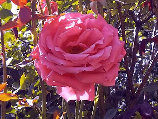 |
| This rose is rose |
Since you have chosen rose as your
tone, it is time to choose the
tint and
shade that go with it. The tint is red mixed with white and the result is a range of pinks from the palest pastel to in-your-face hot pink. A shade is red mixed with black to give you such colors as burgundy and maroon. Make a sample of your tint, tone, and shade with paint, fabric, paper, etc. Those little paint chips from the hardware store are ideal. Then decide which of the three you plan to use the most and which you plan to use just for an accent color. For example, if you are fixing up a bicycle for a little girl, you may want the body to be a bright pink, the saddle maroon, the basket white with a decal of roses, and rose-colored streamers on the handlebars. If you are planning a hooked rug, you may want a burgundy background with figures in rose and highlights in soft pink.
 |
| Monochromatic orange lilies |
As recently mentioned, I will from time to time discuss a contemporary painter whose work has inspired me to try a new project. I want to feature California artist Erin Hanson (
www.erinhanson.com) in conjunction with monochromatic color schemes. She is a contemporary landscape artist with a talent for blending modern Impressionism with modern Expressionism. She is especially fond of painting scenes from our national parks and monuments. Not long ago she set a task for herself to make a gallery show of a series of paintings done primarily in tints, tones, and shades of the color orange, with surface detailing in black. The works ranged from autumn trees to places like Bryce Canyon and Monument Valley. I was delighted to see some favorite places in the American West in my favorite season of Autumn! I've been inspired by all that orange beauty to plan a monochromatic project in greens.
 |
| Iris in blues and blue-violet |
The next scheme is about
analogous colors; that is, colors that are next to each other on the color wheel, like green and blue-green or blue-green and blue. I recently came across the work of an Australian artist, Clair Bremner, (
www.clairbremnerart.com) who lives near Melbourne and paints lovely fantasy-touched landscapes using a palette of analogous colors — largely blue-greens, blues, and blue-violets. She paints with fast-drying acrylics in large swirls, carefully controlled drips, and planned splashes. She says she usually doesn't have a particular landscape in mind when she begins a project, but approaches the dry background she has painted and introduces delicate flowers and leaves with scores of tiny brushstrokes. She likes analogous colors because she feels they best reflect the harmony of nature.
As soon as I saw her paintings I envisioned a flat background with delicate top-stitching in varied stitches! (Much of what I do is taken from Nature, so I may do a slightly different approach, like yellow-green, gray-green, and blue-green for foliage or red-brown, orange-brown and yellow-brown for fur or feathers.) An analogous color project is already on my to-do list!
 |
| Otter, colored in analagous browns |
We have already discussed
complementary colors, directly across from each other on the color wheel, in the first post on this topic(
August 14, 2019). They are red/green, blue/orange, and yellow/violet. All of them can be very striking combinations. They can be a bit overwhelming when both are used used full strength, but work well when one dominates the other in some way.
 |
| Mums in a RV/BV/Y color scheme |
But I have a fondness for
split complementary schemes. An example of this would be using red-orange and yellow-orange across from orange's complement blue, or yellow-orange and yellow-green opposite yellow's complement violet. The other combinations: blue-green/blue-violet/orange, red-orange/red-violet/green, yellow-green/blue-green/red, and red-violet/ blue-violet/yellow. I find those combinations more subtle than straight complementary colors.
Our last color scheme is
triad. It is made up of three colors that are equal distances apart on the color wheel. We have covered primary colors and secondary colors. The other two combinations are made up of tertiary colors. One groups together yellow-orange, blue-green, and red-violet, while the second is composed of yellow-green, blue-violet, and red-orange. These are more unconventional than the others, but can be effective in geometric and abstract designs, posters and logos, ceramic glazes, floral combinations, etc. One way to approach this is to chose the color range of one of the three and use it for the background, either pale or dark Then use smaller amounts of the second color range — but a larger variety of tints, tones and shades — for the focus of the design. Finally, use the third color group as accents, outlines, lettering, etc. (Practice on a small sample before you begin.)
 |
| Photo composition in yellow-green, blue-violet, and red-orange |
With all the tints, tones, and shades available, you have quite a variety to manipulate. I hope you have enjoyed this discussion of color and have found it useful and thought-provoking. These principles apply in a large variety of creative projects.

 Irises, which my mother used to call "poor man's orchids", are my favorite flowers. I would rather have an iris in a vase than an orchid pinned on my shoulder any day. Even my favorite perfume is Iris Noir, or "Black Iris". We have three versions of ‘black' irises here in the garden, one of which is truly black. Some of our favorites will be used to illustrate this post.
 This is a charted iris that can be done in counted cross-stitch on checked gingham, monks' cloth, or Aida cloth in any size you like. It can be done in tent stitch on plastic canvas, conventional needlepoint canvas, quickpoint canvas or rug canvas. If you think of each square as a patchwork square, it could become a quilt. If each square were a ceramic tile, you could make a back-splash for a kitchen or bathroom sink..It is designed to be done as a bi-colored iris, but can also be done in a solid color. In fact, it can be done in any colors you like — even imaginary ones. If you are doing a bi-colored iris, the standards should be in a light color, the falls in a dark color, the beards in yellow or orange and the stem, of course, in green.
 If you are primarily losing the horizontal line in the chart and are not concerned with losing count of your stitches, the simplest solution is to place a 12-inch ruler with its top edge just under the chart line you are following. If you need to add weight to the ruler to keep it in place, glue a couple of coins to the underneath side of the ruler, near the ends.
 For an easy-to-make tool to mark both the horizontal and the vertical lines of your chart, cut two pieces of stiff cardboard about 2 inches (5 cm) wide and 6 inches (15 cm) long. Staple or glue them together so that they form an L-shape. Place the L on the chart so that the bottom part of the L is directly below the horizontal line of the chart that you are following, and the upright part of the L is just behind the first stitch you are going to count. Mentally remind yourself to move the upright part of the L every 5 or 10 stitches you complete. This takes some practice, but will soon become automatic. Slide the bottom of the L up (if you are working from the bottom of the chart) or down (if you are working from the top) one space at the end of every completed row of stitches.
 I use permanent marker on canvas because the stitches will cover it, as you can see in the picture on the right.
 I carefully wipe off any excess ink, as you can see me doing in the photo on the left.


 If you are primarily losing the horizontal line in the chart and are not concerned with losing count of your stitches, the simplest solution is to place a 12-inch ruler with its top edge just under the chart line you are following. If you need to add weight to the ruler to keep it in place, glue a couple of coins to the underneath side of the ruler, near the ends.




 This post by Annake's Garden is licensed under a Creative Commons Attribution-NonCommercial-ShareAlike 3.0 Unported License.


