Showing posts with label using color in needlework landscapes. Show all posts

Tuesday, September 24, 2019

Pigments and Palettes: All About Color, Part II

6 color wheel
Simple six-color wheel

In Part I of this series we talked about the subtractive qualities of color in natural light. Pigments, on the other hand, are additive. We add one color to another to get a third. As a child, I imagine you were taught that if you add red to yellow, you get orange. Add yellow to blue and you get green. Add red to blue and you get purple. Simple, isn't it? Well, it isn't really that simple.

What happens if you add red to green? Or blue to orange?  Or yellow to violet? If you do it well, you get a nice gray. Gray is considered a neutral color. Other colors besides gray can be neutral as well. Neutral colors can be very useful. A neutral color is one that is very low in intensity. The gradual addition of a complementary color or black or white to a hue or pure color will make it progressively less intense until it becomes neutral.
Grays mixed from complementary colors
12-color wheel
12-color wheel
If we expand our color wheel, we find interesting color pairs directly opposite each other. Red-orange is opposite blue-green; yellow-orange opposite blue-violet; yellow-green opposite red-violet. The RO/BG combination is believed to be the most eye-catching combination of all. If you want to make a poster guaranteed to capture attention, you now know what color combination to use. However, it is also fatiguing to  eye muscles, so people won't look at it for long. Make your message short and to the point.

Red-orange & blue-green sign
Red-orange & blue-green message sign

The term value is used to describe the amount of light reflected off an area: that is, the amount of lightness or darkness regardless of the hue or intensity. A value scale can be made for any pure color. This starts with a very light version of the color, followed by medium light, medium, medium dark, and dark. For a more complex scale, begin with white before the light color sample and end with black after the dark one. A simple way to judge the values of an object, scene, or composition is to think of it as a black and white photograph. Which areas are the lightest? Which are the next lightest? Continue until you have found the darkest areas.
Value scale for green

Let's move on to the mixing of pure colors with the absence of color (white), the neutral value (gray), and the other non-color (black). Pure colors are known as hues. Mixing pure colors with white produces a range of tints. Mixing it with gray or other neutrals produces a range of tones. Mixing it with black makes a range of shades. If I'm painting a tree in acrylic, I mix a wide range of yellows carefully with a touch of black, not blue, to get lively summer greens. Will that same tactic work with pastels, watercolors, or embroidery flosses? The only way to make sure is to experiment.

A painter's pallete
A painter's pallete
Now to the subject of palettes — not the objects smeared with paint that artists use while painting, but the selections of color that individuals choose. Most art books will at least hint that you should choose one set of colors and stay with it. As a teacher, I take a very different view. Since I have taught so many kinds of artwork, I am well aware that I don't choose the same colors even for related materials. I don't choose the same colors for chalk pastels that I would for oil pastels, or watercolor pencils for tube watercolors. I would much rather that my students explore all the colors available to them in any medium and find uses for as many of them as they can. For one thing, it doesn't make sense economically to buy a whole set of colors — as most people do — and not use half of them. Isn't it better to try all sorts of color combinations and make note of what they produce? (Many children will do this instinctively.)  If you keep a reference sheet of the combinations, over time, you will know what colors to choose when you need a special effect. Mother Nature is the grandest artist of all, so we are going to illustrate some of our comments with her work from our garden.

One view of Annake's garden
I have found when mixing tints that I get the best results by starting with white and adding a tiny bit of color at a time until I get the tint that I want. On the other hand, when I mix shades I start with the color and add a bit of black to it until I get the shade I want. Tones can be a bit more difficult. I usually start with nearly equal amounts and adjust them as I mix. If I want a warm neutral, I use a little more of the warm complementary color (red/orange/yellow) than I do of its cool complement. If I want a cool neutral, I use more of the cooler complements (green/blue/violet).
If I'm using tube colors with names like raw umber, burnt sienna, or alizarin crimson I put a sample of each paint and one of the mixed neutral on a plain white index card, write the names of the colors used, let it dry completely and file it for future reference when I need a similar color for another project.  When I am mixing flosses or yarns for a special effect, I glue a small square of worked canvas and samples of the floss or yarn to a card and file it the same way. You will be surprised how much time this can save you later.  It is also a great help when you are trying to match materials that have run out. Just drop it in your wallet or purse and take it to the shops.

Color wheels are most useful when you are devising color schemes, whether I'm choosing colors for decorating a room, designing a painting, making a rug pattern or putting together accessories for a special outfit. The simplest color wheel has only six sections, the primary colors of red, yellow' and blue, and the secondary colors orange, green, and purple. Secondary colors are made by mixing two primary colors. To be effective, you will need a color wheel with at least twelve colors. The added colors are tertiary colors, made by by mixing a primary with one of the two secondary colors nearest to it, as mixing red with either violet or orange. The tertiary colors are red-violet, red-orange, yellow-orange, yellow-green, blue-green, and blue-violet.
Tertiary colors
Tertiary colors

Let's begin with the simplest scheme, the monochromatic scheme.  Suppose your favorite color is rose and you want to use it liberally in your project. Rose is a tone of red; it is red mixed with a neutral color. A beige neutral will give you a warm rose, while a gray or blue neutral will give you a cooler one.  This is especially important if you are decorating a room. If the room is naturally sunny, you may want cooler colors. If it is shady, you may want warmer ones. Or you may want to vary your color scheme in a single room differently for summer than for winter. (The colors red through yellow-green are considered warm colors. These colors appear to advance toward the viewer and are associated with energy and activity. The colors green through red-violet are considered cool colors, these colors tend to recede from the viewer and are associated with calm and serenity.)
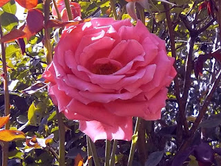
This rose is rose
This rose is rose
Since you have chosen rose as your tone, it is time to choose the tint and shade that go with it. The tint is red mixed with white and the result is a range of pinks from the palest pastel to in-your-face hot pink. A shade is red mixed with black to give you such colors as burgundy and maroon. Make a sample of your tint, tone, and shade with paint, fabric, paper, etc. Those little paint chips from the hardware store are ideal. Then decide which of the three you plan to use the most and which you plan to use just for an accent color. For example, if you are fixing up a bicycle for a little girl, you may want the body to be a bright pink, the saddle maroon, the basket white with a decal of roses, and rose-colored streamers on the handlebars. If you are planning a hooked rug, you may want a burgundy background with figures in rose and highlights in soft pink.

Monochromatic orange lilies
As recently mentioned, I will from time to time discuss a contemporary painter whose work has inspired me to try a new project. I want to feature California artist Erin Hanson (www.erinhanson.com) in conjunction with monochromatic color schemes. She is a contemporary landscape artist with a talent for blending modern Impressionism with modern Expressionism. She is especially fond of painting scenes from our national parks and monuments. Not long ago she set a task for herself to make a gallery show of a series of paintings done primarily in tints, tones, and shades of the color orange, with surface detailing in black. The works ranged from autumn trees to places like Bryce Canyon and Monument Valley. I was delighted to see some favorite places in the American West in my favorite season of Autumn! I've been inspired by all that orange beauty to plan a monochromatic project in greens.

Iris in blues and blue-violet
The next scheme is about analogous colors; that is, colors that are next to each other on the color wheel, like green and blue-green or blue-green and blue.  I recently came across the work of an Australian artist, Clair Bremner, (www.clairbremnerart.com) who lives near Melbourne and paints lovely fantasy-touched landscapes using a palette of analogous colors — largely blue-greens, blues, and blue-violets. She paints with fast-drying acrylics in large swirls, carefully controlled drips, and planned splashes. She says she usually doesn't have a particular landscape in mind when she begins a project, but approaches the dry background she has painted and introduces delicate flowers and leaves with scores of tiny brushstrokes. She likes analogous colors because she feels they best reflect the harmony of nature.

As soon as I saw her paintings I envisioned a flat background with delicate top-stitching in varied stitches! (Much of what I do is taken from Nature, so I may do a slightly different approach, like yellow-green, gray-green, and blue-green for foliage or red-brown, orange-brown and yellow-brown for fur or feathers.)  An analogous color project is already on my to-do list!

Otter, colored in analagous browns


Red poppies in a green meadow  (photo by J.J.)
Red poppies in a green meadow  (photo by J.J.)
We have already discussed complementary colors, directly across from each other on the color wheel, in the first post on this topic(August 14, 2019).  They are red/green, blue/orange, and yellow/violet. All of them can be very striking combinations. They can be a bit overwhelming when both are used used full strength, but work well when one dominates the other in some way.

Mums in a RV/BV/Y color scheme
But I have a fondness for split complementary schemes. An example of this would be using red-orange and yellow-orange across from orange's complement blue, or yellow-orange and yellow-green opposite yellow's complement violet. The other combinations: blue-green/blue-violet/orange, red-orange/red-violet/green, yellow-green/blue-green/red, and red-violet/ blue-violet/yellow. I find those combinations more subtle than straight complementary colors.

Our last color scheme is triad. It is made up of three colors that are equal distances apart on the color wheel. We have covered primary colors and secondary colors. The other two combinations are made up of tertiary colors. One groups together yellow-orange, blue-green, and red-violet, while the second is composed of yellow-green, blue-violet, and red-orange. These are more unconventional than the others, but can be effective in geometric and abstract designs, posters and logos, ceramic glazes, floral combinations, etc. One way to approach this is to chose the color range of one of the three and use it for the background, either pale or dark Then use smaller amounts of the second color range — but a larger variety of tints, tones and shades — for the focus of the design. Finally, use the third color group as accents, outlines, lettering, etc. (Practice on a small sample before you begin.)

Photo composition in yellow-green, blue-violet, and red-orange

With all the tints, tones, and shades available, you have quite a variety to manipulate. I hope you have enjoyed this discussion of color and have found it useful and thought-provoking. These principles apply in a large variety of creative projects.


 Creative Commons LicenseThis post by Annake's Garden is licensed under a Creative Commons Attribution-NonCommercial-ShareAlike 3.0 Unported License.

Friday, October 26, 2018

Out to Sea, In to Shore, and Along the Shore: Seascapes in Needlework, Part 2

Shoreline sunset
Lake shoreline or ocean coastline?
Before we begin our new topic, I would like to address two questions that I am frequently asked. The first is "Can I take what I'm learning about seascapes and use it for lakes?"

In most cases, the answer is a resounding "Yes!" This is particularly true if you have access to a large lake. I can assure you that Lake Michigan during a storm is as awesome as the ocean!  You will not get the same wave forms and breakers that you would see on a seacoast, nor the large tidal differences. Sunrises, sunsets, fog and storms over lakes can be quite dramatic, however. and can be treated in the same way as those at sea.  A solitary fisherman can provide as dramatic a silhouette as strollers on a beach.  Boats of all kinds, docked or in motion, are always interesting. Lakes are also a good place for wildlife sightings, particularly of migratory birds. We had moose reintroduced to our area a few years ago and I'm hoping for a good sighting soon. By all means apply the principles you learn to lakes as well as the ocean. This photograph could be either a lake scene or an ocean one.

Annake tracing petterns on canvas
The second question, phrased in many ways, refers to the amount of planning I recommend before actually starting an art needlework project. Unlike painters, fiber artists (needlepointers, rug makers, quilters, weavers, embroiderers) cannot "paint over" areas of our work. Removing stitches is tedious and time-consuming and always runs the risk of damage to the underlying canvas or fabric. It is wise to work out as many details as possible before putting in that first stitch. (My favorite paint medium is watercolor, which is not as easy to modify or correct as some others, so I learned early to plan before I began.)  This is just a practical reason for pre-planning.

But there are many more advantages to planning.  Planning forces you to think about what you want to do.  You must really look at the scene, animal, flower, or other subject you want to depict in needlework. Then you have many individual decisions that you need to make. What is the function of the piece — rug, picture, decorated clothing, table linens, etc.? How large will it be when it is finished?  Will it need matting, framing, backing, edging? What is the style — realistic, stylized, cartoonish, geometric, abstract? Will you need to transfer the design to your canvas or fabric? Are you following a chart, or just working "free hand"? What is the color scheme? What materials will you need and how much of each one? What tools will you need? Do you have what you need on hand or must you buy some things? Make a shopping list. Once you have resolved all these questions, you will be able to begin your work with confidence and enthusiasm because you know your planning has been thorough.

Now back to seascapes!  Seascapes can be planned in three main ways. The first of these is to look outward from the land to the sea. This is what we concentrated on in the first part of this series. The second is to look at the shore from the sea. We used one of J.J.'s photographs as a basis for demonstrating "gesture" in art. Let's remove the directional lines and look at the picture underneath.

Shoreline #2, cropped
Florida shoreline, photo by J.J.
The city almost appears to float on the calm waters! Look at the clarity of the reflections of the buildings. Here is the scene as part of a larger panorama.

Shoreline #2, full panorama
Panorama of shoreline, as originally shot
Whenever your scene includes a large portion of land, not just rocks that the sea is breaking over, you have a number of decisions to make. I am going to give you two simple sketches of a cove to illustrate this point. The sketches are identical except for one thing — the position of the sketch on the background.  Please feel free to copy both sketches and develop them as you choose. I've made them very simple so that you can do that.

Simple sketch, cove at bottom
In this sketch the cove is dominated by the sky, which occupies the top half of the background.  Is the sky sunny or cloudy? Are the clouds fair-weather clouds or storm clouds? Is it sunrise, midday, or sunset? Is there anything besides clouds in the sky — a flock of migrating birds, perhaps, or colorful hot-air balloons? Is the cove just barren rocks? Is there a lighthouse on the point? Are there buildings? Are there boats anchored in the cove? Is the sky reflected in the water? You will need a balance between light and dark features. If the sky is light, how are you going to balance it by making the cove darker — or the other way around? What are you going to do with the small strip of foreground that is at the bottom of the sketch, closest to the viewer? Make your choices and indicate them with colored pencil, crayon,  marker or pastel. Features will be small, so you need not put in a great deal of detail unless you want to do so.

Never underestimate the value of so-called "neutral' colors like beiges, tans, and the whole array of grays. Wet things — earth, sand, rocks, ropes, fishing nets — dry and lighten in color as they do so. Mixing strands of neutral floss or yarn into the "wet" colors or gradually lightening areas with closely related neutrals make such transitions look more natural and believable.  An exposed rock, for example, may be considerably paler at the top, where it has dried, than it is at the bottom, where it is still wet.

Simple sketch, cove at top
This time the sky is much less visible and plays very little part in the composition. The cove itself takes "center stage". But now that little strip of foreground that you could almost ignore in the first sketch takes up nearly half of the visual space in this one. Is the cove now the site of a village or a simple ridge of rock that the sea, surging in from the right, will break over?  Is there a solitary fisherman standing hip-deep in the water/ A fishing net caught on the rocks? Is the foreground a part of the same rock formation, also battered by the sea? Is it a high elevation looking down on the scene below? Is beach grass growing on it? Are gulls coming in for a landing? Is it a stretch of sheltered beach where someone has built a sand castle? How are you going to balance the lights and darks this time?

breaking surf
Monochrome picture of breaking surf

Shoreline through white leaves
A complex lakeshore photo by J.J
For those of you working on lake scenes instead of seashores, you can easily modify the cove sketches. You may want to visualize trees along the point above the cove  — hardwood trees in autumn foliage, perhaps, or darker evergreens.  What else might you include? Canoes instead of fishing boats? A bear teaching her cubs to fish? The tents of campers? Snow falling softly? Ducks, geese, swans or other migratory birds in the water?

beach with seagrass
Grass blades, plant foliage, tree leaves, even evergreen needles eventually surrender their colors as the seasons of their lives come to an end. Showing their natural colors replaced with darker or more muted tones gives them a liveliness and reality in a composition that they would not otherwise possess. Take beach grasses for example. Even when the grasses die at the end of summer, their complex root systems serve to hold both the dead plants and the sand itself in place against the influences of wind, rain, and snow. If you are adding grassy dunes to your seaside composition, ask yourself if the green in the grass comes from new plants taking hold among the old ones or from hold-outs losing ground to the coming winter. The answer can set the tone for the whole composition — and determine the color scheme as well. Which brings us to the third way of composing a seascape — looking along the beach or seaside itself, while sea and sky act as  "accessories" to complete the picture. This scene of beach grass and sand is a good example of what I mean.

Earlier I mentioned balancing dark and light in a composition. This doesn't mean that you should divide your design down or across its middle and make one half dark and the other half light. It does mean that if, for example, you have a light sky above dark water, you should have at least a small amount of dark tones in the light area (perhaps patches of deep blue sky between white clouds), and lighter tints in the dark area (perhaps white foam on the water or light-colored sand on the beach). It also means that if you have a large dark or light area or object at the center of your composition, you should have a smaller area of similar lightness or darkness close to one edge of the composition. Think about a see-saw. How does a large adult balance a small child on a see-saw? By moving closer to the center, while the child remains at the other end of the board. Try to make a composition that has some alternating light and dark areas. You may find that this is the most satisfying solution to the light/dark balance problem.

"Cascades," mixed needle arts
"Cascades," a mixed needle arts picture demonstrating many of the points above
I have given you a lot of ideas to consider. I'm sure you can think of many more.  Experiment. Play with your choices. When you have considered the alternatives and when you have a combination that pleases you, begin the planning process. Then get busy and make that composition!

And start thinking of yourself as a fiber artist in the making!


 Creative Commons LicenseThis post by Annake's Garden is licensed under a Creative Commons Attribution-NonCommercial-ShareAlike 3.0 Unported License.

Sunday, August 26, 2018

Seascapes in Needlework, Part I

Simple beach scene by J.J.
If you live in a land-locked area far from the sea, as we do, you may feel little inclination to try doing a seascape. However, no landscape is as changeable as the sea and few are as expressive of mood and emotion. I became familiar with both the Atlantic and Pacific Oceans when we lived in Panama, where the two are just a few miles apart. J.J. travels to Florida frequently and takes many photographs as she walks along its beaches. J.D. is addicted to fishing programs on television and is currently following one on deep-sea sport fishing. I check the National Weather Service on my computer at least daily, where I frequently find film clips of marine action which I can watch over and over until I am familiar with a particular aspect of the ocean in motion.

Northeaster by Winslow Homer 1895 [Public domain], via Wikimedia Commons
"Northeaster" by Winslow Homer, 1895
You also have access to such information. Your first resource is your memory. If you have ever been on the ocean or at seaside, what do you remember about it? How did you feel about the experience? Jot down notes about your reactions. They don’t need to be complete sentences — just words and phrases. Do you have pictures from that time, or might a relative have some? Moving pictures from television or electronic devices are your second resource. Check the National Geographic Channel for programs about the Earth. Other sources are travel films, series devoted to animals, and the aforementioned fishing shows. Finally, there are still pictures, whether modern photographs or paintings by masters like Winslow Homer.

Apollo 17 Image Of Earth From Space By NASA [Public domain], via Wikimedia Commons
Apollo 17 Image Of Earth From Space
The oceans are vast. I recently heard an astronaut describe how much of an orbit is over water. Even large continents like South America and Africa, he said, take little time to observe and then you are over water again. The oceans contribute greatly to the fact that Earth becomes the “Blue Planet” (sometimes referred to as the “Big Blue Marble”) when viewed from space. The oceans are also deep, so deep that it is hard to imagine descending to the bottom of one. They are subject to enormous physical forces — the gravitational forces of the planet and its moon, the planet’s spin, the movement of the tectonic plates, tides, currents, tsunamis, storms, seasonal temperature changes. Therefore, they are constantly changing.

Beach sunset by J.J.
The time of day you choose is important. Sunsets and sunrises at low tide are especially interesting because the water reflects the colors of the sky. There will be little blue in the water unless it is reflected blue from the sky. This may be darkened to a degree by the marine blue of the water, but the overall effect will be that of the sky colors. The white of surf and spray also picks up color from the sky. The sun itself creates a prominent path in the water. It colors low clouds and reflects on the undersides of higher ones. Seaside buildings may show color in their planes and shadows, although they do not reflect with the same intensity as the surface of the water. The shadows below the crests of waves appear very dark and there is more violet in the blues. However, the shadows become paler and grayer the further they are from the shore and the waves themselves appear smaller. Wavelets striking the land may appear as distinct bands across the surface where the water is shallow.

directional gesture diagram
Arrows show the four different 'gestures'
There are four lines of directional movement, often referred to as gestures, in a composition. These are horizontal, vertical, diagonal, and curvilinear. While it is desirable to get all four into the design, an eloquent picture can be made with fewer than that number. The panoramic photograph below shows three of the four plainly. The sea’s horizons are almost always strong horizontals, as they are here. This is counterbalanced by the vertical lines provided by the two figures and their shadows. Curvilinear lines of direction come from the gentle wave forms. It would be possible to add a diagonal line with a cloud or by a sailboat on the water, but I don’t believe it would improve the composition, which so beautifully shows the powerful influence of the ocean and the solitary presence of two people who appear to have the world to themselves.

Two Against the Tide by J.J.
"Two Against the Tide" by J.J.


Let me show you what I mean by directional “gestures’. First is what you see in the panorama above. There is the horizontal line for the horizon. Below that are the curved lines of the waves against the beach. Off to the left are two short vertical lines for the two people, which are doubled in length by their shadows. The various lines need not be of the same length or number to give unity and balance o a composition. Diagonal lines are found both in nature, as in the branching of trees, and in man-made forms like a sailboat, the roof of a building, a construction crane, etc.

Silohuettes at sunrise by J.J.
Photo by J.J.
Sunrises usually have gentler colors — pink, apricot, aqua, pale blues. The water reflects less of these colors. Before the sun clears the horizon, structures both far and near may appear only as black silhouettes. This can make a striking picture if the objects that are silhouetted have varied and interesting shapes. The rising sun (small circle at the far right of the photograph) appears largely white, lacking the vivid yellows of the setting sun, and makes a white path of reflection on the water. Colors, diluted by this white glow, gradually appear along the sides and on the tops of the shadowed forms as they emerge out of the darkness. Distant forms may remain backlit longer than nearer ones facing the sun. The sunrise colors fade faster than sunset colors and the overhead sky turns a distinct blue before they entirely disappear. There are a number of diagonals in this picture.

Winslow Homer - On a Lee Shore [Public domain], via Wikimedia Commons
Winslow Homer - "On a Lee Shore"
The open ocean is a deep blue-green. As it approaches land and grows shallower, it becomes duller and other colors are incorporated: the yellow-green of seaweed, browns and grays from underwater rocks and sand, the stark white of wave crests and the off-white of spray where surging water strikes as it meets the shore. Many painted seascapes that I have seen make the sea look almost uniformly dark blue. That is inaccurate and makes the picture less interesting. You can add color to your seascape by blending yellow, green, and brown strands of yarn or floss with the blue and turquoise ones you use for the sea. Try several browns because they create different effects. If you choose to do a sunlit scene. add occasional small stitches of pastel colors to spray, where bursting bubbles make tiny rainbow twinkles.

"Safe Harbor", Nordic stitch needlepoint
A seascape need not be a complicated project. This one is a color version of the logo of a Scandinavian company that attracted me many years ago and meant enough for me to save it. Although the sail has a more modern shape, the hull reminded me of the shallow-draft Viking coastal vessels like the ones both my husband’s and my Frisian ancestors sailed in, centuries ago. I made this color version for him, with the ship at safe harbor in a fjord as the sun is going down.


Sample of Nordic stitch in vertical and horizontal directions
Sample of Nordic stitch in both directions
The stitch, called Nordic stitch, is a very simple one. It is made up of blocks of four horizontal or vertical stitches, each over four threads, so that they are of uniform size. This is useful for creating simple designs like these silhouettes and can easily be combined with other canvas stitches, such as upright gobelin or tent stitches. Since the individual blocks of stitches are square, Nordic stitch patterns can easily be converted to counted cross-stitch patterns. Or the squares could be larger squares cut from fabric and pieced together to form a patchwork panel, or tiles glued to a wood or Masonite background.

Blue wave bargello pillow top
In Landscapes, Part IV, we promised you another of my “Bargello Plus” pictures, which featured bargello patterns plus realistic elements done in tent stitch. This particular one began with a pattern that represented rolling ocean waves. This was a traditional bargello pattern that I lengthened and extended to make larger “waves”. I used the design to make the pillow top seen here.

I left a space above the waves to represent the sky, where I embroidered a seagull in tent stitch. Then I left a space between two of the big waves for a fish, also worked in tent stitch. The composition was entitled “Seafood Surprise”. I will leave it up to you to decide which creature gets the greater surprise.


"Seafood Surprise", Bargello Plus picture

Now it is time for you to design a simple seascape of your own,


Photo credits: Winslow Homer's "Northeaster" and "On a Lee Shore", and the Apollo 17 image of Earth are in the Public Domain, via Wikimedia Commons. All other photos are copyright Annake's Garden.

 Creative Commons LicenseThis post by Annake's Garden is licensed under a Creative Commons Attribution-NonCommercial-ShareAlike 3.0 Unported License.

Tuesday, July 17, 2018

Landscape in Needlework, Part V

Lake reflections photo byJ.J.
"Reflections",  photo by J.J.
This time I’m going to give you some tips and suggestions for making attractive landscapes in needlework. These are not “rules”; they are ideas that I have found useful. I have only two “rules”. You will find them at the end of this article.

Whether you are sketching a real landscape or marking things of interest in a photograph to make a pattern you can follow in your needlework, limit yourself to 45 minutes. Set a timer or arrange for a reminder on your cell phone.  This will force you to simplify what you include on your pattern, leaving out unnecessary details. Try to capture the essence of the place you have chosen for your subject.  You might want to follow J.J.’s suggestion and half-close your eyes so you aren’t seeing minor details and can become more aware of major forms and the spaces between them. You will also become more aware of the masses of light and dark when you are not distracted by unnecessary detail. What you leave out can be just as important as what you put in. You will want some repetition of shapes, lines, and colors in your picture to both “pull it together” (unify it) and to give it variety so that it doesn’t become boring. Be careful that you don’t repeat any of these things too often.

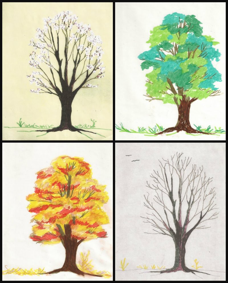
Montage of sketches of the same tree in four seasons
Sketches of the same tree in four seasons
One of my favorite landscape painters, Zoltan Szabo, put it this way: “The human mind tends to organize everything to death.” For example, when a person plants trees, they tend to be the same kind of tree, arranged in straight lines, equidistant from each other and meant to grow to about the same height. When Nature plants trees, they are in interesting clusters of different species and different heights, colors, and textures. Believe me, Nature is by far the better artist! From my kitchen door, I can see three kinds of evergreens and about a dozen deciduous shade and fruit trees. I can observe them and study them in all four seasons. I can mentally move them around into any combination I wish.  Find a place with good trees and get to know them, capture them on paper or film, and keep them for reference.

Photo of trees in winter by J.D.
A winter scene by J.D.
Trees are important components in many landscapes. Here’s an assignment for you. Get a library book or use the search engine on your computer to look up works by the Impressionists. Study the way they painted trees. Compare them. Be sure you include work by Vincent Van Gogh, Paul Signac, Claude Monet, Pierre-Auguste Renoir and Alfred Sisley. If you can find them, look at the work of Dominique Lang (Luxembourg) and Friedrich Eckenfelder (Switzerland). Choose one or two examples of the artist’s brushwork and try to think of stitches that would give you similar textures and effects. Try some of them on scraps of fabric and file the ones you like.

Photo by J.J. pedestrian on a path
"Heading Over the Hill", photo by J.J.
If you are using something like a fence, wall, or stream to lead the viewer’s eye into your picture, it should slant or curve into the picture. Ideally, it should disappear once it has led the viewer to an important point, although it may appear again somewhere else in the picture. Remember that as objects stretch further away from you, they become smaller and less distinct, less detailed, and lighter and grayer in color.

Pencil sketch of a fence
Gray is a color you can use to get wonderful effects. Collect gray yarns or flosses. Use black sparingly. Like straight lines, true black does not appear often in nature. The posts and rails get lighter, thinner, and shorter as they recede into the distance. Here is a simple sketch  that illustrates what I mean. If I were doing this in needlework, I would start the first post with 4 to 6 strands of dark yarn or floss and exchange one thread for a lighter one on the second post, two on the second, three on the third, and so on. See my discussions of blended yarn part II of this series (April 8, 2018).

Transparent grid tool
Speaking of points of interest, here is a simple device you can make to locate them. Start with a piece of thin, clear plastic and a permanent marker. Measure carefully. Put in two straight horizontal lines that divide your plastic into three equal sections. Then put in two straight vertical lines that do the same thing. The four places where the lines intersect are the attention (esthetic) points. These are the areas a viewer is likely to seek out first. Place the plastic on your canvas and mark the four points. If you are working on fabric, you may want to put in rows of long running stitches where the lines would be, Use a bright color that is not in the picture so that you can easily remove the lines when they are no longer needed. Choose one of the attention points for the area of greatest interest in your picture. If you have a second area of interest, it is probably best to place it at or near the attention point directly or diagonally across from the first one you chose. If you use the one directly above or below the first one you have shifted the “weight” of the picture to one side without anything to balance it.

Mountain poppies, photo by J.J.
"Mountain Poppies" by J.J.
The three divisions on the plastic device represent the three planes of the picture: foreground, midground (or middleground), and background. These are the aspects of perspective that make a picture look three-dimensional on a two-dimensional surface. In a landscape, you need to pay attention to the distance that appears to exist between the viewer’s eye and the furthest object in the background. If the proportions do not look correct, the scene will not be believable. This does not mean that the three planes always have to be of equal space or have equal emphasis. Ordinarily, the focus would be on the foreground because it is the closest to the viewer. Details would be sharper in that part of the picture and colors and values (degrees of lightness and darkness) more intense. The midground would be in softer focus and lighter than the foreground. The background would be still lighter and less well-defined. This is the most natural approach.

Simple pencil sketch of a landscape
A simple landscape to experiment with
But you can add importance to any of the three planes if you make it very light or very dark in strong contrast with the other two planes. If you make the midground noticeably lighter and brighter than the other two planes, you will suggest a change in the atmosphere. Add that eerie yellow-green light that sometimes comes before a storm. The background should be very dark; the sky, full of storm clouds. The foreground should also be shadowed and the colors flatter and less distinct. This can make a very dramatic scene. On the other hand, If the background is brighter and more colorful than the other two planes, as it would be at sunrise or sunset, it will dominate the scene, The foreground would be lighter than the midground and its colors would be grayer than normal. The midground would be the darkest plane, with very few details. You have total control over these aspects of the scene, but it is easy to put in too much detail. Use restraint and don’t make the differences between the planes so great that the scene is not believable. You can practice with the landscape sketch above.

Annake toning a canvas
Try working on a colored background. You can tone canvas with diluted acrylic paint. That’s what I am doing in this picture. I often pick up unused canvases at yard sales. If there is a printed design on the canvas, I paint over it until it does not show through. You will not want to leave an area of bare canvas, so match your yarn or floss as closely to the background color as seems necessary.  If you are working on fabric, try to find a medium tone of your major color. For example, use a medium blue fabric for a picture that is mostly sky, a medium green for a woodland scene, etc. You may want to limit yourself to other tones of the same color, plus black, white, and gray. Let some fabric show through. If you like this effect, you can apply it to other genres, like still lifes and even portraits. (For more about toning a canvas, see the post for June 15, 2014.)

Here are some generalizations about color that you may find useful.
  • Color and value are not the same. Think of value in terms of intensity and saturation.
  • A pure color, like the twelve seen on a conventional color wheel, is a hue. Every hue can be a tint (hue mixed with white), a tone (hue mixed with gray), or a shade (hue mixed with black). Use these variations to make your composition more interesting and realistic.
  • Warm colors (red through yellow-green on the color wheel) seem to advance toward the viewer. Cool colors (blue-green through red-violet) seem to recede.
  • Your picture should be predominantly warm or cool, depending upon the light, to assure color harmony. Warm colors are generally cheerful; cool colors are serene.
    Needlepoint of colored squares
    Needlepoint of colored squares
  • A color may look very different in different contexts, depending on the colors that are next to it. Note how the colors seem to change in this needlepoint when the center squares change from white to black.
  • The farther away an object is a picture, the paler (less intense, less saturated) it appears. Colors tend to gray as they approach the horizon.
  • Grays are not always made from mixing black and white. Blending complementary colors can give you some interesting effects. Blue’s complement is orange. Brown is a part of the orange “family”. I have had some success in blending blues and browns in yarns and flosses. Not all combinations work. Blend a short length and place some stitches close together on a scrap of fabric. If you like the result, file the sample along with the color names or numbers that you used. Try to incorporate some of the complementary colors into your shadows.
And here are my two “rules”:

Don’t get discouraged and quit if a project isn’t turning out the way you expected.

A few days ago, J. D. asked me how I was doing with a project. I told him I had come to love it and hate it with about equal intensity. Put the project away for a few days (no longer). When you look at it again, you may find there is nothing wrong with it. You may find you now know how to fix it. You may like it better than your original idea. Give it a chance.

Rules were made to be broken.

Take constructive criticism gracefully, but do not follow it until you have tried it and decided for yourself. Develop your own set of ideals. Listen to yourself. Be your own best critic.

Good luck,


 Creative Commons LicenseThis post by Annake's Garden is licensed under a Creative Commons Attribution-NonCommercial-ShareAlike 3.0 Unported License.

Contact Us

Name

Email *

Message *

Blog Archive