 |
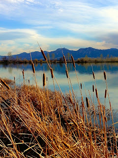
| "Cattails", photo by J.J. |
The next two needlework landscapes are the result of a class I taught for adults at a Park and Recreation center some years ago. It was an intermediate class for people who had completed an introductory class in needlepoint, some other tapestry work, and basic crewel embroidery. They had acquired some skills, but were still turning to kits and published patterns for most of their needlework projects. I decided it was time for each of them to do a piece of original work. I challenged them to draw a simple landscape and bring it with them to class the following week. It could be any shape except rectangular. I wanted them to “think outside” that particular box. They could do a real landscape or an imaginary one, but this first class session was to be devoted to making a series of choices that would make up their plan for the project a plan they would then be expected to follow throughout the project. The chart below summarizes the list of choices that were decided upon. It worked somewhat like a Chinese restaurant menu: one from Column A, one from Column B, and so on.
| Shape | Location | Season | Time of Day |
|---|---|---|---|
| square | evergreen forest | spring | daybreak |
| circle | Eastern woodland | summer | morning |
| oval | prairie grassland | autumn | afternoon |
| hexagon | mountains | winter | sunset |
| desert | night | ||
| seashore |
I handed out pre-cut templates and they traced their choices of shapes on plain paper. Those who had chosen ovals (ellipses) decided whether to use them horizontally or vertically. Once they had written their other choices on a planning page, we moved on to locations and what might be seen there. A couple of the students had grown up on prairie farms. They mentioned barns, haystacks, silos and windmills. That got the discussion started. Then we talked about how colors change with the seasons, times of day, and weather, and how light differs in forests, the desert, at ocean-side, etc. They had suggestions which I wrote on a chalkboard. They were still unsure about the assignment, but gaining some enthusiasm. The rest of the class was devoted to preparing canvas and making a list of materials.
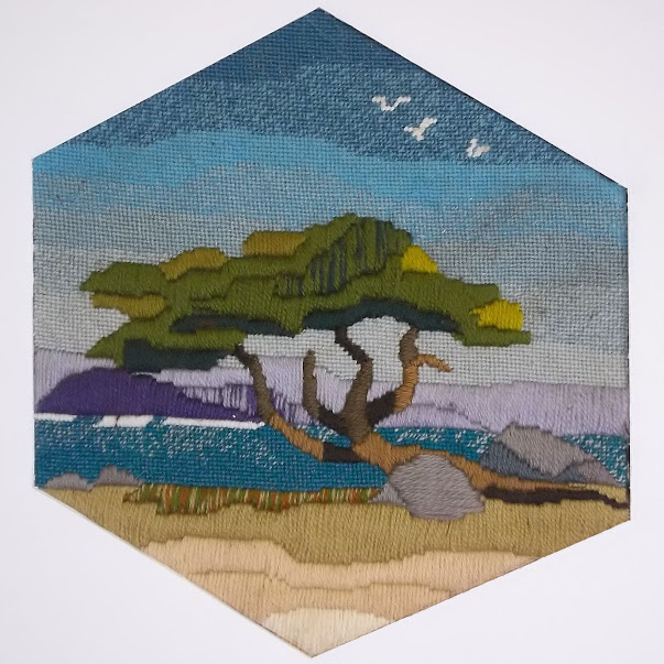 |
| "Monterey Cypress", needlepoint landscape |
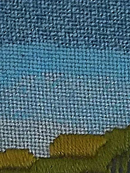
At our second meeting, I showed my class my hexagonal outline and the simple shapes that I had included in my design. They had drawn their landscapes inside the shapes made with templates. We discussed the idea that “less is more”. Most of them needed to simplify their pictures by tracing only the broad outlines of the most important features. I didn’t want them concentrating on small details at this stage. They then used the templates to draw their outlines and simplified landscapes on prepared canvases. I had completed a large section of the sky on my picture and gave them a lesson on blending yarns. They liked the effect and used that technique on their own skies.
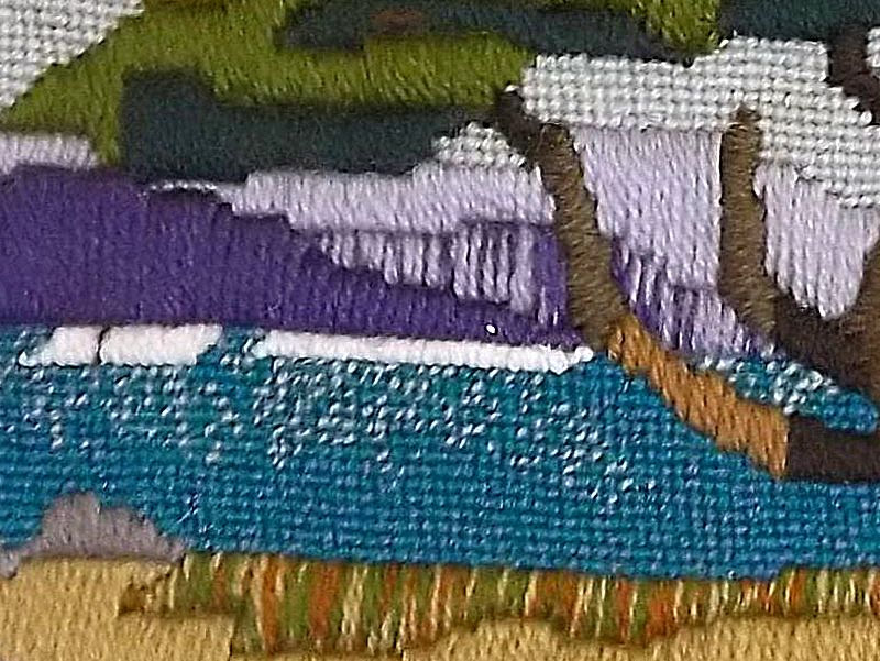 |
| Detail showing blended yarns |
You blend yarn by threading two or more different shades into your needle at the same time. Begin with three shades in the same color range — a dark shade (D), a medium shade (M), and a light shade (L). Look at the sampler. Each division contains three strands of yarn used together. From left to right, you have the following color designations: DDD, DDM, DMM, MMM, MML MLL, LLL and DML. As you stitch, the strands of yarn will turn so that the same strand is not always on top. This is what creates the intermediate shades. You can see some of that effect on the cliffs of the headland in the distance. You will probably need to use several such combinations to create a “needle painting”.
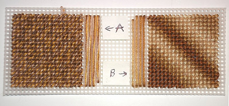
Blending embroidery floss works in a similar manner. With floss, however, you are working with 6 strands, rather than 3. Floss does not separate as easily as yarn does. I usually separate floss into three 2-ply strands, rather than six 1-ply strands. As I did with the yarn, I use a dark, a medium, and a light shade of the same color. You can use more closely related shades of the same color for even more subtle effects if you like. Variegated floss will give you a different effect.
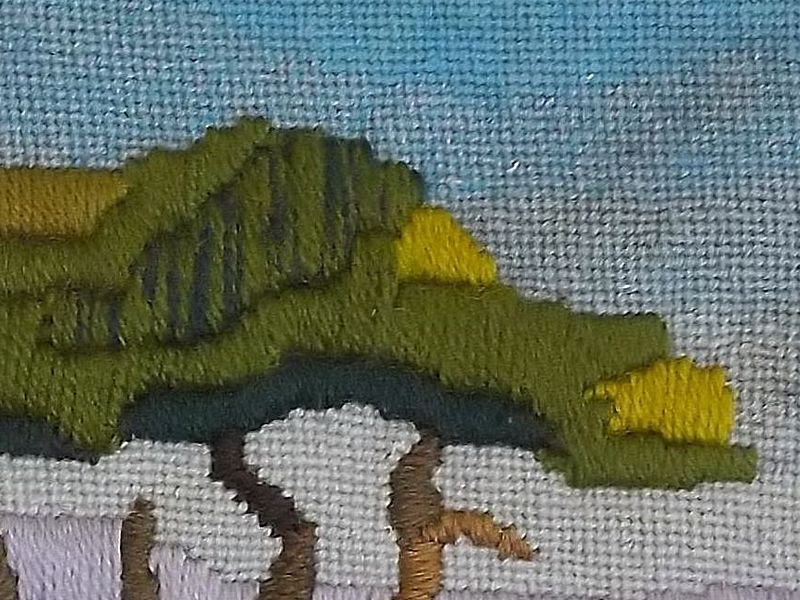
By the following week the students were eager to start on the middle grounds of their pictures. l I had completed the cypress tree, using a lot of upright Gobelin stitch, a stitch which goes back to the Renaissance, where it was used to produce embroidered goods which looked like woven tapestries, but were far less expensive. These were in great demand from the rising middle class, who wanted goods that were similar to those that had only been available to royalty and the rich up to that time. Gobelin can be used either vertically, as I used it in the sections of the tree’s foliage, or horizontally, as I used it on the narrower limbs and tree trunk. I had used two strands of yarn for the foliage rather than a single strand, which made the foliage stand out from the background.
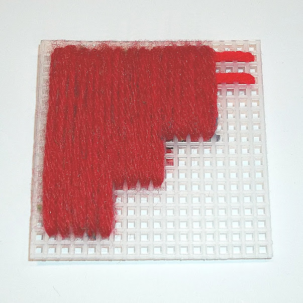
We had a short practice session with the stitches and they began picking out parts of their pictures where the technique was effective. Class sessions were often interrupted by such questions as “How do I get this wall to look like brick?” or “What stitch will make this tree trunk look and feel rough?” Each time I taught a new stitch, the class stopped what it was doing and learned that stitch. They did samples of each stitch on strips of plastic canvas, labeled them, and stored them in binders, folders. or envelopes, or stapled them to index cards for future reference.
Brick stitch can be used either vertically or horizontally over 2 or 4 threads of canvas. Despite its name, it is more commonly used vertically than horizontally (upper left). Two colors are used. The stitches of the second color begin and end at the midpoints of the stitches of the first color. I have used stitches over 4 threads throughout. The next stitches (top middle) are done horizontally. To make them more brick-like, you will need to use at least two rows of stitches, if not more (bottom middle). When I did the piece on the right, I did three things: I used three rows of stitches for the bricks; I alternated the colors as well as the rows; and I outlined the brick shapes with a thinner tan yarn to represent mortar. In the top three rows, I used two layers of “mortar” between the rows. This makes the bricks look smaller, more irregular and worn — older, in fact. On the bottom three rows, I used a single layer of “mortar” between the rows. They look newer and less worn, but the coverage is not as good. This should not be a problem on needlepoint canvas, where the mesh is finer and the threads are thinner. Think about the age of the wall you are trying to portray. The older it is, the more worn and faded the bricks should look and the darker the mortar should be.
I used Gobelin stitches again in the foreground of my picture, but this time I padded the stitches for objects like the large boulder. Before I put in the double-strand stitches vertically, I laid in long stitches of a heavier yarn horizontally across the area to be stitched. This gave the areas extra dimension. You must be careful, however, to get the vertical stitches even, untwisted, and very close together so that none of the padding shows through. This takes a little practice.
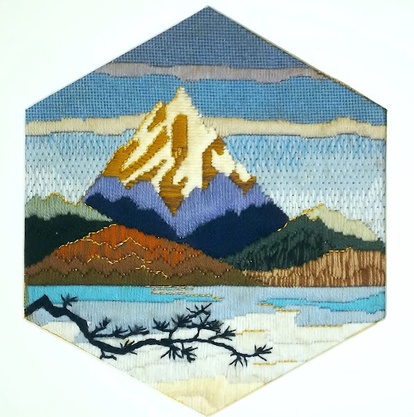
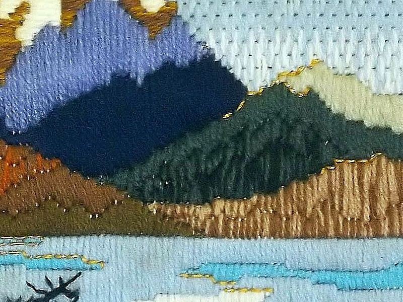
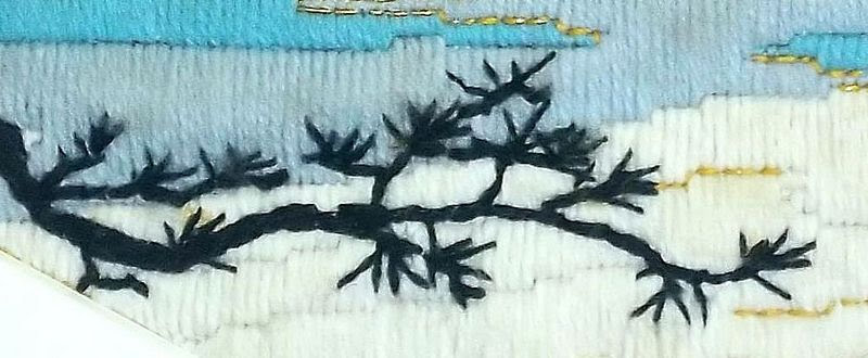
By the middle of the class schedule, I had finished “Monterey Cypress”, given it a hexagonal picture mat, and framed it. I then started on a second example, keeping the hexagonal shape, but choosing a mountain scene on an early spring morning while the lake in the foreground still had a lot of ice on it. This is “Cascades”. Although it captures the “feel” of the area and shows my fondness for it, the scene is completely imaginary. Despite this, I have heard many viewers of it exclaim, “Oh, I’ve been there!” or “I just love that place!”.
As the students finished the mid-grounds of their landscapes and moved on to the foregrounds, they had to decide what the focal point of their picture would be, so they would know whether to really emphasize the foregrounds or make them simple and understated. One of the lessons I gave at that time concerned the use of back-stitching for three different purposes. These are:
a) back-stitching around an area with a single strand of the same color to help define it,
b) back-stitching around an area with a contrasting color to draw attention to it, and
c) back-stitching with metallic yarn or floss to indicate reflections or add sparkle.
You can see all three uses of back-stitching in this sample.
I had embroidered three white gulls on the surface of the sky in “Monterey Cypress” without calling any particular attention to them. The gulls had, however, suggested a “finishing touch” to the pictures. At the end of the next-to-last session, I gave the students a final assignment. They were told to think of some small detail that they wanted to do in crewel embroidery on the surface of their finished needlework. It could be in color or a black silhouette. They were to bring a copy of this detail, in the size they planned to use, a crewel needle, and yarn or floss to the final class. Their landscapes were to be finished, except for this detail, and be ready to be shown to the class for critique.
On the last day, I gave each student a piece of tissue salvaged from an old dress pattern and some straight pins. They traced their details on the tissue and pinned it in place. They embroidered the details through both the tissue and the canvas. I brought out the framed “Cascades” to show them how I had done the branches in the foreground. They used familiar crewel stitches like outline, stem, chain and satin to do the embroidery. Then they tore away the tissue and used tweezers to remove any remaining remnants. They removed the pins and brushed the surface of the needlework with a soft brush.
Each student then presented his or her completed landscape, told what had inspired it, and answered questions from other students about decisions they had made. Each of them went home proud of their accomplishments. They each had created an original, hand-crafted, one-of-a-kind work of needle art.
Now it is your turn. Return to the chart at the beginning of this chapter. Make your choice from each category. (Add other choices — even more categories — if you like.) Prepare your canvas. Make your simple sketch and trace it onto your canvas. You may want to color your sketch and keep it nearby. Choose your yarns and/or flosses with care. Work from background to foreground with your favorite stitches and stitch patterns. When you are sure your composition is complete, add that one detail to the surface of your work.
If there are features of your design that you really want to include, but feel you cannot draw, try to trace the outlines from a photograph. I have a caution about that, however. If you are tracing from a photograph, trace only the basic outlines or outstanding features. Don’t put in unnecessary details. J.J., whose photographs you will see often throughout these chapters, says that she finds it useful to half-close her eyes (squint) and mark only the features she sees that way. If you put in too much detail, you may make something that is difficult for other people to identify — as strange as that may seem. You can always refer to the photograph and add more detail later if you think it is necessary. A good source of photographs is wall calendars, many of which are on sale now.
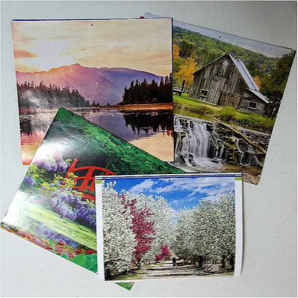 |
| Calendars are a good source of inspiration for landscapes |
I hope you will be as happy with your landscape as my students were with theirs. You may want to frame your work or make it into a wall hanging, pillow top, etc. Display it with pride!
Some material in this post was presented in a different form in a blog post in September, 2013
 This post by Annake's Garden is licensed under a Creative Commons Attribution-NonCommercial-ShareAlike 3.0 Unported License.


No comments :
Post a Comment
Post a New Comment Below -- We Love Feedback !!!