Showing posts with label original needlepoint landscapes. Show all posts

Tuesday, July 17, 2018

Landscape in Needlework, Part V

Lake reflections photo byJ.J.
"Reflections",  photo by J.J.
This time I’m going to give you some tips and suggestions for making attractive landscapes in needlework. These are not “rules”; they are ideas that I have found useful. I have only two “rules”. You will find them at the end of this article.

Whether you are sketching a real landscape or marking things of interest in a photograph to make a pattern you can follow in your needlework, limit yourself to 45 minutes. Set a timer or arrange for a reminder on your cell phone.  This will force you to simplify what you include on your pattern, leaving out unnecessary details. Try to capture the essence of the place you have chosen for your subject.  You might want to follow J.J.’s suggestion and half-close your eyes so you aren’t seeing minor details and can become more aware of major forms and the spaces between them. You will also become more aware of the masses of light and dark when you are not distracted by unnecessary detail. What you leave out can be just as important as what you put in. You will want some repetition of shapes, lines, and colors in your picture to both “pull it together” (unify it) and to give it variety so that it doesn’t become boring. Be careful that you don’t repeat any of these things too often.

Montage of sketches of the same tree in four seasons
Sketches of the same tree in four seasons
One of my favorite landscape painters, Zoltan Szabo, put it this way: “The human mind tends to organize everything to death.” For example, when a person plants trees, they tend to be the same kind of tree, arranged in straight lines, equidistant from each other and meant to grow to about the same height. When Nature plants trees, they are in interesting clusters of different species and different heights, colors, and textures. Believe me, Nature is by far the better artist! From my kitchen door, I can see three kinds of evergreens and about a dozen deciduous shade and fruit trees. I can observe them and study them in all four seasons. I can mentally move them around into any combination I wish.  Find a place with good trees and get to know them, capture them on paper or film, and keep them for reference.

Photo of trees in winter by J.D.
A winter scene by J.D.
Trees are important components in many landscapes. Here’s an assignment for you. Get a library book or use the search engine on your computer to look up works by the Impressionists. Study the way they painted trees. Compare them. Be sure you include work by Vincent Van Gogh, Paul Signac, Claude Monet, Pierre-Auguste Renoir and Alfred Sisley. If you can find them, look at the work of Dominique Lang (Luxembourg) and Friedrich Eckenfelder (Switzerland). Choose one or two examples of the artist’s brushwork and try to think of stitches that would give you similar textures and effects. Try some of them on scraps of fabric and file the ones you like.

Photo by J.J. pedestrian on a path
"Heading Over the Hill", photo by J.J.
If you are using something like a fence, wall, or stream to lead the viewer’s eye into your picture, it should slant or curve into the picture. Ideally, it should disappear once it has led the viewer to an important point, although it may appear again somewhere else in the picture. Remember that as objects stretch further away from you, they become smaller and less distinct, less detailed, and lighter and grayer in color.

Pencil sketch of a fence
Gray is a color you can use to get wonderful effects. Collect gray yarns or flosses. Use black sparingly. Like straight lines, true black does not appear often in nature. The posts and rails get lighter, thinner, and shorter as they recede into the distance. Here is a simple sketch  that illustrates what I mean. If I were doing this in needlework, I would start the first post with 4 to 6 strands of dark yarn or floss and exchange one thread for a lighter one on the second post, two on the second, three on the third, and so on. See my discussions of blended yarn part II of this series (April 8, 2018).

Transparent grid tool
Speaking of points of interest, here is a simple device you can make to locate them. Start with a piece of thin, clear plastic and a permanent marker. Measure carefully. Put in two straight horizontal lines that divide your plastic into three equal sections. Then put in two straight vertical lines that do the same thing. The four places where the lines intersect are the attention (esthetic) points. These are the areas a viewer is likely to seek out first. Place the plastic on your canvas and mark the four points. If you are working on fabric, you may want to put in rows of long running stitches where the lines would be, Use a bright color that is not in the picture so that you can easily remove the lines when they are no longer needed. Choose one of the attention points for the area of greatest interest in your picture. If you have a second area of interest, it is probably best to place it at or near the attention point directly or diagonally across from the first one you chose. If you use the one directly above or below the first one you have shifted the “weight” of the picture to one side without anything to balance it.

Mountain poppies, photo by J.J.
"Mountain Poppies" by J.J.
The three divisions on the plastic device represent the three planes of the picture: foreground, midground (or middleground), and background. These are the aspects of perspective that make a picture look three-dimensional on a two-dimensional surface. In a landscape, you need to pay attention to the distance that appears to exist between the viewer’s eye and the furthest object in the background. If the proportions do not look correct, the scene will not be believable. This does not mean that the three planes always have to be of equal space or have equal emphasis. Ordinarily, the focus would be on the foreground because it is the closest to the viewer. Details would be sharper in that part of the picture and colors and values (degrees of lightness and darkness) more intense. The midground would be in softer focus and lighter than the foreground. The background would be still lighter and less well-defined. This is the most natural approach.

Simple pencil sketch of a landscape
A simple landscape to experiment with
But you can add importance to any of the three planes if you make it very light or very dark in strong contrast with the other two planes. If you make the midground noticeably lighter and brighter than the other two planes, you will suggest a change in the atmosphere. Add that eerie yellow-green light that sometimes comes before a storm. The background should be very dark; the sky, full of storm clouds. The foreground should also be shadowed and the colors flatter and less distinct. This can make a very dramatic scene. On the other hand, If the background is brighter and more colorful than the other two planes, as it would be at sunrise or sunset, it will dominate the scene, The foreground would be lighter than the midground and its colors would be grayer than normal. The midground would be the darkest plane, with very few details. You have total control over these aspects of the scene, but it is easy to put in too much detail. Use restraint and don’t make the differences between the planes so great that the scene is not believable. You can practice with the landscape sketch above.

Annake toning a canvas
Try working on a colored background. You can tone canvas with diluted acrylic paint. That’s what I am doing in this picture. I often pick up unused canvases at yard sales. If there is a printed design on the canvas, I paint over it until it does not show through. You will not want to leave an area of bare canvas, so match your yarn or floss as closely to the background color as seems necessary.  If you are working on fabric, try to find a medium tone of your major color. For example, use a medium blue fabric for a picture that is mostly sky, a medium green for a woodland scene, etc. You may want to limit yourself to other tones of the same color, plus black, white, and gray. Let some fabric show through. If you like this effect, you can apply it to other genres, like still lifes and even portraits. (For more about toning a canvas, see the post for June 15, 2014.)

Here are some generalizations about color that you may find useful.
  • Color and value are not the same. Think of value in terms of intensity and saturation.
  • A pure color, like the twelve seen on a conventional color wheel, is a hue. Every hue can be a tint (hue mixed with white), a tone (hue mixed with gray), or a shade (hue mixed with black). Use these variations to make your composition more interesting and realistic.
  • Warm colors (red through yellow-green on the color wheel) seem to advance toward the viewer. Cool colors (blue-green through red-violet) seem to recede.
  • Your picture should be predominantly warm or cool, depending upon the light, to assure color harmony. Warm colors are generally cheerful; cool colors are serene.
    Needlepoint of colored squares
    Needlepoint of colored squares
  • A color may look very different in different contexts, depending on the colors that are next to it. Note how the colors seem to change in this needlepoint when the center squares change from white to black.
  • The farther away an object is a picture, the paler (less intense, less saturated) it appears. Colors tend to gray as they approach the horizon.
  • Grays are not always made from mixing black and white. Blending complementary colors can give you some interesting effects. Blue’s complement is orange. Brown is a part of the orange “family”. I have had some success in blending blues and browns in yarns and flosses. Not all combinations work. Blend a short length and place some stitches close together on a scrap of fabric. If you like the result, file the sample along with the color names or numbers that you used. Try to incorporate some of the complementary colors into your shadows.
And here are my two “rules”:

Don’t get discouraged and quit if a project isn’t turning out the way you expected.

A few days ago, J. D. asked me how I was doing with a project. I told him I had come to love it and hate it with about equal intensity. Put the project away for a few days (no longer). When you look at it again, you may find there is nothing wrong with it. You may find you now know how to fix it. You may like it better than your original idea. Give it a chance.

Rules were made to be broken.

Take constructive criticism gracefully, but do not follow it until you have tried it and decided for yourself. Develop your own set of ideals. Listen to yourself. Be your own best critic.

Good luck,


 Creative Commons LicenseThis post by Annake's Garden is licensed under a Creative Commons Attribution-NonCommercial-ShareAlike 3.0 Unported License.

Tuesday, May 8, 2018

Landscapes In Needlework, Part III

Miguel Hermoso Cuesta, Fresco fontana piccola 05, CC BY-SA 4.0
Landscape fresco in Pompeii (Wikimedia)
People have been painting on walls for a very long time. Cro-Magnons painted wonderful animals on cave walls. The Egyptians painted on the walls of their tombs. Other ancient civilizations produced paintings and mosaics featuring conquerors and their armies, gods and heroes and, from the Greeks, athletes. But any attempts at landscapes were just sketchy backdrops for the figures. We have to go back to doomed Pompeii and Herculaneum to see landscapes painted for their own sake around 2,000 years ago. Today, even more of these murals are being uncovered as new excavations and restorations are done there. The cities were destroyed in 79 AD (CE). Buried so long in the ashes of Vesuvius, these murals are remarkably well-preserved.

Tuscan landscape
Tuscan landscape, not too different than it would have appeared in Roman times
Mountain landscape photo by J.D.
Detail and color fade with distance
We will probably never know the names of the artists or whether they were Romans or Greeks or people brought in from some other part of the Empire. They painted villas, hills, groves, mountains, seashores, farms, bridges, people, domestic animals, gardens, vineyards, boats, temples, rock formations, even small wildlife realistically. They had mastered atmospheric perspective, making distant objects proportionately smaller than those in the foreground and slightly graying colors near the horizon. They used trompe l’oeil (“fool the eye”) so effectively that viewers must have reached out to touch features of the paintings, believing that they were real. The artists sought to portray the peaceful and pleasant life of people living close to, and caring for, the land. The free, fluid brushstrokes and delicate colors would not appear again in Western art until the time of the Impressionists more than eighteen centuries later! This photograph shows how background features become smaller and grayer.

Mountain panorama, photo by J.J.
In the 11th Century, landscape painting began to flourish in China. Painters studied rock formations, trees and grasses, flowering plants, birds and insects, and drew them expertly. They portrayed the changing of the seasons with great delicacy. Despite their attention to detail, however, their landscapes do not represent specific places. Instead they represented the artist’s spiritual journey to connect with Nature in a perpetual search for enlightenment. These “journey” paintings are meant to be experienced by the viewer moving from right to left across them. This is probably because many paintings were done on scrolls, which were held in the right hand (and sometimes re-rolled), while the left hand unrolled the scroll, revealing a small area at a time.

Rustic cabin, photo by J.D.
I really like the proportions of the Chinese paintings. I have never been thrilled with the Golden Mean, which dictates our conventional frame sizes of 5 in. x 7 in., 8 in. x 10 in., 9 in x 12 in., 11 in. x 14 in., and so on. Whether vertical or horizontal, their pictures are more than twice as high as they are wide, or more than twice as long as they are deep. That is one reason that I like to do wall hangings. The eye cannot take them in at a glance, and so is drawn to look at one section at a time as the gaze travels the length of the work. Spring Thaw, for example, (3/11/2018) is meant to be viewed as it was stitched, from bottom to top. Here is one of J.D.’s ‘painterly’ photographs with similar proportions and lines that draw the eye from bottom to top.

Yucca Before the Storm, watercolor sketch by Annake
Watercolor sketch by Annake
This is a picture of one of my paintings that eventually became “translated” into a wall hanging. The picture was painted from memory some years after the experience, but I can still remember many of the sensations. We had pulled our van over to the side of the road, parking by a large cluster of yucca plants, to watch a spectacular sunset. The yucca flowers were glowing, reminding me why one of their names is “Candelas del Dios”. A storm was moving in swiftly from the northwest. Thunder rumbled. Lightning flashed. I remember the smell of the dust blowing in the wind. Still we lingered, watching the afterglow as the yuccas became dark silhouettes against it. Then the storm was upon us. I may have mentioned that I love storms; my companions, however, were not as fond. We closed the windows and fled before the storm.

Yucca Sunset, latch hook wall hanging by Annake


Later, I made a latch-hook wall hanging as a kind of abstraction of the painting. Both of them are also intended to be “read” from bottom to top, from earth to sky. J. D peeled and polished the branch that holds the hanging, and secured it with leather thongs.


 Horses, photo by J.J.
Horses, photo by J.J.

For several centuries after the fall of the Roman Empire, landscapes were primarily backdrops for religious themes. In the late 15th Century, a well-known Flemish painter, Joachim Patinir, broke from this tradition. While his paintings bear the names of saints and martyrs (who do appear somewhere in the pictures), the viewer is much more likely to be impressed by the stunning landscapes which dominate the paintings. The artist used very high horizons and filled the foreground and middle ground, as well as the background, with an astonishing collection of landscape features. He included examples of human enterprise among the many natural features in his paintings. Human eyes could not have been able to distinguish in reality all the area included in a single canvas, no matter what their vantage point was.

 Storm Reflections, photo by J.J.
Storm Reflections, photo by J.J.
By the 16th Century, Spanish artists were moving away from strictly religious painting, embracing court paintings and portraits, and experimenting with still lifes and genre paintings. A man from the island of Crete went to Spain looking for a patron and found one in the city of Toledo. His name was Domenokos Theotokopoulos. Apparently that was too much of a mouthful for the Spanish people, who called him “El Greco” (“The Greek”). Although most of his paintings were religious scenes or portraits of church notables, he is probably best known for his View of Toledo, in which he captures the onset of a violent storm and the eerie light that sometimes precedes such a storm. Here is one of J.J.’s photos that has also captured that light. Notice how much darker the clouds are when reflected in the water.

Mountain lake, unattributed picture from a calendar
Landscape with no sign of humans
Landscapes, with or without structures and/or figures, became an important new painting category in Northern Europe after the Reformation. While Flanders remained Catholic, Holland, Germany, and some other northern countries did not. Many of the Dutch painters turned to painting sunny interiors or elaborate still lifes, but others preferred to paint their local landscapes. German artists tended to emphasize, even romanticize, landscapes. Even the great Albrecht Durer, best known for his woodcuts and meticulous engravings, painted rather “dreamy” watercolors of the Alps, which he passed through on his way to and from studying in Italy. (The artist is rather special to J.D., who was born on Durer’s birthday.) Another German artist, Albrecht Altdorfer, achieved fame for his paintings of the Danube River Valley. He occasionally included buildings and people, but the landscape clearly dominated his paintings.

You may wonder why I have put so much emphasis on photos in this chapter. If you are at home with a new baby or toddlers; if you are a caretaker for a loved one; if you work from home; if your movement is limited by physical or financial conditions; if transportation is an issue or you live in a neighborhood where it is not safe to wander around, photos may be your best source for landscapes. In my long life, I have faced all of those situations. Some of them still apply to me. I have a large collection of sketches, my own and family photographs, art prints, etc., to draw upon for my work, but I still look for and collect drawings, logos, and pictures that attract my eye for some reason. If you are serious about doing needle art, I suggest that you start a collection of your own. Really look at everything you can see. Ask yourself questions like:”What colors can I see here?” and “What kind of stitches would it take to look like that texture?” As you learn or invent new stitches and stitch patterns, keep samples for future reference. A shoebox can hold a whole library of stitches.

Delicate Arch, unattributed photo from calendar
Delicate Arch, unattributed photo from a calendar
Speaking of photos, I came across one in a calendar that really makes my point about how few places there are at Delicate Arch to sketch or photograph. This photographer stood a few feet to the right and a few feet closer to the drop-off in the right foreground than where I made sketches for the rug in Landscapes in Needlework, Part I. Unfortunately, no information was given about the photographer who took this beautiful winter sunset.


Train your eyes!


Photo Credits:
Roman fresco: Miguel Hermoso Cuesta, Fresco fontana piccola 05, CC BY-SA 4.0
Tuscan landscape, Mountain lake, Delicate Arch are all unattributed from calendars with no publisher or manufacturers information: if you see your work or that of someone you know, please contact us so that we can give credit where due.
All other photos, copyright Annake's Garden

 Creative Commons LicenseThis post by Annake's Garden is licensed under a Creative Commons Attribution-NonCommercial-ShareAlike 3.0 Unported License.

Sunday, April 8, 2018

Landscapes in Needlework, Part II

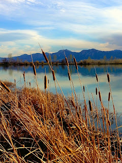
Cattails, photo by J.J.
"Cattails", photo by J.J.
The next two needlework landscapes are the result of a class I taught for adults at a Park and Recreation center some years ago. It was an intermediate class for people who had completed an introductory class in needlepoint, some other tapestry work, and basic crewel embroidery. They had acquired some skills, but were still turning to kits and published patterns for most of their needlework projects. I decided it was time for each of them to do a piece of original work. I challenged them to draw a simple landscape and bring it with them to class the following week. It could be any shape except rectangular. I wanted them to “think outside” that particular box. They could do a real landscape or an imaginary one, but this first class session was to be devoted to making a series of choices that would make up their plan for the project a plan they would then be expected to follow throughout the project. The chart below summarizes the list of choices that were decided upon. It worked somewhat like a Chinese restaurant menu: one from Column A, one from Column B, and so on.

ShapeLocationSeasonTime of Day
square evergreen forestspringdaybreak
circleEastern woodlandsummermorning
ovalprairie grasslandautumnafternoon
hexagonmountainswintersunset
desertnight
seashore

I handed out pre-cut templates and they traced their choices of shapes on plain paper. Those who had chosen ovals (ellipses) decided whether to use them horizontally or vertically. Once they had written their other choices on a planning page, we moved on to locations and what might be seen there. A couple of the students had grown up on prairie farms. They mentioned barns, haystacks, silos and windmills. That got the discussion started. Then we talked about how colors change with the seasons, times of day, and weather, and how light differs in forests, the desert, at ocean-side, etc. They had suggestions which I wrote on a chalkboard. They were still unsure about the assignment, but gaining some enthusiasm. The rest of the class was devoted to preparing canvas and making a list of materials.

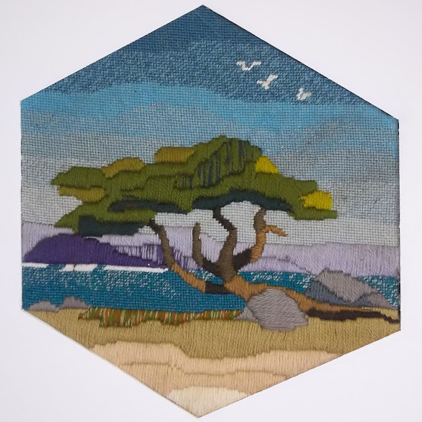
Monterey Cypress needlepoint landscape
"Monterey Cypress",  needlepoint landscape
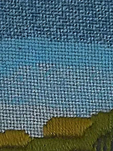
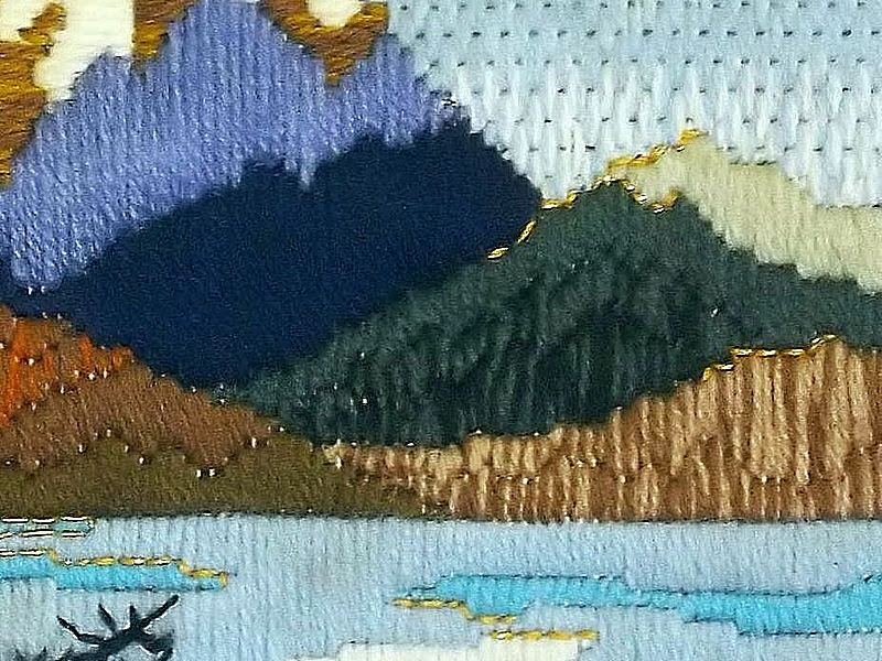
Since I never ask students to do any project that I don’t do along with them, I made my own plan from the “menu” and promised to have my design for the next meeting. I chose hexagon, seashore, summer, afternoon, clear weather. The result was “Monterey Cypress”. This is one of those landscapes mentioned in the previous chapter which try to capture the “essence” of an area without portraying a specific scene. It is a mixture of memory and sensations. There are scenes like this along the Monterey Peninsula, but neither the tree nor the headland in the distance represent a particular one. As I expected my students to do, I used examples of techniques learned in the previous class, as well as new ones. I also wanted the picture to have a 3-dimensional quality. I began at the top of the sky with conventional tent stitch, but used blended yarns to gradually lighten the sky from the zenith to the horizon. Tent stitches are very flat, which made the other elements of the composition stand out from the surface.

Monterey Cypress sky detail
Sky detail showing variegated & blended yarns
At our second meeting, I showed my class my hexagonal outline and the simple shapes that I had included in my design. They had drawn their landscapes inside the shapes made with templates. We discussed the idea that “less is more”. Most of them needed to simplify their pictures by tracing only the broad outlines of the most important features. I didn’t want them concentrating on small details at this stage. They then used the templates to draw their outlines and simplified landscapes on prepared canvases. I had completed a large section of the sky on my picture and gave them a lesson on blending yarns. They liked the effect and used that technique on their own skies.

Detail showing blended yarns
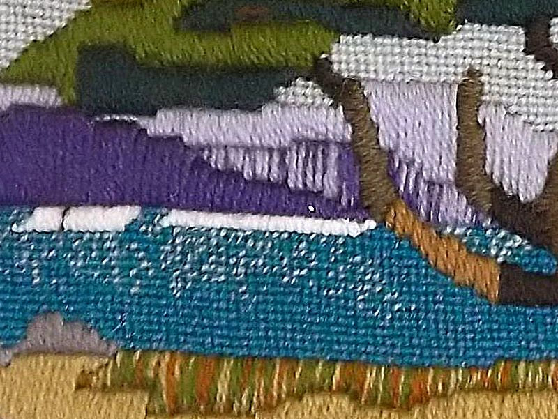
You blend yarn by threading two or more different shades into your needle at the same time. Begin with three shades in the same color range a dark shade (D), a medium shade (M), and a light shade (L). Look at the sampler. Each division contains three strands of yarn used together. From left to right, you have the following color designations: DDD, DDM, DMM, MMM, MML MLL, LLL and DML. As you stitch, the strands of yarn will turn so that the same strand is not always on top. This is what creates the intermediate shades. You can see some of that effect on the cliffs of the headland in the distance. You will probably need to use several such combinations to create a “needle painting”.

blended yarns sampler
Blended yarns sampler

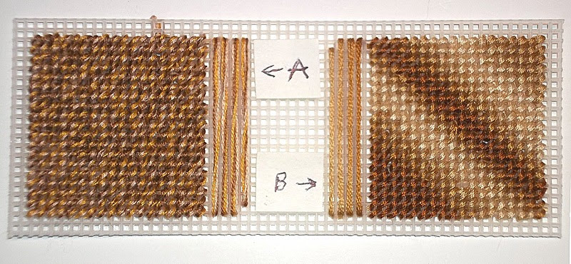
Blending embroidery floss works in a similar manner. With floss, however, you are working with 6 strands, rather than 3. Floss does not separate as easily as yarn does. I usually separate floss into three 2-ply strands, rather than six 1-ply strands. As I did with the yarn, I use a dark, a medium, and a light shade of the same color. You can use more closely related shades of the same color for even more subtle effects if you like. Variegated floss will give you a different effect.

Blended and Variegated Floss Sample
Blended (A) and Variegated (B) Floss Sample


Detail of cypress foliage
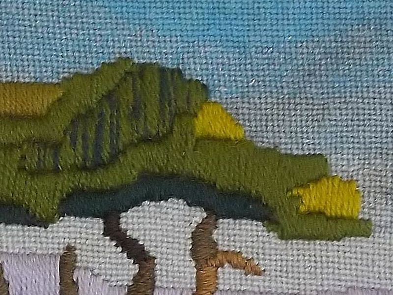
Detail of cypress foliage, showing raised stitching
By the following week the students were eager to start on the middle grounds of their pictures. l I had completed the cypress tree, using a lot of upright Gobelin stitch, a stitch which goes back to the Renaissance, where it was used to produce embroidered goods which looked like woven tapestries, but were far less expensive. These were in great demand from the rising middle class, who wanted goods that were similar to those that had only been available to royalty and the rich up to that time. Gobelin can be used either vertically, as I used it in the sections of the tree’s foliage, or horizontally, as I used it on the narrower limbs and tree trunk. I had used two strands of yarn for the foliage rather than a single strand, which made the foliage stand out from the background.

We had a short practice session with the stitches and they began picking out parts of their pictures where the technique was effective. Class sessions were often interrupted by such questions as “How do I get this wall to look like brick?” or “What stitch will make this tree trunk look and feel rough?” Each time I taught a new stitch, the class stopped what it was doing and learned that stitch. They did samples of each stitch on strips of plastic canvas, labeled them, and stored them in binders, folders. or envelopes, or stapled them to index cards for future reference.

Brick stitch sampler


Brick stitch can be used either vertically or horizontally over 2 or 4 threads of canvas. Despite its name, it is more commonly used vertically than horizontally (upper left). Two colors are used. The stitches of the second color begin and end at the midpoints of the stitches of the first color. I have used stitches over 4 threads throughout. The next stitches (top middle) are done horizontally. To make them more brick-like, you will need to use at least two rows of stitches, if not more (bottom middle). When I did the piece on the right, I did three things: I used three rows of stitches for the bricks; I alternated the colors as well as the rows; and I outlined the brick shapes with a thinner tan yarn to represent mortar. In the top three rows, I used two layers of “mortar” between the rows. This makes the bricks look smaller, more irregular and worn older, in fact. On the bottom three rows, I used a single layer of “mortar” between the rows. They look newer and less worn, but the coverage is not as good. This should not be a problem on needlepoint canvas, where the mesh is finer and the threads are thinner. Think about the age of the wall you are trying to portray. The older it is, the more worn and faded the bricks should look and the darker the mortar should be.

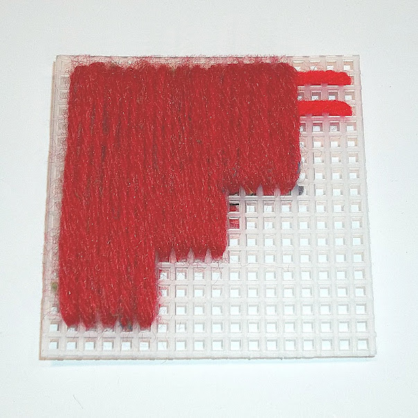
Padded stitch sample
I used Gobelin stitches again in the foreground of my picture, but this time I padded the stitches for objects like the large boulder. Before I put in the double-strand stitches vertically, I laid in long stitches of a heavier yarn horizontally across the area to be stitched. This gave the areas extra dimension. You must be careful, however, to get the vertical stitches even, untwisted, and very close together so that none of the padding shows through. This takes a little practice.


Cascades needlepoint landscape
"Cascades",  needlepoint landscape
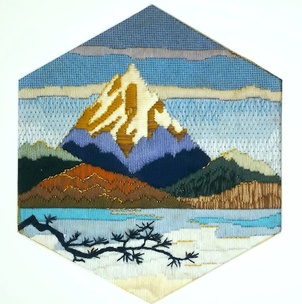
By the middle of the class schedule, I had finished Monterey Cypress”, given it a hexagonal picture mat, and framed it. I then started on a second example, keeping the hexagonal shape, but choosing a mountain scene on an early spring morning while the lake in the foreground still had a lot of ice on it. This is “Cascades. Although it captures the “feel” of the area and shows my fondness for it, the scene is completely imaginary. Despite this, I have heard many viewers of it exclaim, “Oh, I’ve been there!” or “I just love that place!”.

As the students finished the mid-grounds of their landscapes and moved on to the foregrounds, they had to decide what the focal point of their picture would be, so they would know whether to really emphasize the foregrounds or make them simple and understated. One of the lessons I gave at that time concerned the use of back-stitching for three different purposes. These are:

     a) back-stitching around an area with a single strand of the same color to help define it,
      b) back-stitching around an area with a contrasting color to draw attention to it, and
      c) back-stitching with metallic yarn or floss to indicate reflections or add sparkle.

You can see all three uses of back-stitching in this sample.

Detail showing backstitching
"Cascades" detail showing backstitching
I had embroidered three white gulls on the surface of the sky in “Monterey Cypress” without calling any particular attention to them. The gulls had, however, suggested a “finishing touch” to the pictures. At the end of the next-to-last session, I gave the students a final assignment. They were told to think of some small detail that they wanted to do in crewel embroidery on the surface of their finished needlework. It could be in color or a black silhouette. They were to bring a copy of this detail, in the size they planned to use, a crewel needle, and yarn or floss to the final class. Their landscapes were to be finished, except for this detail, and be ready to be shown to the class for critique.

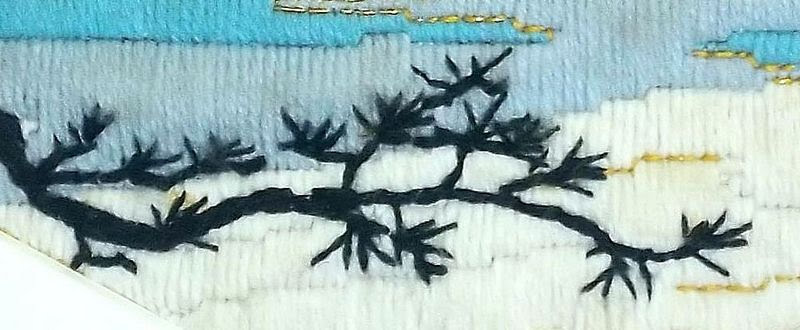
On the last day, I gave each student a piece of tissue salvaged from an old dress pattern and some straight pins. They traced their details on the tissue and pinned it in place. They embroidered the details through both the tissue and the canvas. I brought out the framed “Cascades” to show them how I had done the branches in the foreground. They used familiar crewel stitches like outline, stem, chain and satin to do the embroidery. Then they tore away the tissue and used tweezers to remove any remaining remnants. They removed the pins and brushed the surface of the needlework with a soft brush.

Detail of tree branch from Cascades
Detail of tree branch from "Cascades"
Each student then presented his or her completed landscape, told what had inspired it, and answered questions from other students about decisions they had made. Each of them went home proud of their accomplishments. They each had created an original, hand-crafted, one-of-a-kind work of needle art.

Now it is your turn. Return to the chart at the beginning of this chapter. Make your choice from each category. (Add other choices even more categories if you like.) Prepare your canvas. Make your simple sketch and trace it onto your canvas. You may want to color your sketch and keep it nearby. Choose your yarns and/or flosses with care. Work from background to foreground with your favorite stitches and stitch patterns. When you are sure your composition is complete, add that one detail to the surface of your work.

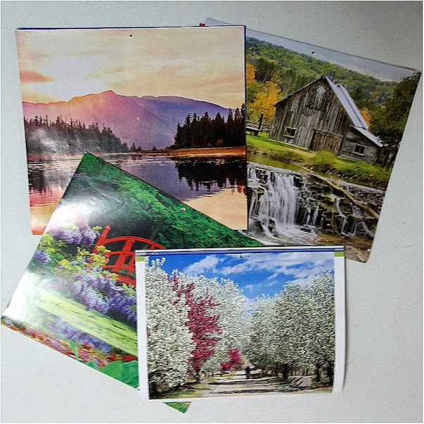
If there are features of your design that you really want to include, but feel you cannot draw, try to trace the outlines from a photograph. I have a caution about that, however. If you are tracing from a photograph, trace only the basic outlines or outstanding features. Don’t put in unnecessary details. J.J., whose photographs you will see often throughout these chapters, says that she finds it useful to half-close her eyes (squint) and mark only the features she sees that way. If you put in too much detail, you may make something that is difficult for other people to identify as strange as that may seem. You can always refer to the photograph and add more detail later if you think it is necessary. A good source of photographs is wall calendars, many of which are on sale now.

Calendars
Calendars are a good source of inspiration for landscapes
I hope you will be as happy with your landscape as my students were with theirs. You may want to frame your work or make it into a wall hanging, pillow top, etc. Display it with pride!


Some material in this post was presented in a different form in a blog post in September, 2013

 Creative Commons LicenseThis post by Annake's Garden is licensed under a Creative Commons Attribution-NonCommercial-ShareAlike 3.0 Unported License.

Monday, February 19, 2018

Still Life in Needlework, Part V: Inspiration Is Everywhere

mining equipment and Japanese dolls
Two photos by J.J.
You have now had enough experience with still life compositions to know whether you want to continue translating them into needlework. Now it is time to broaden your horizons a bit. Beside these first paragraphs, you will see a couple of photographs that you might not have considered as still lifes... but they are. I want you to extend your thinking about what constitutes a still life and where to find them. Still lifes do not have to be table-top compositions or pictures of items confined to the interior of a room. Any collection of items that are not going to get up and move away while you are sketching them (or photographing them for later sketching) will qualify. My grandfather, whose sketchbook I inherited, made some charming compositions of simple items like garden tools leaning against a fence. A collection of modern tools, including motorized ones, would make an even more intricate composition. (And, of course, you can always make a sketch of your drawing or needlework tools.)

Amaryllis
Amaryllis, in the style of a 19th century lithograph
If you will bear with me, I will point out some more history that applies to our subject. By the 1830’s, technology had begun to affect the European art world. Artists had made prints of various kinds for several centuries. The Dutch Masters, for example, and the great German artist Durer had made good use of them. Now lithography made print-making even more attractive. The Romantic painters Delacroix, Corot, and Millet had etchings made of some of their work. The Impressionists, including Manet, Degas, and American-born artists Cassatt and Whistler, popularized prints even more. Art shows began adding entire exhibits of prints. Museums were delighted to sell prints of their treasures to a growing middle class. Newspapers, book publishers, and scientists cataloging plants, animals, and fossils were demanding good illustrators.

And then Louis Daguerre, through an unlikely — but happy — accident, discovered a whole new way to produce images, and what was to become a whole new art form, photography, was born. Some of the art world felt panic. People, they said, would no longer sit long hours to have their portraits painted; they would readily sit for long, uncomfortable minutes for the much cheaper photographs. Portrait painters did, in some cases, suffer from the new trend, but only temporarily. People did sit for those photographs, but people also began to buy more paintings of all kinds. And, as for Daguerre, the first daguerreotype he made to show the world was... a still life. (J.D., of course, considers this only right and proper!)

photo in the style of a daguerreotype
Still life in the style of a daguerreotype - an homage to Louis Daguerre


The Impressionists made significant discoveries about color. Remember when I advised you to put complementary colors into your shadows? That was one of many examples of their discoveries. By revisiting sites and painting them in all seasons, all weather, at different times of day, etc., they learned a great deal about how changing conditions altered colors. The pointillists discovered that putting tiny dots of mixed colors into an area of a painting gave it a more realistic aspect. Those dots are the “ancestors” of the pixels on your screen. (Latch-hook work is pointillism in action!) Although few of these painters concentrated on still lifes, their contributions improved overall understanding of the effects of light and color. In return, these also led to great improvements in the reproduction of both paintings and photographs.

rose photo and pillow-top
J.J.'s photo of a rose, and the latch-hooked pillow-top based on it


We need to honor one more individual painter for his contribution to still lifes, the Post-Impressionist painter Paul Cezanne. He freed artists from the last restrictions on traditional still life compositions. In effect, he “tilted the table” so that everything on it was visible… and nothing fell off! J.D. is going to show you how he does some of this by changing perspectives with his camera.

pottery still life collage
Different views of the same subject; only camera position and lighting was changed


pine cones
Pine cones by J.J.
Sometimes simply changing the scale of what you are observing brings up subjects you might not have thought about otherwise. Try “thinking small”. Look at individual plants, seashells, pine cones, mushrooms, etc., and their immediate surroundings. Often this will give you a new perspective on what constitutes a still life.


Now you have seen examples of 'translations' from observations, sketches, photographs and prints into samples of embroidery, needlepoint, latch-hook and other forms of stitchery. It is time for you to put what you have learned into serious practice. Use what you have learned to make an outline for a simple still life on cloth or canvas (even plastic canvas). Then fill in those outlines with your choice of yarns, flosses, or other materials, in your choice of colors, using your choice of stitches. When it is completed, you will have made something that would not exist in this world if you hadn’t created it. If that doesn’t make you feel good, I don’t know what will!


For more tutorials and suggestions, look for our next series of 'translations', Part I of LANDSCAPES, beginning later this spring.

Wheels
"Wheels" by J.J.


Resilience
"Resilience" by J.D.


 Creative Commons LicenseThis post by Annake's Garden is licensed under a Creative Commons Attribution-NonCommercial-ShareAlike 3.0 Unported License.

Contact Us

Name

Email *

Message *

Blog Archive