Showing posts with label still life in needlework. Show all posts

Monday, February 19, 2018

Still Life in Needlework, Part V: Inspiration Is Everywhere

mining equipment and Japanese dolls
Two photos by J.J.
You have now had enough experience with still life compositions to know whether you want to continue translating them into needlework. Now it is time to broaden your horizons a bit. Beside these first paragraphs, you will see a couple of photographs that you might not have considered as still lifes... but they are. I want you to extend your thinking about what constitutes a still life and where to find them. Still lifes do not have to be table-top compositions or pictures of items confined to the interior of a room. Any collection of items that are not going to get up and move away while you are sketching them (or photographing them for later sketching) will qualify. My grandfather, whose sketchbook I inherited, made some charming compositions of simple items like garden tools leaning against a fence. A collection of modern tools, including motorized ones, would make an even more intricate composition. (And, of course, you can always make a sketch of your drawing or needlework tools.)

Amaryllis
Amaryllis, in the style of a 19th century lithograph
If you will bear with me, I will point out some more history that applies to our subject. By the 1830’s, technology had begun to affect the European art world. Artists had made prints of various kinds for several centuries. The Dutch Masters, for example, and the great German artist Durer had made good use of them. Now lithography made print-making even more attractive. The Romantic painters Delacroix, Corot, and Millet had etchings made of some of their work. The Impressionists, including Manet, Degas, and American-born artists Cassatt and Whistler, popularized prints even more. Art shows began adding entire exhibits of prints. Museums were delighted to sell prints of their treasures to a growing middle class. Newspapers, book publishers, and scientists cataloging plants, animals, and fossils were demanding good illustrators.

And then Louis Daguerre, through an unlikely — but happy — accident, discovered a whole new way to produce images, and what was to become a whole new art form, photography, was born. Some of the art world felt panic. People, they said, would no longer sit long hours to have their portraits painted; they would readily sit for long, uncomfortable minutes for the much cheaper photographs. Portrait painters did, in some cases, suffer from the new trend, but only temporarily. People did sit for those photographs, but people also began to buy more paintings of all kinds. And, as for Daguerre, the first daguerreotype he made to show the world was... a still life. (J.D., of course, considers this only right and proper!)

photo in the style of a daguerreotype
Still life in the style of a daguerreotype - an homage to Louis Daguerre


The Impressionists made significant discoveries about color. Remember when I advised you to put complementary colors into your shadows? That was one of many examples of their discoveries. By revisiting sites and painting them in all seasons, all weather, at different times of day, etc., they learned a great deal about how changing conditions altered colors. The pointillists discovered that putting tiny dots of mixed colors into an area of a painting gave it a more realistic aspect. Those dots are the “ancestors” of the pixels on your screen. (Latch-hook work is pointillism in action!) Although few of these painters concentrated on still lifes, their contributions improved overall understanding of the effects of light and color. In return, these also led to great improvements in the reproduction of both paintings and photographs.

rose photo and pillow-top
J.J.'s photo of a rose, and the latch-hooked pillow-top based on it


We need to honor one more individual painter for his contribution to still lifes, the Post-Impressionist painter Paul Cezanne. He freed artists from the last restrictions on traditional still life compositions. In effect, he “tilted the table” so that everything on it was visible… and nothing fell off! J.D. is going to show you how he does some of this by changing perspectives with his camera.

pottery still life collage
Different views of the same subject; only camera position and lighting was changed


pine cones
Pine cones by J.J.
Sometimes simply changing the scale of what you are observing brings up subjects you might not have thought about otherwise. Try “thinking small”. Look at individual plants, seashells, pine cones, mushrooms, etc., and their immediate surroundings. Often this will give you a new perspective on what constitutes a still life.


Now you have seen examples of 'translations' from observations, sketches, photographs and prints into samples of embroidery, needlepoint, latch-hook and other forms of stitchery. It is time for you to put what you have learned into serious practice. Use what you have learned to make an outline for a simple still life on cloth or canvas (even plastic canvas). Then fill in those outlines with your choice of yarns, flosses, or other materials, in your choice of colors, using your choice of stitches. When it is completed, you will have made something that would not exist in this world if you hadn’t created it. If that doesn’t make you feel good, I don’t know what will!


For more tutorials and suggestions, look for our next series of 'translations', Part I of LANDSCAPES, beginning later this spring.

Wheels
"Wheels" by J.J.


Resilience
"Resilience" by J.D.


 Creative Commons LicenseThis post by Annake's Garden is licensed under a Creative Commons Attribution-NonCommercial-ShareAlike 3.0 Unported License.

Monday, January 1, 2018

Question & Answers, New Year's 2018

Black/white photo of a winter scene
A Winter Scene
When can we expect Part V of the Still Life in Needlework series? And what is next after that?

There will be some delay, I'm afraid. J.D. is busy making prints of some of his work. His sister J.J. has just sent us several folders of her photographs that haven't even been downloaded yet. And I am offering beginning needle arts classes for adults on weekdays and mother/daughter or grandmother/grand-daughter classes for children 10 years old and older on weekends, starting in mid-January. All that is going to take some time to sort out. At this point, it looks like at least mid-February for Still Life V. I apologize for the delay. Next will be the start of a similar series on landscapes, hopefully launched before Earth Day. There will be posts on other subjects in the meantime, including our yearly Anniversary issue. Please keep watching.

Three student designs for Hawaiian quilts


Are you still going to show more of the Hawaiian quilt kinds of designs that you started showing last spring?

Yes, indeed. I have shown some of mine in various contexts throughout the years, but you may have missed them if you were searching the posts for Hawaiian quilt designs. You may remember that this was a project I once was doing with 5th grade students who were studying about the state of Hawaii. I included three student designs (see above) that showed a real grasp of the Hawaiian quilt design style. Here is one more good student design that took a different approach.

Four-way design with strawberries


Four-way design with sea turtles
At the same time, I was teaching about different ecosystems in science, so I combined the two ideas and made several 4-way designs, each featuring something about a different environment. Some of these started at the center and worked toward the four corners of the square, while others featured corner designs with simple centers. Here is a central-focus design of sea turtles swimming outward through seaweed. I used a background that suggested ocean waters.


Four-way design with penguins

The second design shows pairs of penguins close together for both communication and warmth. The background suggests a pale sun and air filled with ice crystals. This one was a favorite with the students.


Four-way design using a desert motif

A third pattern features a desert habitat. This time the main emphasis is at the corners where large lizards surround cactus plants. The background suggests sand, while a hot sun fills the center spot.


There is quite a bit of detail in the corner designs, so we will show you a close-up of one of the corners.

Close-up detail of the desert motif

There are other patterns in my files … somewhere. I'll show them at a later date. I hope you have enjoyed all of these and that they have given you ideas for either paper or fabric projects. I apologize for making you wait for them.

Did you ever finish the Siamese fighting fish you were doing in reverse applique?

Finished reverse applique of Siamese fighting fish
Yes, it was finished as a small wall hanging. Here is a picture of it. I am currently working on a companion piece of a fantail goldfish, intended to face this one. In fact, you will see a post very soon with the pattern and directions for the goldfish. If you like, you can then make one of your own. So look around for those pretty scarves, silk handkerchiefs and men's ties that are never worn. Reverse applique can give them a whole new life!

Hey, Annake, those “roses” at the top of Part IV of the Still Life series sure look like tulips to me!?!

Good catch! We share the blame. J.D. wrote the caption and I didn't catch it in proof-reading. We both know better, since we grow both tulips and roses in Annake's Garden. Blame it on late hours and hurrying to get the post online. Sorry!

When are you going to show the real basket of flowers from Part IV?

Here it is now. How does it compare with your design?

Original flower basket photo

Thank you for your patience,


A Note from the Gnome:
We recently changed our ISP, and the email address on our contact page no longer works. Until we can get a new contact page built, please address any correspondence to:  annakes_garden@yahoo.com


 Creative Commons LicenseThis post by Annake's Garden is licensed under a Creative Commons Attribution-NonCommercial-ShareAlike 3.0 Unported License.

Sunday, December 17, 2017

Still Life in Needlepoint, Part IV

vase of roses needlepoint
Needlepoint  of a vase of roses
After the Reformation, artists in Northern Europe and the British Isles turned primarily to secular subjects. Paintings of everyday life, sunny interior settings, and still life paintings were prominent in their work. The Dutch and Flemish masters of this period did much to popularize still lifes. In fact, the term “still life” is derived from the Dutch word “stilleven”, coined around the year 1650. At this time, still life paintings of vases of flowers became quite popular. Even today, this is probably the most popular still life subject.

map of Netherlands & Flanders around 1650
Map of the Netherlands & Flanders around 1650
It was a time of exploration and discovery. Voyages to far-flung parts of the world were organized to study and collect plants, animals, and artifacts. Many of these expeditions employed artists to paint pictures of the discoveries. A little-known fact (certainly not taught to me in my art history classes!) was that it was not unusual for the artists to be young women. A number of them became well-known, their work sought-after and published in books. Two women of note were Anna Maria Sybilla Merian of Germany and Rachel Ruach of the Netherlands.

After returning home, Ruach turned to a style of still life painting that was to see her become one of the best-known and highest-paid artists of her time, in a career that spanned seventy years! She painted vases of flowers. She used her notes and sketchbooks for reference, so that many of her compositions featured flowers that would never have been blooming in any one place at the same time. These were customarily painted against a very dark background, so that the flowers seem to glow with an inner light. This is an effect that is relatively easy to create in needlepoint because you complete the colored design first in whatever canvas stitches you choose and then fill in the background with black tent stitches. You can see this effect in this “needle painting”.

Needlepoint, "Love is Like a Red,Red Rose"
Doing embroidery of other kinds on on black or very dark backgrounds., however, creates some additional problems. Embroidering on a very dark background can be a challenge. The first problem is to transfer your sketch or pattern to the fabric in such a way that it is plain enough for you to follow. I was taught to do this by placing dress-maker's carbon in white or yellow face down on the fabric and going over the lines from the back with a tracing wheel a device that looked somewhat like a cowboy's spur on a handle. There are two problems with that. First, both the carbon and the wheel are hard to find today. Second, the little dots made by the points of the wheel tend to smear or disappear from use before you finish the project. I recommend securing the fabric to a hard surface and tracing solid lines and shapes with a ball-point pen that has used all its ink. Substitutes for the carbon (although inferior to it) can be made by applying a heavy layer of chalk, white crayon, or white grease pencil to tracing paper after you have drawn the design on the other side of the paper.

Dressmaker's carbon, wheel, & ballpoint pen
If you are working on a light-colored fabric, you can use a commercial iron-on transfer (following the directions on the envelope) or make your own hot-iron transfer (see the post for May 12, 2016). For dark-colored fabrics, I usually draw my design on thin tissue paper and pin it to the back of the dark-colored fabric I plan to embroider. Then I back-stitch along the pattern lines with white thread, floss, or yarn, depending on which one I plan to use in the embroidery itself. This gives me an easy-to-follow outline on the right side of the fabric. I remove the tissue paper by pulling the tissue pieces away gently with tweezers and then discard the pieces. The white stitches can be removed from the finished embroidery later if you like; but I usually just work over them to hide them. These next photographs show steps in the process.

Steps in stitching outlines on dark fabric
When I begin thinking about a design, I make several simple sketches to help me work out my ideas. This one was for a flowering plant in a terra cotta pot. (There are many plants some of them flowering in terra cotta pots in our greenhouse, but this one is purely imaginary.) I had decided that the light would be coming from slightly above and to the side of the arrangement, but I had not decided which side, so I left highlights on both sides of the pot and left the shadows cast by pot and flowers very vague. The shapes of flowers and leaves are very general; however, I have indicated interior shadows where leaves and flowers overlap. This particular project has never been made, but I kept the sketches in case they might be useful some day. Today is that day.

Annake's sketch of a pot of flowers
Annake's sketch of  flowers in a terra cotta pot
There will be interior and exterior shadows in your composition, too. Those shadows, while darker than the blossoms, will be lighter than the background. Nor will they be a colorless gray. Shadows have some color in them and that color is the complement of the color of the object that cast the shadow. For example, a blue vase will cast a shadow which contains a tinge of orange. (And a terra cotta pot is is a red-orange, so it will cast blue-green shadows, even on a blue tablecloth.) Using this fact will make your compositions livelier and more realistic. Common pairs of complementary colors are: red/green, red-orange/blue green, orange/blue, yellow-orange/ blue-violet, yellow/violet, and yellow-green/red-violet.

Now I'm going to give you an outline of a bouquet of flowers that you can download. You can experiment with it. The flower shapes and interior shadows are merely suggestions; you make your own choices. The flowers are simple enough that you can treat them all as the same kind of flower or as a mixed bouquet. They could all be done as shades of the same color or as many different colors. Remember that your background will be black or a very dark color, so that light or bright colors will show up best against it. Highlights are a little more subtle than shadows. They are easiest to show as light even white reflections on a shiny surface like a ceramic vase or highly polished wood. One on a small cluster of flowers in a group indicates where light strikes most directly.
This outline is based on an actual basket of silk flowers that J.D. picked up around the house. We are not going to show the “model” at this time, because we don't want it to influence your decisions or choices. We will show it at some future date, so you can compare it with your composition.

Play with your composition. What kind of texture does the basket have? Remember the texture that the basket of strawberries had in the post for August 31, 2017? Where on the basket will shadows appear? What kind of shadow will the basket itself cast on the table top or tablecloth? Would you prefer to have the flowers in a terra cotta pot instead of a basket? (Refer to the sketch above.) Would you prefer to change the basket to a vase? If so, what kind of shape and texture or pattern would it have? Do you want to add another object to the table (perhaps one of the kinds of fruit you experimented with in Part II)? Once you are happy with your composition, how will you construct it? Will you use counted cross-stitch or tapestry stitches? Will you use crewel embroidery? Will you cut the pieces from fabric and sew them or glue them to the background? Will you use a combination of these techniques? Will your picture be realistic, impressionistic, or abstract?

At one time, not too long ago, there were generally accepted rules for painting still life pictures. There were to be several objects on a table in front of a fairly dark background that wasn't very important to the picture. There was a very shallow depth of field. Textures were often more important than colors. The viewers eyes were supposed to be drawn upward and diagonally across the picture, usually to the right-hand side. It is easy to imagine just how dull and uninteresting many of the compositions painted according to the rules must have been. Aren't we lucky that artists and crafts-people today are not expected to follow those rules?

Learn from your experiments and produce a composition that makes you proud.



 Creative Commons LicenseThis post by Annake's Garden is licensed under a Creative Commons Attribution-NonCommercial-ShareAlike 3.0 Unported License.

Monday, October 2, 2017

Still Life in Needlework, Part III

Still life shapes
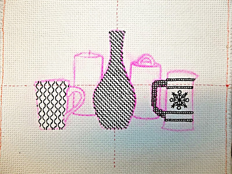
In Part II, I promised to show you a technique in which you could do a still life in black and white only. This is one of several related embroidery techniques which spread across parts of Europe after the Renaissance and eventually found their way to the Americas. It is called Spanish blackwork. Its patterns can be used in other styles of single-color embroidery, such as Russian redwork and Scandinavian whitework, as well as a multicolor style like Holbein embroidery. My choice of objects to portray is shown above in a photo that J.D. took at the beginning of the project.

I'm going to take you step-by-step through a still life picture in blackwork. The original 16th century blackwork was done in black silk and gold thread on white linen. I urge beginners in any of these monochromatic stitch techniques to begin with black floss on quarter-inch checked gingham because it is so much like graph paper. It is easy to work out the individual patterns (called diaper patterns) on graph paper and then repeat each individual line with a single stitch.

"Cat Nap," blackwork embroidery on 1/4" checked gingham

If you have done counted cross-stitch, you may want to work on the smaller “baby check” gingham to get more complex-looking patterns. I prefer pastel checks so the blackwork design stands out dramatically. If you are working on “baby check”, you may want to divide your floss and use only three strands instead of six. The stitch used for the patterns is a simple back-stitch.

Hot iron transfer for still life
In order to have a truly black and white (and gray) design, I'm going to work on white monks' cloth, where the squares are indicated by tiny spaces in the weave at each square's corners. I begin with a piece of monks' cloth that I have backed with interfacing and basted around the edges. I find the vertical and horizontal center lines of the fabric and mark them with a running stitch in a color other than black. This is to center my design; the colored stitches are pulled out after the design is worked. I made a hot-iron transfer of my design outline and transferred it to the fabric. (The transfer will reverse the design, so I studied mine carefully from the back against a bright light to make sure it worked well in reverse.) I chose the area to begin and used an embroidery hoop.

You will need a sharp-pointed crewel needle with an eye large enough to accommodate the floss and several skeins of black six-strand embroidery floss. I like to have several needles so I don't have to stop as often to thread my needle. I was working on monks' cloth, which is comparable to “baby check” gingham, I divided the floss to use three strands. Here is a picture of the first completed section, and close-up of the pattern used for it. Each line on the pattern is a single stitch. Stitches begin and end in the same spaces at the corners of squares.

Blackwork embroidery, Step 1: the Vase

Stitch pattern for the Vase
Tip #1: The Vase. When you are stitching a pattern over an object with a complicated shape, begin at the widest part of the object. Start at one side and work the pattern line to the other side. Then stitch the pattern lines in order both to the top and the bottom of the object.

The next series of pictures show each of the other sections as they were completed, accompanied by a close-up of the graph-paper pattern for each. The lighter I wanted the section to be, the simpler the pattern I used; the darker I wanted it to be, the more complex the pattern.

Blackwork embroidery, Step 2: the Pitcher

Stitches for the pitcher


TIP #2: The Pitcher. When you are stitching a radiating pattern like this one, find the exact center of the place you want it to be and mark it lightly with a pencil. Begin there at the center of the design; work outward, one step at a time.


Blackwork embroidery, Step 3: the Cup

Stitch for the Cup
Stitch for the Cup
Tip #3: The Cup. As you reach the border lines of the section, make as much of the pattern stitches in each square as you can without crossing the border-line. When your outline of the shape is completed, there may be small gaps where the pattern doesn't quite reach the outline. Fill these in with tiny stitches.


In this project, I concentrated on shape, pattern, and perspective only. If objects of the same size are placed side by side, the one with the faintest outline will seem the furthest away. If you make the objects overlap, so that the more faintly drawn objects are partly covered, you have started the illusion that they are behind the darker figures and are farther away from the viewer. This is called “recession in space”. This illusion can be considerably increased by combining it with lighter outlines. Because I wanted to draw your attention to this visual device, I used gray floss for the two objects “behind” the front three. You will also notice that their bases appear to be on a higher plane. You can use all these devices in your own still life projects.

Blackwork embroidery, Step 4: the Birch Bark Box

Stitch for the Birch Bark Box
Tip #4: The Birch Bark Box. Instead of back-stitch for this pattern, I used a simple running stitch. The marks on the birch bark appear in clusters on the box, but I didn't think that would show up sufficiently so I used the stitches for the entire pattern. I left an empty space for the line indicating the bottom of the box lid.


Blackwork embroidery, Step 5: the Candle
Stitch for the Candle


Tip #5: The Candle. Here the back-stitch is used vertically. Be sure that your stitches are as straight as possible. To make the wick more visible, I stitched it in black instead of gray.


Finally, I covered the outlines with solid lines of stitching. I wanted a bold, modern feeling to the picture, along with many contrasts, so I used the full six strands of floss for the outlines. I chose chain stitch, but I could have used back-stitch, outline stitch, stem stitch or any of several other stitches. I outlined the gray objects with the same number of strands of floss that I had used for the black ones. You might prefer a more delicate treatment. J. D. has shown here how it would look outlined in three strands of floss in a back-stitch or outline stitch. I then removed the colored centering stitches. A quick hand-washing in the sink with dish-washing liquid removes the remnants of the iron-on pattern. Follow this by a rinse and pressing with an iron set on 'cotton', and it's done.

How the still life might look with narrow outline stitching

To make your own blackwork still life, start with a simple outline pattern. Follow the directions for preparing the material. Use the patterns I used, see additional patterns on the posts for October 6, 2013, October 18, 2013, February 21, 2014, and January 15, 2017 or make up your own.

Now, you are ready to transfer those outlined areas of your design to your fabric. You can place your outline on a light-box or tape it to a sunny window-pane and trace it directly on your fabric., or you may want to use a hot-iron transfer. For directions to make one, go to the post for October 6, 2013. For more on monks' cloth, see see the post for April 30, 2014.

Go make something black, white, and beautiful!


Finished Blackwork Embroidery Still Life

Updated October 10, 2017, to replace all the illustrations Google Photo somehow lost :-p


 Creative Commons LicenseThis post by Annake's Garden is licensed under a Creative Commons Attribution-NonCommercial-ShareAlike 3.0 Unported License.

Sunday, September 17, 2017

Going a Step Farther with Still Life

A Simple Still Life Composition
I'm happy to see that there is so much interest in translating still life from painting into needlework. It is evident that some of you are eager to learn how to set up your own still lifes and work from them. To help you with that, I'm going to turn the instruction over to our editor/photographer, J.D., to help you make and choose a pleasing still life arrangement.

 
[Gnome, grumbling] Okay, so here’s the story: Annake tells me, “I need you to take a series of shots for some points I’m trying to make on the next blog post about still life in needlework. Just find some interesting objects, make an attractive arrangement, and then shoot it from several angles. Here’s what I’ve written for the blog. Oh, and J.D. – keep it simple, please.”

Make an arrangement of 4 or 5 objects on a table or other flat surface. Move the objects into a grouping that pleases you. Try to use a variety of shapes –- some linear, some angular, some curved. Look at it from different angles: above, different sides, eye level, etc. If possible, take a few photographs from these angles with a camera or your cell phone. Here is a montage of photos J.D. took before choosing the one above. Notice how he has used light to emphasize reflections and shadows.

Montage of still life photos
Montage of still life photos, taken from different viewpoints
[Gnome] First part of the assignment completed: I shot these four pieces of pottery of different sizes and shapes, all with matte finishes in a limited range of colors against a plain off-white background so that you can concentrate on the shapes, placement, and point of view without any extra distraction. However, since I was not sure what Annake had in mind for the final product here, I was a concerned about the distortion of the colors under the artificial lights. (Those of you who seldom photograph under artificial lights may be unaware of how much different light sources can affect the color of your photos, but when you live in a hole in the ground you get used to compensating.) So, I used a variety of portable lighting to try to true up the colors. The photo on the right below, taken under a fluorescent grow light plus flash is the most accurate color representation.

original composition next to corrected colors
Still life composition (left), with adjusted lighting (right)
[Gnome] And, while I had all my portable lighting out, I decided to take some shots with unusual light directions, just in case Annake wanted to do something different with the composition before I cleared it away. Not exactly in keeping with Annake’s dictum to keep things simple, but I already had everything in place...

Montage of special lighting effects
Composition photographed with various light placements
Then I trekked up to Annake to show her the results, and find out what the next step was. She said, “Turn it into something that can be put on canvas or fabric for a needlework project. Here’s what I’ve written for our readers: ”

Make a sketch of your favorite view. If drawing is difficult for you, have a print made, enlarged if necessary, of your favorite photograph. Outline the most important features in a dark, bold marker.

TIP: Take this opportunity to simplify your design. Don't try to include every detail. Remember you are going to have to “translate” these lines and shapes into some kind of needlework. What you leave out is just as important to your final picture as what you leave in.

[Gnome] I do a lot of different things here in the Garden, which call for a lot of different skills; however, drawing isn’t one of those – that I leave to the boss lady. Tracing – now, that I can handle. Here’s a trace of the photo at the top of this post, ready to be transferred to whatever sort of material you want by one of the methods Annake has shown over the course of this blog.
Tracing of still life composition photo
Need anything else, boss?

At this point, I like to look at my design through frames or mats of different shapes: horizontal rectangle, vertical rectangle, square, oval and round. (Embroidery hoops are helpful for the ovals and circular views.) This helps me to decide whether to crop the background, how much to crop it, and what shape I want the final picture to be.

Still life tracing under a frame
[Gnome] No sooner said than done...now I’m going to go play with some of these shots I’ve taken (not all of which have been shown in this post!) to see what I come up with. This still life stuff is kind of fun!

You ought to try it.

J.D., Annake’s Garden Gnome (filling in for)


Updated October 10, 2017 to replace the mysteriously disappearing photos.

 Creative Commons LicenseThis post by Annake's Garden is licensed under a Creative Commons Attribution-NonCommercial-ShareAlike 3.0 Unported License.

Contact Us

Name

Email *

Message *

Blog Archive