Showing posts with label downloads. Show all posts

Thursday, May 14, 2020

Trees in Art and Design

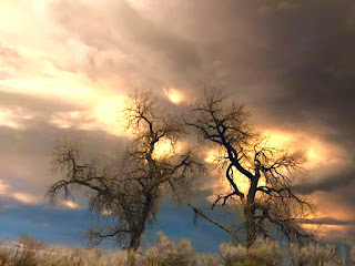
Bare trees against stormy sky
"Incoming Storm," photo by J.J.
Many trees change form drastically as they mature and age, sculpted by wind and weather.  A dwarfed, twisted tree at timberline can give real drama to a mountain scene. Some trees define the seasons. Last autumn we were in the high country, photographing the glorious colors of aspens and scrub oaks against the darker evergreens.

I like to study deciduous trees in the winter when their basic skeletal structure is most evident. Then I revisit the trees in the other seasons, sketching or photographing them to understand how that skeleton supports the masses of their leaves. Fruit trees are especially interesting because they have a flowering stage — often before any leaves have formed — and provide attractive backgrounds when the fruit is ripe. If I understand the way a tree is growing, I can anticipate where the masses of foliage are going to be once they develop.
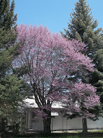
Fruit tree in bloom
Ornamental fruit tree in bloom
Trees are, of course, vital to many landscape compositions in graphic arts and needle arts, but they can compliment many other types of composition. For example, they can contribute in many ways to photography: to enhance an outdoor wedding or family picnic, as backgrounds for pictures of animals that use them for food and shelter, to soften the lines of street scenes or individual buildings, etc. One way to change a potential landscape or a picture with houses, for example, is to move the surrounding trees into different positions.


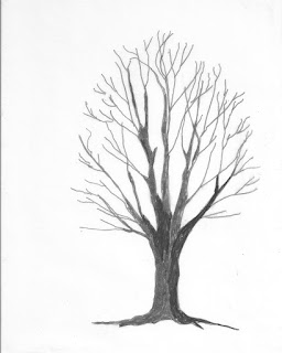
Click here to Download
Here is a quick watercolor study of a palm tree that I made many years ago in Panama. Imagine that you can "borrow" my palm tree. What do you see beneath it? An abandoned beach ball? A picnic lunch? A sunbather stretched out on a blanket? An animal digging in the sand for turtle eggs? See how a single tree can stimulate your imagination? Download the tree. Make a sketch of what you would include or look for a photograph that you could adapt.

Here are some things to consider when looking at trees. Study the patterns created by the direction of the light. If the sun shines directly on the tree from the front, which parts of the tree are darkest and lightest? What sorts of patterns are created around the tree? Where do the shadows fall? How do these things change when the trees are lit by light coming from behind them? (Sometimes it helps to half-close your eyes to really distinguish the masses of dark and light.)  If you are sketching the tree, put in the masses of middle value first. Then concentrate on the lighter and darker masses. Trees do not grow out of the ground like fence posts. Include the roots and the spread of the tree toward the roots in your study (sketch) of the tree. If you are doing a picture that includes a group of trees, remember that distance tends to add gray to more distant objects and try to make the farthest trees less distinct than those in the foreground.
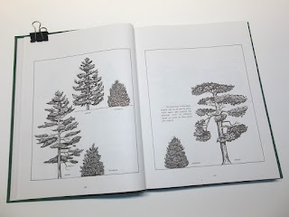
Landscaping tree book
I have, as a prized possession, a book written in 1983 specifically for landscape architects and nurserymen. It shows detailed drawings of trees and shrubs commonly used for those purposes. The pictures are all drawn to the same scale, so that you can make combined groupings and be sure that they would look natural together (in a park or garden, for example). It is also possible to enlarge a tree — or even part of a tree — to show how it would look beside or behind a building. You can also enlarge foreground trees and reduce background ones to show realistic perspective. Remember that distance not only makes trees look smaller. It also makes them look paler.

Transparency of an  evergreen
One of Annake's transparencies
Finally, the trees can be copied on clear overlays,  and be superimposed one on another. Although my book is probably long out of print, comparable photographs or drawings can be found in library books or online. Look for such topics as Forestry, Trees of <insert your country, region, continent, or the World>, Landscaping, or Ornamental Trees.

Here is a simple way to determine whether a tree might enhance your picture. When you have your photograph or sketch well organized, place a clear plastic overlay of the tree shape you are considering on top of it. This doesn’t have to be a detailed picture of the tree, just its general shape and growth pattern. You would be surprised, for example, how many shapes different kinds of evergreens can take. I have built up a collection of such overlays that I keep in a file folder. Because they are transparent, I can move them into any position I want on top of my sketch, reverse them, show only a portion of the tree, etc. Move a tree that blocks the view of a building to behind the building. You will still have its shape as a point of interest in the composition, but it will no longer overshadow the building or hide interesting architectural features. Even a single branch can have a big impact as you can see in this  needlepoint picture.
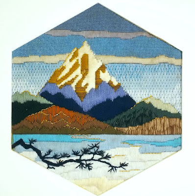
Cascades needlepoint by Annake
"Cascades," needlepoint by Annake

sketch of bare trunk and llmbs
Trunk and limbs
Let's go step-by-step through a tree sketch. I am going to use a simple #2 pencil because it is the one you are most likely to have available. I recommend you do this exercise in late spring or summer, when trees are usually in their best condition. It is neither necessary nor desirable to draw, paint, or embroider the majority of tree branches.  Get the larger ones and enough of smaller ones to show the directions in which the tree is growing. I like to think of the limbs as gesturing in these directions.  After all, when you portray a tree you are making an image of a living, growing creature, constantly adapting to its environment. Its growth is dictated by the amount of sunlight it gets and the directions and angles of that light. It responds to the winds and the amount and kind of moisture it gets — rain, fog, snow, etc.  Its form may be changed at various stages of its life by the presence of obstacles like large rocks, fences, buildings and other trees.  Try to see these influences in the living tree and indicate them in your sketch. And don't forget to show some roots in your sketch to connect the tree with the ground. When I am satisfied with my sketch, I move on to the next step.
sketch of trunk and llmbs with foliage blocked in
Foliage blocked in
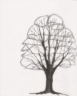
Just as it is not necessary to show all the tree limbs, it is not necessary to show all the foliage. If you look at a single tree, you will see the foliage is arranged in large clusters with parts of the trunk and limbs showing through between them. Look at the clusters. Which ones seem to be pointing — or gesturing — toward you? Which ones are pointing away from you, out to the sides, or up at the sky?  Treat them like separate pieces in a jig-saw puzzle. Sketch the general shapes of the most important ones. You don't need all of the clusters to make the tree look real. Make some little irregularities in the outlines of the shapes for realism. Indicate the larger limbs and parts of the trunk that show between the masses of leaves and where they may be seen in "holes" in the foliage. Carefully erase any of the trunk or limbs that you don't want to have showing in the finished design. (Pencil erasers tend to smudge, so it is a good idea to have a piece of sandpaper to remove the surface of the eraser as it starts to darken. A kneadable eraser is a good thing to have.)
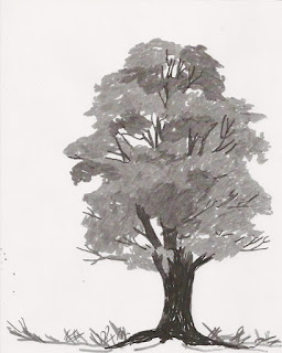
tree sketch in greyscale
Values
Now it is time to consider the values of the masses of foliage. Value refers to the relative lightness or darkness of objects or areas. (We are not going to consider color at this stage.)  Which cluster is the lightest and brightest in the tree? Leave it nearly as white as your drawing paper. Check to see if there are any areas that are almost as bright.  Fill them in as lightly as possible with your pencil. Now find the darkest cluster. Consider it carefully. Is it darker than the tree trunk and limbs? About the same? Lighter? Fill it in very solidly, pressing hard with the tip and side of your pencil point. Go over it as many times as you need to give it the value you want.  Continue working alternately with the next lightest and next darkest clusters until all of them have a value. Check the whole composition against the real tree for accuracy. Do you need to further darken any limbs or parts of the tree's trunk?

If you have easy access to the tree, this may be a good place to stop sketching and leave color decisions to another day. Put your sketch away and don't overwork it. If you can get a couple of photographs of the tree, that is an excellent idea. It might rain tomorrow.

Summer colors or autumn?


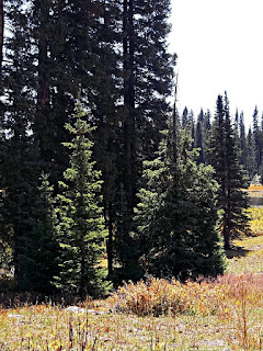
Evergreens photo by J.D.
Evergreens
So far we have only discussed broad-leaved trees. Evergreens present different problems and possibilities.  Because so many conifers have a generalized triangular shape, many people never try to learn the differences between the species and assign them cookie-cutter appearances. We have a number of different species close by. I love to look at them just before sunrise.  They do start out as very simple silhouettes, but, as the light begins to filter through them, you see that they grow in very different ways. Some of them reach for the sky with tiers of V-shaped branches. Others are less dense and produce their branches at much wider angles with their trunks. Still others have branches that curve or angle downward, sometimes touching the ground.  And there are ground-hugging evergreens which don't take a tree form at all.  They are all worth study and are particularly beautiful in winter.
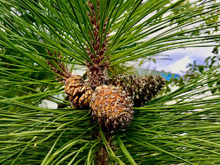
Pine cones, photo by J.J.
Trees that lose their leaves in autumn are known as broad-leafed trees. Evergreens have needles or scales instead of leaves. They lose these gradually all year long. You can usually find a pile of them underneath the tree.  A number of evergreen trees bear cones and are classified as conifers. A photograph or sketch simply featuring cones and needles can be very decorative.  If you are not familiar with the evergreen trees in your locality,  consult a tree guide book or have a talk with someone from a local nursery.

I often use trees to design needlework projects. Some of them are highly stylized like the evergreens and aspens in the two end photos, while others are more naturalistic like the design in the center.

Needleworks with trees

Simple tree silhouettes, particularly of evergreens, make nice border designs for illustrations, needlework borders or all-over patterns, photo mats, etc.
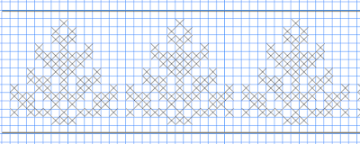
Chart for cross-stitched border
Chart for cross-stitched border of evergreen silhouettes

It is often useful to study how artists have represented trees in their works. For a long time trees were simply backdrops and not done with particular attention to detail. It wasn't until about the middle of the 19th Century that, particularly in France, they became viewed as subjects worthy of painting for their own sake. Jean Baptiste Camille Corot led the field in this respect. He strongly influenced the Impressionist painters. They, in turn, influenced whole schools of contemporary and Post-Impressionist artists. Pointillist painter Paul Signac also did beautiful trees. Look at paintings by your favorite painters to see how they handled the subject of trees.

If you missed our recent Arbor Day post, follow this link. For more information about trees, check our Extras section for "Teachable Moments" activities and a Self-Teaching Unit for teens.  And, if you can, plant a tree!

Now, as our favorite tree-house builder loves to say: "To the trees!"


 Creative Commons LicenseThis post by Annake's Garden is licensed under a Creative Commons Attribution-NonCommercial-ShareAlike 3.0 Unported License.

Friday, January 31, 2020

Adventures In Assisi Work

assisi hearts


assisi snowflake chart
Assisi snowflake chart
Assisi work is a very old form of counted-thread embroidery. Its first known use was in the late 13th or early 14th Century in Italy. The name comes from Assisi,  the little town in Umbria made famous for its association with St. Francis of Assisi.  Many of the best examples, made by nuns in the convent there for use as altar cloths in the cathedral, have managed to survive in museums. They were worked on white linen with single colors of silk thread, limited to red, blue, yellow, green and brown.  Only a few lines of stitches outlined features on the subjects of the design and those were sometimes omitted.  But the backgrounds were worked solidly in closely placed stitches.  As you might imagine, many of the subjects were Biblical scenes and depictions of familiar plants and animals. But a surprising number were of mythical creatures portrayed as monsters! There were also geometric designs following the Arabic motifs brought to Spain by the Moors and responsible also for the use and popularity of blackwork.

Lithuanian embroidery
Heirloom Lithuanian embroidery (Annake's private collection)
The technique spread to other cloisters.  Nuns controlled the making of Assisi work until the beginning of the 16th Century, when it was largely taken over by the women of the town as a kind of cottage industry. The designs became more secular.  (Nonetheless, this embroidery remained popular in churches until the end of the 17th century.)  Because the outlines were frequently drawn on the fabric with ink, black stitches were often used to cover the outlines.  Red and green remained popular for backgrounds. However, some women began to use colors which were not the traditional ones.  Rose and blue were popular combinations, as were a slate blue combined with gold.  Gradually the technique began to influence the folk embroidery of Northern and Eastern Europe and Scandinavia and became integrated with their favorite stitch techniques. Look carefully at the enlargement of this 20th Century Lithuanian embroidery, You will see tiny flowers that are not embroidered, but simply suggested by stitches around them.

Assisi butterfly
Assisi butterfly, by Annake
Today you need not be limited by any of the traditional restrictions. Simple subjects don't even have to be outlined; you can indicate their inner structure by extended the background stitches into the silhouettes to show important features. Take this butterfly for example. The traditional red is used here on white evenweave fabric, but you could use any color you like — including black — or even more than one color.  Try interesting color combinations like turquoise and lavender.  Use a metallic thread instead of floss or yarn for outlining, as I have done on this rose. Use stripes or blocks of several colors to emphasize a word or a person's name. Express your own style and personality.

Framed Assisi rose
Framed Assisi rose by Annake

Because of our modern penchant for words, logos, and slogans, Assisi work seems to me to be an ideal type of embroidery.  If you have children in pre-school or elementary school, you might ask their teacher if they would like some colorful reminders like "Indoor Voices" or "Reading Corner" for their classrooms. These are easy to make on plastic canvas, easy to handle and hang, won't cause injuries and can even be laundered in a sink if needed. I imagine your children might like signs on their doors at home that say something like "Joey's Room".  Waiting rooms, clubhouses, shelters, etc., may possibly be grateful for signage. Just ask.

sample sign

Another place that I foresee for this type of embroidery is tote bags.  As we sharply reduce our dependence on plastic and paper bags, tote bags will become ever more popular. You can embroider your design directly on the side of the bag or make it separately and stitch it on the bag later.  The bag you take to the library or to book club might simply say "READ";  grocery store bags might say "RECYCLE".   Or you might feature a cause that is important to you, like "VOTE" or "VOLUNTEER". You get the idea.

Assisi "JOY" layout
Assisi "JOY" layout
I like single words displayed in ways that make me stop and think about the meaning of the word. I decided to do an Assisi embroidery featuring the word JOY against a background of “joyous” rainbow colors. I had a frame I wanted to use for it, so that dictated the size of the project. After working out my design on graph paper, I prepared my fabric and backing with easy-to-remove basting and centering stitches.  I decided to use the conventional black outline. I back-stitched around the three letters. Here is a picture of the project at that stage.

Framed Assisi "JOY"
Completed projecct
The yellow and green center stripes were measured so that each would fill exactly half of the space allotted for the letter “O”. The other stripes are slightly wider. I wanted the blue and orange stripes to encompass the majority of their letter spaces and the red and purple ones to cover the small parts left over. I decided to leave a margin of unstitched background fabric at either end of the embroidery to set it off. This picture shows the project completed and framed.

Two styles of cross-stitch
By the 20th Century, Holbein embroidery had become popular for items that may be viewed from both sides.  Here is a link to our recent post on Holbein embroidery. The most common background stitches are conventional cross-stitches.  The British way to do cross-stitches is to make the bottom half of the stitch from lower left to top right and the top half from lower right to top left.  Connected, all the stitches seem to lean to the left. The American and European way to make them is to make the bottom half of the stitch from lower right to top left and the bottom half from lower left to top right.  Connected, the stitches appear to lean to the right.  I work in both styles, depending on where I start in the design. Left-handed stitchers may have a stronger preference for one way than right-handed stitchers do. Try both ways and use the one which is more comfortable for you. I don't think it makes any difference  —  as long as you do the same thing consistently throughout the whole piece.

Assisi stitch sampler
This stitch chart shows popular background stitches for Assisi embroidery.  The first two rows are of long-armed cross-stitch (all stitches shown first in a single color and again in two colors to make the structure of the stitch clearer).  There are several versions of long-armed cross-stitch. I have chosen a simple one.  The next two rows are of zigzag stitch. The upright stitches may be done first and the cross-stitches put in later.  The last two rows show the four-sided stitch. The upright stitches are put in first. Then the top and bottom edges are back-stitched.  Outlining is usually done in back-stitch or Holbein stitch.  You can also use outline stitch, stem stitch, chain stitch or couching.  Detached stitches like French knots or wheat ear can be used for filling.  The four-sided stitch can also be used as a detached filling stitch.

Assisi iris
Assisi work on needlepoint canvas
I had never seen Assisi work done on needlepoint canvas, but I could see no reason not to try it. I drew a simple outline of an iris bloom and a bit of stem and traced it with pencil onto #10 mono canvas. I worked the outlines of the design in continental stitch and the background in basketweave stitch. I decided it needed a bit of a second color, so I did the “stamens” in doubled six-strand floss. I like the result and am planning a long horizontal panel with several flowers (done so the white canvas becomes the flower), each with a different color background. There may be a place for the little butterfly above somewhere in the panel, too.

Since Valentine's Day is approaching, I'll leave you with this simple chart based on a design I did in a different style of needlework some time ago.

assisi heart chart
Click here to download

The heart and lettering are outlined in lavender backstitch; the heart is filled in with red cross-stitch, and the background is a light pink cross-stitch. But, as always, I hope you will feel free to use the chart as a starting point for something that is uniquely yours. You don't need a linen background and silk thread. Cotton fabrics and cotton or rayon floss, craft threads, and crochet cotton are inexpensive, readily available, easy to use and come in a multitude of colors. Hardanger, monks' cloth, and Aida are strong contenders for this type of work. I have a special fondness for linen thread and tapestry wool on coarser fabrics like hop-sacking and decorator burlap. (Whatever you use, use something that will not cause discomfort to your eyes or hands.)

I believe my interest in Assisi work stems from my fascination with positive and negative shapes in design. If you want to see the work of a master of positive/negative design (and one of my favorite artists of all time), look for pictures by Dutch artist M. C. Escher (Maurits Cornelis Escher, 1898–1972). They will exercise your mind and your imagination.


 Creative Commons LicenseThis post by Annake's Garden is licensed under a Creative Commons Attribution-NonCommercial-ShareAlike 3.0 Unported License.

Tuesday, January 21, 2020

New Patterns for Blackwork and Holbein Embroidery

linear design in 3 colors
A simple linear stitch design in 3 colors (two blues and gold)

Holbein embroidery is a special case of Spanish blackwork, so popular in the 15th and 16th centuries. The name is sometimes used interchangeably with “blackwork”. I've taken the position that, as I use the term “Holbein embroidery”, it differs from the traditional blackwork or redwork in two ways: it is done in multicolor, rather than solid black or red, and it can be done on canvas as well as fabric. (Blackwork and redwork are traditionally done on linen, but that's a “rule” I break — a lot!) Besides, I find “Holbein embroidery” a term less confusing than “blackwork done in color”. Our purpose here is to bring these Renaissance techniques into the 21st Century to use on contemporary projects. For example, here are my “Onion Domes” done both in blackwork and in Holbein embroidery. I seldom do the same design more than once — and never in the exact same way — but it seemed worthwhile to repeat this one in order to let you compare and contrast the two techniques.

Onion Domes in b&w and color
Annake's "Onion Domes" and "Colorful Onion Domes"


Detail of blackwork from painting by Hans Holbein the Younger
Detail of blackwork from painting by Holbein the Younger
The Holbein style of needlework is named in honor of Hans Holbein the Younger, a Dutch artist who was the official court painter for King Henry VIII of England from 1537 to 1543, and who painted detailed renderings of the fancy embroidered clothing of that era.  The Holbein stitch is a double-running stitch used widely in Holbein embroidery. Its virtue is that it covers both sides of the fabric. When it is done skillfully, there is no “right” or “wrong” side to the piece.  Once a couple of lines of Holbein stitches are laid in parallel to each other, they can be whipped, couched, threaded. laced, back-stitched, interlaced, made into Pekinese stitch, etc. (For more on these techniques, see our recent post about crewel embroidery.)

Holbein stitch sampler
Holbein stitch sampler, black and gold on blue gingham
Holbein stitch is made up of evenly-spaced running stitches worked in one direction, then worked in the reverse direction to fill the spaces between the stitches, using the same needle holes that were used the first time. The running stitches may be horizontal, vertical, or diagonal. I've tried to simplify the process by stitching on checked gingham so the stitches are of uniform lengths, and by using different colors for the forward and backward stitches. Traditionally, the first stitches go from right to left. If you are left-handed, however, you may find it easier to work from left to right. You can turn your fabric at the end of each stitch row if you like, so that you are always stitching in the same direction. Check your practice work from time to time to see that the stitches are uniform on both sides of the fabric. This takes some practice, especially to avoid splitting stitches. On the stitch sampler we have: 1) double-running stitch, 2) a Greek Key design, 3) a stepped design, 4) the stepped design reversed, 5) a design using Holbein stitch vertically, 6) a pattern with diagonal stitches and 7) the last stitch pattern reversed. Combine 3 and 4 to get a border with plenty of space for another design in cross-stitch, star stitch, lazy daisy, etc., inside each outlined space. Combining 6 and 7 gives you a smaller border, but still has room for an extra motif inside. Holbein embroidery uses the same filling designs and diaper patterns that we have used for blackwork, as well as more elaborate leaf, flower, fruit and insect designs.

Snowflake cross-stitch pattern


These patterns are very versatile. In fact, here is that kind of design as the basis for counted cross-stitch!  Can you see how you can adapt patterns from one kind of needlework to another? The pattern could just as easily be done in tent stitch or even latch-hook.


Holbein embroidery design 'doodles'
Here are some of the designs I've been playing around with as fillers or for use on small projects. If you like to “doodle” and make little drawings while you talk on the phone or wait at the doctor's office, you should try making small motifs of your own like these. The stylized flowers are easy. They can be used in closely arranged rows as filling in a design, in single rows as a border, or broken apart to scatter and repeat over a larger area (a diaper pattern). The little “bugs” were fun to do, as was the snail. Designing them is something enjoyable you can do with your children or grandchildren, too. Some of the larger separate designs are attractive additions to babies' or children's clothing. You can apply these by using a chart and counting threads, by making your own transfer patterns, or by embroidering through waste canvas — a removable needlepoint canvas that isn't interlocked. You pin or baste a piece of the waste canvas, somewhat larger then your design, loosely in the desired spot on the background. Embroider the design as you usually would, not pulling your stitches too tight. When the design is finished, gently pull out each of the canvas threads. I like to steam-press the embroidery afterward.

10 step 3 color stich pattern
10 step 3 color pattern. Click to download step-by-step
But you do not have to use the Holbein stitch if you don't want to do it. Just use the stitches the way you have been doing for blackwork, but do them in the colors you desire. We have shown you a way to "grow" a blackwork pattern using colors. I mentioned then that I use alternate colors when planning a complex blackwork pattern, so that I can do the changes in each new round exactly the same way all around. Then we showed you the design done in rainbow colors.  Now I am going to show you a new design using 3 colors alternately. I will show the first 10 steps.  I have worked the design through four further steps, but I am not going to show those. Instead, I will challenge you to do the next 4 steps in any way you like. I'm pretty sure none of your final designs will be exactly like mine — or like each other's designs. (If you have friends who are interested, make it a competition.) Use as many colors of yarn or floss as you like, but make sure each step is in a different color than the one before it and the one after it, so you will need a minimum of 2 colors.

Here are some simple patterns that each give you the center ‘spot' or ‘cluster’ pattern for one of these developing designs.

Spot or cluster stich patterns
Choose any one of them and draw it in color at the center of a sheet of graph paper. Then start at each side or each corner — or both — with a repeatable element in another color. Be sure you have done the same markings all the way around. Then change colors again and continue in the same way until the design is large enough to suit you. Once it is complete, reproduce it in yarn or floss on an even-weave fabric like checked gingham or monk's cloth. When you have finished, you should have something entirely unique.  Doesn't that feel good?

Another way to use these small motifs is to arrange them in a straight line, either vertically or horizontally, in order to create a border design.  If your border is to be used to frame something, be very careful that your corner motifs line up, with exactly the same spaces between them, both horizontally and vertically. Or you may want a different motif just for the four corner spaces. Be sure your corner motifs are similar enough in design to the motifs for the four sides that they don't overwhelm them. Notice the extra stitch pointing to the appropriate corner on this motif.

Corner motif stitch pattern

My intent is not to give you designs to follow slavishly. My intent is to give you designs that teach you the basic stitch patterns and then — hopefully — encourage you to get enough out of your comfort zone to invent simple patterns of your own. From that stage, I would hope you'd continue until you were adapting patterns to make larger and more complex designs or to apply skills you have learned in one technique to something entirely different, like calligraphy or painting. Another desirable outcome, from my point of view, would be to use something you have learned in another craft — like decoupage or cake decorating, for example — and apply it to some form of needlework like trapunto or needle-weaving.  I want you to come to see the tremendous possibilities inherent in these simple techniques. Look! Try! Do! Explore possibilities! Create!

YES, YOU CAN! I have confidence in you!


 Creative Commons LicenseThis post by Annake's Garden is licensed under a Creative Commons Attribution-NonCommercial-ShareAlike 3.0 Unported License.

Sunday, April 28, 2019

Blue Skies and Cloudy Skies: Skyscapes Part I

Colorado landscape photo by jljardine
Colorado landscape photo by J.J.
Why is the sky blue? It is because of the atmosphere. If we were astronauts standing on a planet that had little or no atmosphere, we would be looking up through the face-plates of our helmets at the blackness of outer space. Instead, we are looking at that blackness through a deep layer of atmosphere. If we look sideways toward the horizon, we are looking through even more atmosphere — complete with dust, smoke, industrial haze, etc. By the time you look at the horizon, you may find that the sky has lost most of its blue and has taken on a yellowish tinge. This is most noticeable in the winter. The blue color of the sky is produced by the reflection, refraction, and scattering of light by particles and water droplets in the atmosphere. I have looked at skies on three different continents and have seen a large variety of blues. One factor in the blue of our Colorado skies is that much of the state is a mile or more above sea level. That means there is a mile less atmosphere between us and the edge of outer space.

Sky reflected in a pond, photo by jljardine
Sky reflected in a pond, photo by J.J.
We talk about "clear blue sky" but it is not a uniform blue and it is a mistake to portray it that way. If you are simply using the sky as a background for your subject, you should still make your sky realistic Otherwise, your picture will lack depth and naturalism. The darkest blue is directly overhead and grows lighter closer to the ground. It is not enough to simply lighten the blue you used for the top of the sky.. There are different blues in the sky and you will need more than one to show it realistically — as in the picture to the right. Look at the reflection of the sky in the pond. You can see the deeper blue of the sky overhead, which is not visible in the photograph itself. Such details make a composition come to life.

original of "Racing the Dragon," photo by jljardine
Uncropped original of "Racing the Sky Dragon," photo by J.J.

You can also see this gradual change in this photograph, even though it is interrupted by clouds. You can also see that the clouds are darker on the bottom and brightest at the top. If clouds are very close to the ground, they may pick up earth tones in their bottom shadows. Notice that the clouds disappear below the ridge. You cannot see the horizon in this picture. What you see is the horizon line, which is the ridge the solitary cyclist is riding along. If your composition is primarily about the clouds, you should still put in a strip of land or sea at the bottom of the picture to emphasize the vastness of the sky. The ridge and rider do this well.

Old cabin photo by jljardine
Old cabin photo by J.J.
If the subject of your picture is in the foreground, however, make the sky and clouds simple and unobtrusive, without sharp edges. They should be light in color if they are contrasted with a darker, very detailed subject like this building.  If the foreground is brightly illuminated, on the other hand, you may want to deepen the sky colors and make the edges of the clouds, as well as the shadows at their bottoms, more distinct. Try to find a pleasing balance between foreground and background.

Skyscape photo by jljardine
Skyscape photo by J.J.
What are clouds and how do they form? Water evaporates from the surfaces of earth and sea and rises in the air in the form of vapor. Eventually the cooling vapor begins to condense into tiny droplets. This area is called a "ceiling' or a "condensation layer". It is here that the water droplets become visible to us as clouds. Clouds move and change shape, driven by the wind. The shapes are quite varied. If you want to use clouds in your compositions, you may want to make a collection of photographs and/or sketches of clouds for reference. There are many classifications of clouds. I will deal with the three most generalized ones.

Downloadable cumulus cloud background by Annake
Click here to download
These are cumulus clouds. they are most common in the summer. They are generally rounded at the top, thick, and fluffy, often piling high into the sky. They are sometimes called "fair-weather clouds", and are used in many depictions of summer scenes. This sketch is downloadable. You can use it as a background to practice your own compositions.

Clearing skies watercolor by Annake

On the other hand, cumulus clouds also form the basis for the storm clouds we call "thunderheads". Driven by strong winds, the tops — while still rounded — are more broken and the edges are less distinct. Dark gray clouds may show through the irregular edges, as well as through breaks in the clouds themselves. The column of clouds towers over the land, dimming the light below it and casting shadows on the land. The shadows at the bottoms of the clouds are a darker gray — often showing an ominous green or purple cast. Features on the ground are darker and less distinct, and may be obscured by light gray streaks of falling rain. As the storm departs, the columns of clouds break up and the sky clears from the horizon upwards.

Cirrus clouds, photo by jljardine
Cirrus clouds, photo by J.J.
Cirrus clouds are less common than cumulus clouds because they form from ice crystals at very high altitudes. Sometimes they form an anvil-shaped cloud. More often they are blown by the wind into thin wispy or scarf-like layers at different elevations. They often move in different directions and at different angles.  J.J.'s photograph shows this type of pattern. She even captured the reflection of the cloud pattern on the water. The clouds form interesting patterns, but the patterns change very quickly, so they are difficult to capture. These are probably the most difficult of the kinds of clouds to portray, but they can be spectacular, particularly when they are back-lit by a rising or setting sun. Cirrus clouds in a clear blue sky almost guarantee a beautiful day. But don't get too relaxed. They signal a change in the weather usually within 12 to 24 hours — and that change is not generally for the better. If you can determine the place where the clouds originate, you will know what direction the changed weather is coming from.

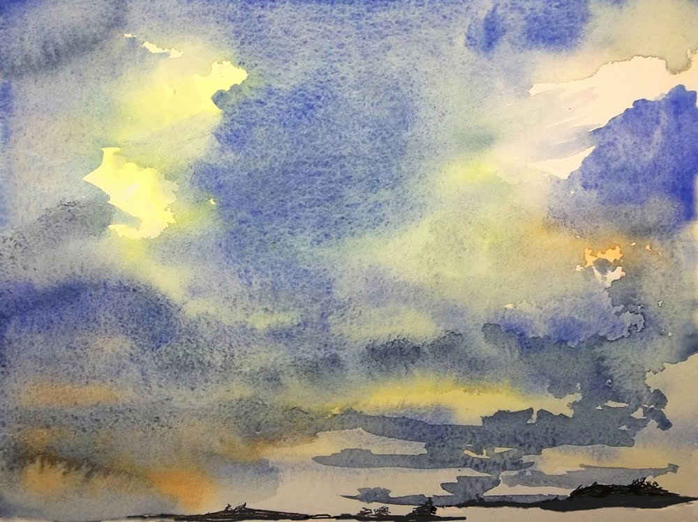
Stratus clouds watercolor by Annake
The third type of cloud is a Stratus cloud. These clouds form layers at different elevations. They are formless layers of cloud with fuzzy edges. They are very slow-moving and often hover over a region for hours and even days. They look very dense, but sunlight or moonlight can sometimes shine through them or reflect off them, as you can see in the upper layers here. They are not serious storm clouds, although they may produce a drizzle or light snow. This is a picture of stratus clouds that I painted in watercolor. Their slow movement gave me time to capture the entire scene. I tend to paint what I see, even if my picture breaks some of the "rules", so you can believe that this scene was as accurate as I could make it without a camera.

If you are not already a sky-watcher, try to become one. Skies are usually most interesting in the early morning and the late evening, but unusual cloud formations can appear at any time. When you see one, try to photograph it, make a simple sketch of it, or jot down a description of it in quick phrases. Once you have collected a few, think in terms of how you could use them in simple designs or compositions. Just remember that skies with clouds are usually more interesting than those without them.

Troubled sky, photo by jljardine
Troubled sky, photo by J.J.

Happy skies,    


 Creative Commons LicenseThis post by Annake's Garden is licensed under a Creative Commons Attribution-NonCommercial-ShareAlike 3.0 Unported License.

Contact Us

Name

Email *

Message *

Blog Archive