Showing posts with label perspective. Show all posts

Wednesday, March 27, 2019

All the World's a Stage: Another Look at Landscapes

Stinking Desert Sunset, photo by Annake
Near sunset in western Colorado (35mm SLR photo)
Jim Richardson,  National Geographic photographer, urges photographers to think of landscape photographs they are about to shoot as if they were settings for plays.* That set me to thinking of broader applications for that principle:  I wanted to apply it to pictures we already have.


Do you have photographs or sketches of landscapes that are accurate, but that just aren't ‘special’? Too good to throw away, not good enough to frame?  Perhaps you have a collection of picture postcards from past trips stored in a box somewhere. I certainly have all of those. I got out a few while I thought about what to say in this post.

I took the picture above late in the day, looking westward.  The color is accurate, I did not use a colored filter. I have always liked the picture, but had never decided what to do with it. It seemed a good place to start the current experiment.  Because I wanted to try several scenarios with my picture, I made a couple of copies before I moved to the next step.  J.D. took one for his own use. We decided to each do the project, but separately, choosing our own themes. J.D. will chime in with comments on his own results as we go along.

Camel photo by J.J.
Camel, photo by J.J.
Much of western Colorado, where our picture was taken, is semi-desert. It is not a sand desert, but dry grassland with some rocky areas. The picture certainly said desert to me. I determined it would be the backdrop for a desert scenario. And what more appropriate desert animal than a camel?

“But a camel in western Colorado?”, you scoff. Well, truth is often stranger than fiction. In 1855, Jefferson Davis (remember him from the Civil War?) was the Secretary of the U.S. War Department. He spent $10,000 to import camels to carry supplies and mail between remote western military posts. The endeavor worked well but was broken up by the Civil War, when most of the animals were auctioned off, killed, or escaped.  At least one became the source of a legend,  said to be 30 feet tall, to eat grizzly bears, and to vanish when in plain view. (Look up “camels in the Western U.S.”, and also look for a Smithsonian article on the Legend of the Red Ghost — great reading!)  I decided to do a detailed color drawing on watercolor paper to depict the Legend of the Red Ghost. One story was that the camel carried a macabre burden — a skeleton wrapped in canvas, strapped and roped to the camel's back.

Red camel with skeleton drawing by Annake

The image was drawn in colored pencil, graphite and charcoal. I sprayed it with fixative (hair spray will do, but practice first to get distances and amounts of spray correct; it is better to do this outside on a warm, calm day). I cut the figure out carefully with small, very sharp scissors and put it in place on the photograph. I used sketches, but you might prefer to use other photographs.

Legend of the Red Ghost paste-up by Annake

J.D.:  Over the winter holidays, I began to learn to use a much more powerful image editing program in order to meet the increasing technical demands of the work at Annake’s Garden; so, when Annake proposed this exercise, I decided it was a good time to see how far I’d learned to push the boundaries of what I could do with digital images. First I turned the picture upside down and backwards – and got an image that looked a lot like the sea at a sandy beach, about as far from a desert scene as you can get. Being an ornery and contrary sort of creature, I figured I would see how many element of this image I could turn into their opposites.

Moonlight on Dunes, digital graphic by J.D.
"Moonlight on Dunes," digital graphic by J.D.
Without getting into the specifics of how I used the software, this is what I did: turned sky into water and sand, mostly by stretching the image horizontally and squashing it vertically; turned the ground into night sky by pasting in a strip of the same almost-black color, then sprinkling in some fake stars; turned the sun into a reflection of the moon by laying a mostly transparent image from a different source over it, then adding a little glare effect at the right edge to suggest an out-of-frame moon rising. Everything else was just fine tuning the intensity of the colors, contrast, and sharpness to give the impression of a photograph taken at night.

This all may sound like mysterious high-tech digital wizardry, but there is nothing here that can’t also be done in an analog photographer’s darkroom (although it might take considerably more time and expense!)

ANNAKE: Now suppose you had a copy of the photograph we worked on. What would you do with it? Ask yourself some questions:
  • Do I need to turn the photo upside down? Change a horizontal picture to a vertical one or the reverse? Crop the photo (cut off parts of it)? Cover up or take out something? Change my perspective (point of view)?
  • What kind of story would I like this landscape to tell? Adventure? Romance? History? Mystery? Fantasy? Science fiction (remember J.D.'s "Early Morning Frost...” on Mars)? Horror? Comedy? Tragedy? Natural history?
Once you have decided what kind of story you want to tell, ask yourself if the picture you are considering can help you tell that kind of story. If the answer is "Yes", then ask yourself how the picture can help.
  • Does it suggest a particular place? A particular period of time?
  • What sort of people might live here or have lived here in the past?
  • Is it the habitat of a particular animal? Alive or extinct? Real or mythical?
  • What interesting objects might have come to rest here? Is it an extraterrestrial place? In the sky? Under the ground?

Cliff face public domain photo
Cliff face (rock wall**)
Each decision will clarify your story in your mind. You will begin to ‘flesh out’ your narrative. Then decide what scenery, props, and cast members you need to introduce into the photo to make your story come to life. You might have a picture of a steep rock wall.  Are you going to show a family of mountain goats descending the wall? Climbers free-climbing or ascending on ropes? A hang-glider swooping away from it? A helicopter hovering in front of it? Choose your characters and props carefully.


Now, how are you going to get your props and characters onstage?

  • Are you going to cut parts out of other photographs and glue them to your background?
  • Are you going to stand the background up and place cutouts or small model figures in front of it? Make a diorama out of it?
  • Are you going to glue or paint your characters and/or props on a clear plastic overlay?
Dry branches, 35mm photo by Annake
Another 35mm photo by Annake
This photograph is also one of mine and was done with no color filters.  Not desert this time, but certainly dry grassland and open woodland. There's no mystery involved this time. It is a simple natural history scene that could easily have happened.  J. D. asked for a big raptor alighting on the pile of branches, and that is exactly what I gave him.

Desert hawk drawing by Annake

The hawk was done in the same way as the camel and applied to the photograph. It is a kind of hawk known to make its nest of sticks. The picture was cropped to take out "clutter".

Desert hawk paste-up by Annake

J.D.:  Since Annake used my best idea for this photo, I struggled to come up with anything else interesting. In the end, I just squashed the perspective enough so that I could create sufficient foreground to put in some stock creepy elements. The skull and spider are cut-&-paste from public domain photos available online, and the burrow with glowing red eyes under the pile of sticks is pretty much the same set of effects I used for the night sky in the beach scene above. I don’t really have a story for this image, but if it inspires one for you drop us a line and let us know.

Landscape wiith skull digital image by J.D.
J.D.'s silly/spooky landscape

ANNAKE: This post is the result of my musings. It is not just for those of us who paint landscapes, photograph them, or portray them in needle arts.  It is for those who have photos, slides, or sketches they have always meant to organize and "do something" with, for those who collect picture postcards, and for those who just like to make something new out of something old that might otherwise be discarded. (If I missed anyone, it probably applies to you, too.) Have fun! 


*From a lecture for The Great Courses Masters of Photography, copyright 2014 The Teaching Company

**So, Annake tells me she needs a picture of a rock wall; I downloaded this nice public domain photo. Then I find out she meant a cliff face...


 Creative Commons LicenseThis post by Annake's Garden is licensed under a Creative Commons Attribution-NonCommercial-ShareAlike 3.0 Unported License.

Tuesday, July 17, 2018

Landscape in Needlework, Part V

Lake reflections photo byJ.J.
"Reflections",  photo by J.J.
This time I’m going to give you some tips and suggestions for making attractive landscapes in needlework. These are not “rules”; they are ideas that I have found useful. I have only two “rules”. You will find them at the end of this article.

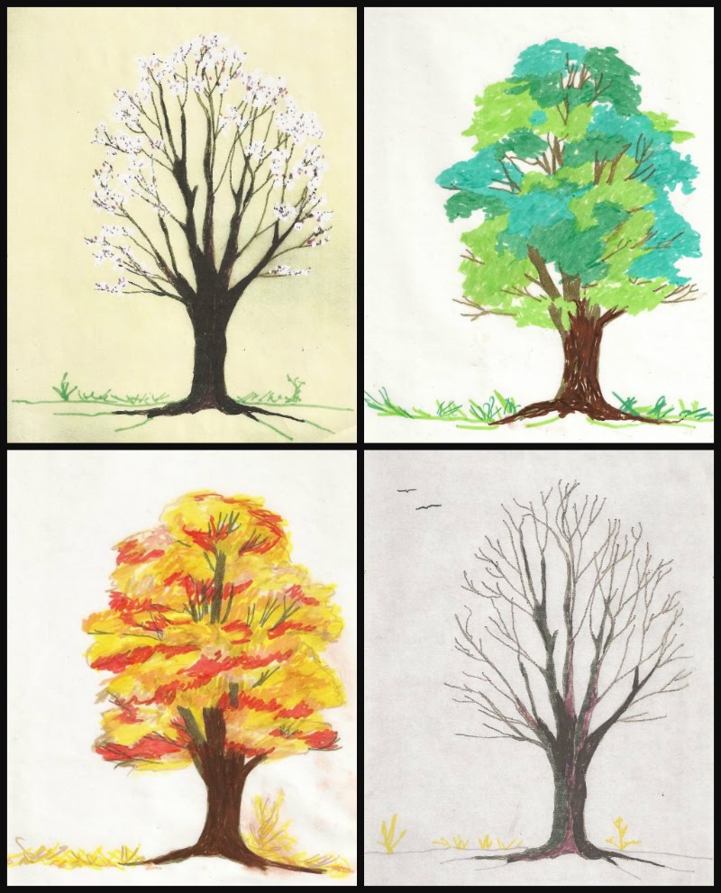
Whether you are sketching a real landscape or marking things of interest in a photograph to make a pattern you can follow in your needlework, limit yourself to 45 minutes. Set a timer or arrange for a reminder on your cell phone.  This will force you to simplify what you include on your pattern, leaving out unnecessary details. Try to capture the essence of the place you have chosen for your subject.  You might want to follow J.J.’s suggestion and half-close your eyes so you aren’t seeing minor details and can become more aware of major forms and the spaces between them. You will also become more aware of the masses of light and dark when you are not distracted by unnecessary detail. What you leave out can be just as important as what you put in. You will want some repetition of shapes, lines, and colors in your picture to both “pull it together” (unify it) and to give it variety so that it doesn’t become boring. Be careful that you don’t repeat any of these things too often.

Montage of sketches of the same tree in four seasons
Sketches of the same tree in four seasons
One of my favorite landscape painters, Zoltan Szabo, put it this way: “The human mind tends to organize everything to death.” For example, when a person plants trees, they tend to be the same kind of tree, arranged in straight lines, equidistant from each other and meant to grow to about the same height. When Nature plants trees, they are in interesting clusters of different species and different heights, colors, and textures. Believe me, Nature is by far the better artist! From my kitchen door, I can see three kinds of evergreens and about a dozen deciduous shade and fruit trees. I can observe them and study them in all four seasons. I can mentally move them around into any combination I wish.  Find a place with good trees and get to know them, capture them on paper or film, and keep them for reference.

Photo of trees in winter by J.D.
A winter scene by J.D.
Trees are important components in many landscapes. Here’s an assignment for you. Get a library book or use the search engine on your computer to look up works by the Impressionists. Study the way they painted trees. Compare them. Be sure you include work by Vincent Van Gogh, Paul Signac, Claude Monet, Pierre-Auguste Renoir and Alfred Sisley. If you can find them, look at the work of Dominique Lang (Luxembourg) and Friedrich Eckenfelder (Switzerland). Choose one or two examples of the artist’s brushwork and try to think of stitches that would give you similar textures and effects. Try some of them on scraps of fabric and file the ones you like.

Photo by J.J. pedestrian on a path
"Heading Over the Hill", photo by J.J.
If you are using something like a fence, wall, or stream to lead the viewer’s eye into your picture, it should slant or curve into the picture. Ideally, it should disappear once it has led the viewer to an important point, although it may appear again somewhere else in the picture. Remember that as objects stretch further away from you, they become smaller and less distinct, less detailed, and lighter and grayer in color.

Pencil sketch of a fence
Gray is a color you can use to get wonderful effects. Collect gray yarns or flosses. Use black sparingly. Like straight lines, true black does not appear often in nature. The posts and rails get lighter, thinner, and shorter as they recede into the distance. Here is a simple sketch  that illustrates what I mean. If I were doing this in needlework, I would start the first post with 4 to 6 strands of dark yarn or floss and exchange one thread for a lighter one on the second post, two on the second, three on the third, and so on. See my discussions of blended yarn part II of this series (April 8, 2018).

Transparent grid tool
Speaking of points of interest, here is a simple device you can make to locate them. Start with a piece of thin, clear plastic and a permanent marker. Measure carefully. Put in two straight horizontal lines that divide your plastic into three equal sections. Then put in two straight vertical lines that do the same thing. The four places where the lines intersect are the attention (esthetic) points. These are the areas a viewer is likely to seek out first. Place the plastic on your canvas and mark the four points. If you are working on fabric, you may want to put in rows of long running stitches where the lines would be, Use a bright color that is not in the picture so that you can easily remove the lines when they are no longer needed. Choose one of the attention points for the area of greatest interest in your picture. If you have a second area of interest, it is probably best to place it at or near the attention point directly or diagonally across from the first one you chose. If you use the one directly above or below the first one you have shifted the “weight” of the picture to one side without anything to balance it.

Mountain poppies, photo by J.J.
"Mountain Poppies" by J.J.
The three divisions on the plastic device represent the three planes of the picture: foreground, midground (or middleground), and background. These are the aspects of perspective that make a picture look three-dimensional on a two-dimensional surface. In a landscape, you need to pay attention to the distance that appears to exist between the viewer’s eye and the furthest object in the background. If the proportions do not look correct, the scene will not be believable. This does not mean that the three planes always have to be of equal space or have equal emphasis. Ordinarily, the focus would be on the foreground because it is the closest to the viewer. Details would be sharper in that part of the picture and colors and values (degrees of lightness and darkness) more intense. The midground would be in softer focus and lighter than the foreground. The background would be still lighter and less well-defined. This is the most natural approach.

Simple pencil sketch of a landscape
A simple landscape to experiment with
But you can add importance to any of the three planes if you make it very light or very dark in strong contrast with the other two planes. If you make the midground noticeably lighter and brighter than the other two planes, you will suggest a change in the atmosphere. Add that eerie yellow-green light that sometimes comes before a storm. The background should be very dark; the sky, full of storm clouds. The foreground should also be shadowed and the colors flatter and less distinct. This can make a very dramatic scene. On the other hand, If the background is brighter and more colorful than the other two planes, as it would be at sunrise or sunset, it will dominate the scene, The foreground would be lighter than the midground and its colors would be grayer than normal. The midground would be the darkest plane, with very few details. You have total control over these aspects of the scene, but it is easy to put in too much detail. Use restraint and don’t make the differences between the planes so great that the scene is not believable. You can practice with the landscape sketch above.

Annake toning a canvas
Try working on a colored background. You can tone canvas with diluted acrylic paint. That’s what I am doing in this picture. I often pick up unused canvases at yard sales. If there is a printed design on the canvas, I paint over it until it does not show through. You will not want to leave an area of bare canvas, so match your yarn or floss as closely to the background color as seems necessary.  If you are working on fabric, try to find a medium tone of your major color. For example, use a medium blue fabric for a picture that is mostly sky, a medium green for a woodland scene, etc. You may want to limit yourself to other tones of the same color, plus black, white, and gray. Let some fabric show through. If you like this effect, you can apply it to other genres, like still lifes and even portraits. (For more about toning a canvas, see the post for June 15, 2014.)

Here are some generalizations about color that you may find useful.
  • Color and value are not the same. Think of value in terms of intensity and saturation.
  • A pure color, like the twelve seen on a conventional color wheel, is a hue. Every hue can be a tint (hue mixed with white), a tone (hue mixed with gray), or a shade (hue mixed with black). Use these variations to make your composition more interesting and realistic.
  • Warm colors (red through yellow-green on the color wheel) seem to advance toward the viewer. Cool colors (blue-green through red-violet) seem to recede.
  • Your picture should be predominantly warm or cool, depending upon the light, to assure color harmony. Warm colors are generally cheerful; cool colors are serene.
    Needlepoint of colored squares
    Needlepoint of colored squares
  • A color may look very different in different contexts, depending on the colors that are next to it. Note how the colors seem to change in this needlepoint when the center squares change from white to black.
  • The farther away an object is a picture, the paler (less intense, less saturated) it appears. Colors tend to gray as they approach the horizon.
  • Grays are not always made from mixing black and white. Blending complementary colors can give you some interesting effects. Blue’s complement is orange. Brown is a part of the orange “family”. I have had some success in blending blues and browns in yarns and flosses. Not all combinations work. Blend a short length and place some stitches close together on a scrap of fabric. If you like the result, file the sample along with the color names or numbers that you used. Try to incorporate some of the complementary colors into your shadows.
And here are my two “rules”:

Don’t get discouraged and quit if a project isn’t turning out the way you expected.

A few days ago, J. D. asked me how I was doing with a project. I told him I had come to love it and hate it with about equal intensity. Put the project away for a few days (no longer). When you look at it again, you may find there is nothing wrong with it. You may find you now know how to fix it. You may like it better than your original idea. Give it a chance.

Rules were made to be broken.

Take constructive criticism gracefully, but do not follow it until you have tried it and decided for yourself. Develop your own set of ideals. Listen to yourself. Be your own best critic.

Good luck,



 Creative Commons LicenseThis post by Annake's Garden is licensed under a Creative Commons Attribution-NonCommercial-ShareAlike 3.0 Unported License.

Monday, February 19, 2018

Still Life in Needlework, Part V: Inspiration Is Everywhere

mining equipment and Japanese dolls
Two photos by J.J.
You have now had enough experience with still life compositions to know whether you want to continue translating them into needlework. Now it is time to broaden your horizons a bit. Beside these first paragraphs, you will see a couple of photographs that you might not have considered as still lifes... but they are. I want you to extend your thinking about what constitutes a still life and where to find them. Still lifes do not have to be table-top compositions or pictures of items confined to the interior of a room. Any collection of items that are not going to get up and move away while you are sketching them (or photographing them for later sketching) will qualify. My grandfather, whose sketchbook I inherited, made some charming compositions of simple items like garden tools leaning against a fence. A collection of modern tools, including motorized ones, would make an even more intricate composition. (And, of course, you can always make a sketch of your drawing or needlework tools.)

Amaryllis
Amaryllis, in the style of a 19th century lithograph
If you will bear with me, I will point out some more history that applies to our subject. By the 1830’s, technology had begun to affect the European art world. Artists had made prints of various kinds for several centuries. The Dutch Masters, for example, and the great German artist Durer had made good use of them. Now lithography made print-making even more attractive. The Romantic painters Delacroix, Corot, and Millet had etchings made of some of their work. The Impressionists, including Manet, Degas, and American-born artists Cassatt and Whistler, popularized prints even more. Art shows began adding entire exhibits of prints. Museums were delighted to sell prints of their treasures to a growing middle class. Newspapers, book publishers, and scientists cataloging plants, animals, and fossils were demanding good illustrators.

And then Louis Daguerre, through an unlikely — but happy — accident, discovered a whole new way to produce images, and what was to become a whole new art form, photography, was born. Some of the art world felt panic. People, they said, would no longer sit long hours to have their portraits painted; they would readily sit for long, uncomfortable minutes for the much cheaper photographs. Portrait painters did, in some cases, suffer from the new trend, but only temporarily. People did sit for those photographs, but people also began to buy more paintings of all kinds. And, as for Daguerre, the first daguerreotype he made to show the world was... a still life. (J.D., of course, considers this only right and proper!)

photo in the style of a daguerreotype
Still life in the style of a daguerreotype - an homage to Louis Daguerre


The Impressionists made significant discoveries about color. Remember when I advised you to put complementary colors into your shadows? That was one of many examples of their discoveries. By revisiting sites and painting them in all seasons, all weather, at different times of day, etc., they learned a great deal about how changing conditions altered colors. The pointillists discovered that putting tiny dots of mixed colors into an area of a painting gave it a more realistic aspect. Those dots are the “ancestors” of the pixels on your screen. (Latch-hook work is pointillism in action!) Although few of these painters concentrated on still lifes, their contributions improved overall understanding of the effects of light and color. In return, these also led to great improvements in the reproduction of both paintings and photographs.

rose photo and pillow-top
J.J.'s photo of a rose, and the latch-hooked pillow-top based on it


We need to honor one more individual painter for his contribution to still lifes, the Post-Impressionist painter Paul Cezanne. He freed artists from the last restrictions on traditional still life compositions. In effect, he “tilted the table” so that everything on it was visible… and nothing fell off! J.D. is going to show you how he does some of this by changing perspectives with his camera.

pottery still life collage
Different views of the same subject; only camera position and lighting was changed


pine cones
Pine cones by J.J.
Sometimes simply changing the scale of what you are observing brings up subjects you might not have thought about otherwise. Try “thinking small”. Look at individual plants, seashells, pine cones, mushrooms, etc., and their immediate surroundings. Often this will give you a new perspective on what constitutes a still life.


Now you have seen examples of 'translations' from observations, sketches, photographs and prints into samples of embroidery, needlepoint, latch-hook and other forms of stitchery. It is time for you to put what you have learned into serious practice. Use what you have learned to make an outline for a simple still life on cloth or canvas (even plastic canvas). Then fill in those outlines with your choice of yarns, flosses, or other materials, in your choice of colors, using your choice of stitches. When it is completed, you will have made something that would not exist in this world if you hadn’t created it. If that doesn’t make you feel good, I don’t know what will!


For more tutorials and suggestions, look for our next series of 'translations', Part I of LANDSCAPES, beginning later this spring.

Wheels
"Wheels" by J.J.


Resilience
"Resilience" by J.D.


 Creative Commons LicenseThis post by Annake's Garden is licensed under a Creative Commons Attribution-NonCommercial-ShareAlike 3.0 Unported License.

Sunday, May 7, 2017

A Quickpoint Project

Daffodils in the garden
Spring daffodils
Our project for today will be another picture in my “Close Encounters” series. I am working on #5 jute canvas, principally with acrylic and novelty yarns. Most of the work is done in continental (tent) stitch, but there are exceptions. I will discuss each of those as we come to it. To cover the canvas, I have used doubled strands of many of the yarns, giving the picture a homespun effect.

When I work on a picture, particularly if landscape is involved, I imagine that this is a real place and that I am am standing nearby observing it. (From behind a telephoto lens in this case, since a bear is involved!) I envision a sunny day in late spring or early summer. The highest mountains have not lost their snow cover, but the lower slopes are snow-free. The mountains slope away downward and toward the left, as do the lower layers in front of them. Although my approach to this picture is impressionistic, I will try not to break the rules of perspective and lighting.

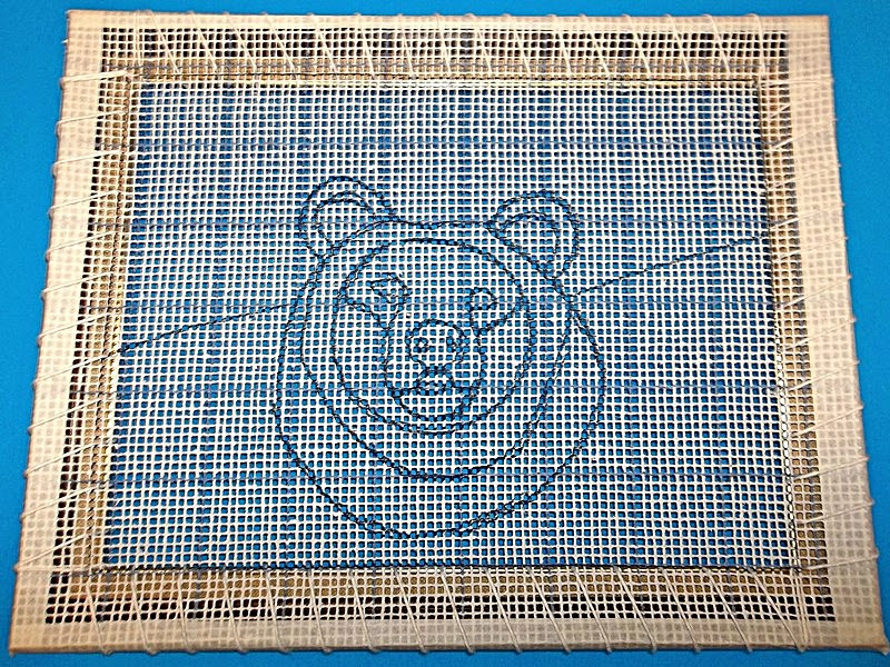
Bear outlined on canvas
You will notice that the canvas is printed with a pattern of 10-by-10 squares. That means that each blue square on the canvas encloses 100 empty squares. This type of canvas is especially good if you are going to do a detailed square-by-square pattern of your design before you begin stitching. This time, however, I am just going to indicate the major areas of my picture by drawing lines on the canvas with a permanent black marker. I go over the marks with a sheet of paper towel to remove any loose color that might come off on the yarn as I stitch. I am using minimal guidelines so that I can make changes as I work.

Canvas lashed to picture frame
Once I am satisfied with my design, J. D. laces the canvas to the top of the frame I plan to use for the finished project. When the canvas is firmly stabilized on the frame, he ties off the lacing and cuts it. I can then hold the frame with one hand and put stitches in firmly with the other. This gives me tension to make my stitches as even as possible. I highly recommend securing your canvas this way. If you do not pull your stitches too tight, you should not have much — if any — blocking to do on the finished canvas. A gentle steam pressing should be enough.

Small balls of yarn stored in egg cartons
Then I choose the colors and weights of the yarns I want to use. Since one of my major themes is saving money, I am going to use just what I have on hand. Some areas will need large amounts of yarn, while others will require only a few inches. I keep small balls of leftover yarn in egg cartons. I run the ends of the yarn through holes in the top of the carton so that I can see at a glance what yarns the carton contains. For each project, I fill one or more cartons with small quantities of the yarns I plan to use as small accents. Blunt-pointed tapestry needles with large eyes and a pair of sharp scissors complete my preparation.

Canvas with mountains stitched in
I prefer to work by natural window light. I decided to stitch over the white knitting worsted tent stitches, but not over the gray ones. This gave the snowy mountains more depth and resolution. I make decisions like these constantly as I work — and so should you. If your work doesn't please you, change it. Take out stitches and re-do them, stitch over them, change colors, blend colors, put in details or leave them out. If you don't make your work match your ideas, you may always be dissatisfied with the piece — no matter how much other people admire it.

Canvas with sky added
...and the sky added
The next step was to stitch the large area of the sky. I continued in tent stitch, graduating the blue colors from a very light blue just above the horizon to a deeper, darker blue at the top of the picture. The light is coming from above and to the left side of the picture, with the sun about ten o'clock high in the sky.


Bear needlepoint with middle background
Needlepoint with middle background added
Then I turned to the middle distance. Here I sketched the lower slopes of the mountains, showing slopes of rock, dark green patches of evergreen forest, and lighter green areas of mountain meadows. As I moved down behind the bear's head to the neck and shoulders, I put in a section representing broad-leaved trees along a watercourse that is implied, but not actually seen, in the picture. (The land has leveled off here, although it still moves a little farther into the distance on the left side of the picture than on the right side.) In the shade below these trees, I stitched a few rows of a dark green yarn that has tiny fleck of color in it. Using single strands of Persian tapestry yarn and a small crewel needle to make tiny random stitches on the surface of the dark green yarn, I suggested a variety of plants growing and flowering in the shade.

Needlepoint with bear's head begun
Beginning to stitch the bear's head
The next step was to begin stitching on the bear's head. I worked from the outer layers inward, beginning with the ears. The bear is standing in sunlight in a field of wild sunflowers. The sun is bringing our the red tones in her coat. (Yes, I said her coat. I decided from the very beginning that my bear would be a young female.) She has just turned her head and is looking almost straight at the viewer because something has attracted her attention. This shows a bit more of her neck, cheek and muzzle on the left side of the picture and a bit more of her shoulder and ruff on the right.

Bear with face and shoulders filled in
Filling in the face and shoulders
In this step, I completed much of the bear's face, neck and the tops of her shoulders. The eyes, nose, and mouth will not be stitched until much later. The shoulder is more prominent on the right. That shoulder is “bunched”, because it is carrying more of her weight. A dark shadow runs down that side of her body, which is not struck directly by the sun. I sketched three wild sunflower blossoms and a couple of leaves in marker below the bear's head, leaving the guidelines for her upper chest, since some of her body will be visible between the flowers and leaves when they are done. A different color background was used for this photograph so that the faint sketched lines would be more readily visible.

Bear with sunflowers added
Sunflowers added in the foreground
Now I filled in the flowers, leaves and the bear's shoulders and chest, including the parts of her body that show between the flowers and leaves. Wild sunflowers have much smaller centers than domesticated ones. The number of petals varies, and the petals may be irregular.


Bear and sunflowers with near background detail
More detail added in the near background
I continued to fill in the background. As it grew closer to the foreground, I made larger random stitches for the flowers and gave them increasing size, shape, and definition. Not all of them are facing forward; some are seen from the side or the back. Leaves and stems are suggested. (This kind of surface embroidery can also be done after the picture is removed from the frame.) I emphasized the divisions between the petals of the large flowers in the foreground and added veins to their leaves. Back-stitching — a lot of it — emphasized other features in the picture, such as the rocky cliffs in the mid-ground and the tall trees along the watercourse. I try to be conservative with outlining, but only you can decide when you have done enough on your picture. A good rule to consider, however, is: “Don't put anything in that you are not willing to take out if the effect doesn't work!”

Oh, my goodness! Look at the time! We are doing a Farmers' Market this weekend. I hate to leave you with unfinished business, but I need to be in the greenhouse NOW! I'll be back in a couple of weeks with the completion of this project and much, much more.

In haste,


Bear with background complete and some back-stitching
To be continued - please bear with us...

 Creative Commons LicenseThis post by Annake's Garden is licensed under a Creative Commons Attribution-NonCommercial-ShareAlike 3.0 Unported License.

Wednesday, August 31, 2016

Another “Op Art” Needlepoint from a Quilt Block

2 color ribbon design
From time to time, J. D and I look at our archive to see which of our older posts are getting the most attention. This helps us to plan posts which return to those subjects. Lately, there has been interest in the posts about optical illusion effects in needlepoint. If this is a new subject for you, you can find more information on the following posts: November 16, 2015, December 19, 2015, January 21, 2016, and February 10, 2016.

We have been working with geometric designs based on quilt blocks. We will continue to do this, but I wanted to show you that there are other ways to create an optical illusion. This is a color sketch I did for a future needlepoint project. It was inspired by the recent Rio Olympics. At first glance, it appears to be an open flower. On closer examination, however, you will see that it is made up of the stylized bodies of gymnasts.

Design with gymnast motif

Today's pattern is also derived from a quilt block. This one probably has several names — most quilt patterns do — but I know it only as “Bachelor's Puzzle”. I have no idea how it came to get that name! We are going to begin by drawing a diagram. You will need the following materials:

  • a sheet of ¼-inch graph paper
  • a sharpened pencil
  • an eraser that won't “smudge”
  • a ruler or other straight-edged item
  • a black fine-line pen or marker
I drew each step separately, but you need only follow the steps in sequence.

Design steps 1 - 3
Design steps 1 - 3


Step 1: Find the center of your graph paper and mark it with a pencil dot. Draw a square around the central point. Each side of the square should mark through the center of 5 diagonal squares of the graph paper.

Step 2: Draw four squares in the positions shown on the diagram. Be sure the positions are exact. Each of these squares should enclose 16 of the graph paper squares.

Step 3: Draw the lines connecting the squares and creating 4 parallelograms. Once again, these lines should pass diagonally through the centers of 5 diagonal squares of the graph paper. Essentially, the entire design is made with only two kinds of lines: horizontal or vertical lines along 4 squares and diagonal lines through the center of 5 squares.

At this point, you already have an interesting design. A series of these done in bright colors and evenly spaced on a plain background would make a colorful pillow top or — done in latch-hook or quickpoint — a small rug. On a smaller scale, they would make an attractive set of coasters or could be joined together to make a purse or tote bag.

Design steps 4 - 5
Design steps 4 - 5

Step 4: Draw these straight 4-square lines outward from the squares as shown. Once again, careful positioning is necessary.

Step 5: Complete the parallelograms with diagonal 5-square lines. This gives you four “blocks” to make appear as 3-dimensional.

Once you are satisfied with your diagram and have erased any unnecessary marks, retrace the design (using the straight-edge) with a permanent black fine-line pen or marker. This will make it easier to transfer the design to your needlepoint canvas. The easiest way to do this is to tape the design to the glass of a sunny window. Center the canvas over the design and tape the canvas to the windowpane. Press against the canvas with your free hand while you trace the design on the canvas with pencil. You can then correct any tracing errors and re-trace the lines with pen or marker if you like.

Your next decisions will depend on what you wish to do with the pattern. If you are doing a sample or a small picture, you will want to use a larger mesh canvas, probably no finer than #10. you can use either fabric canvas or plastic canvas for these purposes. For a pillow top or similar item, you will want a finer mesh fabric canvas like #14. The stitches can either be done as long upright gobelin stitches or as tent stitches.

shaded Bachelor's puzzle design

The diagram above shows the method of shading the design. You will need three shades of your chosen color: a very light, a medium, and a dark. Bear in mind that these illusions often show up best on black or a very dark blue, green, red, or brown. Dark backgrounds are my personal choice; however, that does not mean that you cannot use white or a light color for the background. Be sure that your darkest design shade is enough lighter than your dark background that it will show up well. Conversely, be sure that your lightest color is enough darker than your light background color that it doesn't just blend into the background.

three shades of yarn
Three shades of yarn

Here are the steps for making the design:

1) Work the four squares first, using the lightest of your three design colors. These represent the ends of the “blocks”.

stitching step 1

2) Use the medium color on the sides that are a light gray in the diagram.

stitching step 2

3) Use the darkest shade on the dark gray shaded sides in the diagram.

stitching step 3

4) Fill in the center square with your background color. You can have as much background as you like around the finished design motif. It need not be square (although I would recommend a square pillow top), but may be rectangular, circular, or even hexagonal. You are limited only by your imagination.

5) Back-stitch along dividing lines as needed.

Bachelor's Puzzle finished
Bachelor's Puzzle finished, framed, and hung

Enjoy!


 Creative Commons LicenseThis post by Annake's Garden is licensed under a Creative Commons Attribution-NonCommercial-ShareAlike 3.0 Unported License.

Contact Us

Name

Email *

Message *

Blog Archive