Showing posts with label Counted thread embroidery. Show all posts

Thursday, June 11, 2020

That's a Good Question!: Summer 2020 Q & A


working aids for senior crafters
Some of Annake's aids
Ordinarily I do seasonal Question and Answer posts, but I haven't kept to that schedule lately. I apologize for that. Having been through a bad flu epidemic when I was in graduate school many years ago, I got worried when the first news of sickness in China appeared in January. I feared that such a large and populous country with so many connections around the word would not be able to confine the epidemic, so we began making long-range plans immediately. When it became evident that the virus was spreading quickly from country to country, we redoubled our efforts. Because I am high-risk, I have been in self-quarantine for about two weeks longer than most of you. I thought that if isolation is difficult for me — when I work from home all the time —- it must be doubly difficult for those who are unused to it. So J.D. and I decided that, along with our planned posts we would create the EXTRAS section of the blog (see the tab on the menu bar above) and fill it with all sorts of things from photo essays to how-to articles and free patterns to teaching units. We have put up a number of these items and plan to do more until mid-summer. Since most of these questions center on topics in our recent post about easing eye and hand problems for older needleworkers, J.D. suggested that we show some of the devices (shown above) that I personally use.

Do you do quickpoint from charts, or on painted canvas?

Butterfly chart no.4
Click here to download
Either or both, plus other choices as well. I prefer to work from charts because I make my own. By the time I put symbols on graph paper, I have a pretty clear mental picture of what I hope to accomplish. If you are working from a chart in a needlework book or magazine, there are some things to consider. The chart was probably designed for a specific project with well-defined dimensions. If you are doing quickpoint, which is larger than tent stitch and regular cross-stitch, you will need to count squares carefully to figure out just how large your finished project will be. (I add an extra inch all the way around, just in case.)  Most of the charts I put into these posts are meant to be used for a large variety of sizes and colors. but let me give you one that is a little less variable. Because this is a specific butterfly rather than a generalized one, the colors need to be followed closely. You will still need to count squares as described above for the figure to work on the background you have selected.

Painted canvas of South American child
If you are working on a painted canvas, start in a corner and work a 10-stitch square of the stitch you plan to use  (be ready to take the stitches out if you need to) to see if you will be able to put in the smaller details of the design. 
I buy painted canvases when I can get a bargain, but I paint out the design and replace it with one of my own, either painted on the canvas or outlined on it. You need to examine the canvas carefully because some, especially ones made for kits,  are just starched cotton and don't hold up well.

Monk's cloth
Monk's cloth
If you are used to working on even-weave fabric like Aida, you can use several easier alternatives. One is monks' cloth, which has easy-on-the-eyes squares, but it requires a lot of preparation. It needs to be pre-shrunk. Then you need to bind the edges or at least put 2 rows of machine stitching around the edges. When I do use it, I back it with non-woven interfacing, which I work through, and use it for something that doesn't get a lot of wear. On the other hand, if you can find a good quality decorator burlap, you can use it just like Aida and get some lovely surface effects with crewel, tapestry, or novelty yarns.

What is wrong with using printed gingham?

Printed vs. woven gingham
I can show you with the two examples in the picture. The fabric on the left is printed gingham.  It is folded so that both the top surface and the bottom one are showing.  Notice how the design doesn't look the same on the wrong side?  There is no guarantee the cloth was printed so that each square wound up with the same thread count or that your cross-stitches will come out the same size. Now look at the woven gingham on the right. See how the squares are the same on both sides of the fabric? This is true whether you are using baby-check, standard quarter-inch check, or one of the  "jumbo" checks. Your stitches will be the same size and will line up properly both horizontally and vertically. The woven gingham is a little more expensive, but is well worth it.

Love the Bear and the Bee. Does it have a title? And are you going to make any more "Close Encounters" pictures?

The things that fit nicely into my typed scripts don't always fit as nicely when J.D. sets the format for publication. The title was too long for the caption, so he left it off. It is "What Kind of Flower Are You?"  The titles are designed to be said by either one of the pair of animals to the other. I try to do one a year, but — as with everything right now — I am running a bit behind. I am almost ready to do the color cartoon stage of the design. Did you know that the word "cartoon" originally meant the complicated chart for a tapestry weaving? I use the term for the stage when I make a full-sized color rendering to trace permanently on my canvas. I may also graph some of the finer details. Since you know how the titles are chosen, I will give you a hint about the two animals — one a mammal and the other not — coming up next.  The title is "Want to Race?"

You mentioned  'Window Wonders' when you were showing tracing a pattern against a sunny window. What are they and what do you do with them?

materials for making Window Wonders
Some materials for making Window Wonders
They aren't a form of needlework, but they are pretty and fun to do. I make them for craft shows, usually in three graduated parts, featuring a hummingbird, a butterfly, and a flower, but I have done colorful frogs, dragonflies, small tropical fish, and more. I draw my own pictures, but it is easy to trace them from photographs and drawings. You will need an embroidery hoop (wooden or plastic) with a screw adjustment for each individual picture. I usually make a set of three with a 3-inch, a 4-inch, and a 5-inch hoop, but that varies. I use both circular and oval hoops. You can paint the wooden ones if you like and the plastic ones come in colors. You will need permanent markers in a variety of colors. You will need a transparent or translucent fabric that is stiff when you stretch it across the hoop.  Sheer organdy is ideal.  You will also need a small, sharp pair of embroidery or manicure scissors.


Cut a square of the sheer fabric about an inch larger all around than your drawing.  Center the square over the design and trace the design with permanent markers. (Practice on a scrap first.) When the picture is dry, stretch it over the bottom of the hoop and push the top of the hoop down firmly. Pull the fabric until it is as firm as you can make it.  Turn the hoop over and carefully cut away all excess cloth. Fasten the hoops together as J.D. has shown you here.  I hang the 'wonders' surface-side-out in a sunny window. The design can be seen from outdoors and indoors. If you have a light-colored wall across from the window, you may get still another image on it.  Some people hang the item on screened-in porches or sheltered patios. I showed some outdoors in a 40-mph wind once and all survived beautifully. This is a craft that can be taught to children in elementary school. (For more on 'Window Wonders', see the article in our Extras section.)

You mentioned a kind of pattern-making that you didn't discuss because you said it would probably be hard to get the materials for it right now. My mother-in-law has a lot of materials that she lets me use, so she might have what I need. Would you tell me about that technique?

I'll be glad to — and show you as well. Also, I am so glad that you have a good relationship with your mother-in-law. I had one of the best in the world and I miss her greatly. Cherish that relationship. (And I'll bet she will be a wonderful grandma, too.)

I am going to teach you to make a simple hot-iron transfer. You will need the following materials:
    an ironing board
    an iron, preferably a steam/dry iron
    fabric to transfer the design to (cotton is best for beginners)
    a simple design
    a sheet of tracing paper larger than your design
    a transfer pencil (this is the tough one!)
    a pencil sharpener
    straight pins
    scissors

Downloadable owl outline
Click here to download
I do a lot of children's patterns, so I am going to give you a simple one. Or you may substitute a design of your own. Mine faces forward, so you don't have to worry about design reversal. If your design is facing to one side, it will be reversed in the finished pattern. If you are going to put words or names in the design, you will need to reverse them before they are added to the design or leave them out of the design and chart them separately.

Draw or trace your design on the tracing paper with a hot-iron transfer pencil.
These red pencils are made by several companies. I use Aunt Martha's™ (2 to a package for around $3.00.) Each pencil will make many transfers.  Keep the pencil point sharp and go over the lines firmly until they look dark. Set the transfer aside.

Finished blackwork owl
Finished blackwork owl - no red marks
Cut you fabric at least an inch larger all around than your paper pattern. Set your iron for the proper temperature for your fabric. Press your fabric. Fold it in half lengthwise and press a strong crease along the fold. Refold it in half crosswise and press another pleat. these should meet in the center of the fabric. At this point i like to stitch a row of bright-colored basting stitches down each pleat that I will pull out once the transfer to the fabric is complete. Stretch the fabric flat. Place the transfer penciled side down on the fabric and lift the center of the transfer up with the center of the fabric. Pin the pattern to the fabric all the way around. Set the iron no higher than cotton and put it on dry (no steam). Press the pattern in to the fabric, pressing hard and go back and forth several times, but don't scorch the paper. It takes at least 5 seconds of hard pressure on each line to get a good transfer. Unpin one corner and lift it carefully. Peek under it to see if your lines have been transferred. If not, re-pin it in the same place iron over it until they do. Turn off the iron and unpin the pattern from the fabric.  I gently pull the basting threads out of the fabric at this point. Work the pattern in any needlework style you choose. The red lines will wash out of the fabric with warm water and a good detergent (I like Dawn® dish detergent) when your project is finished.

I hope these clarifications have answered your questions. Keep creating!



Annake's 24" monitor
Annake's 24" monitor & soundbar - more help for aging senses


 Creative Commons LicenseThis post by Annake's Garden is licensed under a Creative Commons Attribution-NonCommercial-ShareAlike 3.0 Unported License.


Wednesday, October 30, 2019

Blackwork Revisited: Some New Patterns and Processes

Still life by Annake, blackwork stitching on Aida cloth
Still life by Annake, blackwork stitching on monk's cloth

Periodically, J.D. checks to see what topics readers are searching for in earlier posts. One that always seems popular is Spanish blackwork. It just so happens that there has been a good bit of interest in the subject lately. Also, I have gotten both a request for new blackwork patterns and a question about using them, so I am going to address those issues today.

First of all, I want to present some new blackwork patterns. These are designed primarily to fill larger areas of design than many of the ones we have shown previously. It takes several repeats of the design elements to really display the pattern properly. These would show up well on checked gingham, for example. If you want them to appear smaller and denser, you will need something like #14 needlepoint canvas or a comparable Aida fabric. I suggest you practice by drawing each design at least once on a piece of graph paper before you begin stitching it.  Then you will have the paper patterns for future reference.

Blackwork stitch pattern 1
This open-weave design not only covers large areas quickly, but also can give an optical illusion of depth. If I were doing this, I would stitch around all of the woven pieces first. Then I would put three or four closely packed upright stitches in to fill each square between them. This would look like a dark background some distance behind the lattice. If you don't want to create the illusion, then put an X, a plus sign, or an asterisk (made by combining the X and the plus} in each of the small squares to complete the pattern.

Blackwork stitch pattern 2
This next pattern is a true tiling pattern. If you draw the large squares with points, you will create the shapes between them without further drawing. Conversely, if you draw the in-between shapes correctly, you will create the squares without further drawing. The little asterisks in the squares just add texture to the design.

Blackwork stitch pattern 3


The last pattern is a large one that can be used alone as an all-over pattern for a pillow, baby carriage cover, or an even larger article. It can be made considerably smaller by using fabrics with a much higher thread count. Either way, it requires concentration. I really recommend that you work this one out on graph paper before you begin stitching. You may want to do it in two steps. Step 1 would be to draw in the long-stemmed Y shapes that form the North, East, South and West supports of the design. Add the X at the center of the design. Step 2 is to draw the  ‘petals’ at the four corners of the design. Step 3 puts in the small diamond shapes and the X-shapes between the motifs.  Notice that the arms of all the X-shapes extend through the motifs to make diamond shapes connecting the motifs. It is important that these lines be as straight as possible. To make this more visible, draw Steps 1 and 3 in a dark green pencil or pen, while you do the Step 2  ‘petals’ in a bright color.  This chart will help you even if you are going to do the whole design in black later. Used at a smaller size, the motifs create another type of illusion.  While you will only use straight stitches to construct the design, the illusion will form that you have used curved lines to make it.

Little Red Dragon, embroidery on checked gingham
"Little Red Dragon", embroidery on checked gingham
The question I got was: "Can I do blackwork patterns in other colors?" The answer is most emphatically "Yes!" There was a time when similar pattern stitching was done in red in countries like Russia, Poland, Lithuania, Latvia and Estonia. It came to be known as Russian Redwork. A friend who has traveled to Russia assures me that pieces adorned with this type of embroidery are still being sold at the Moscow airport. I do my own version of it, as you can see in my baby dragon.

Unicorn, embroidery on checked gingham
"Unicorn", embroidery on checked gingham
Scandinavian needle workers do exquisite surface embroidery — often combined with cut work — in white on both white and colored fabrics. Again, I do my own version, as you can see in my rampant unicorn. I did not do any cut work on this picture because it did not seem appropriate. I did use a heavy gold thread for the unicorn's horn and a lighter one on the mane, tail, hooves, nostril and around the eye.  I made the eye itself with a dark blue French knot.

Colorful Onion Domes
"Colorful Onion Domes", embroidery on monk's cloth


When the patterns are done in multicolor, the work is called Holbein embroidery. To be strictly legitimate, Holbein embroidery involves using a stitch that covers both sides of the fabric (see our August 20, 2014 post), but you can do a very good simulation using the traditional blackwork stitching. Here is my blackwork "Onion Domes" pattern done in multicolor.

If you think you may have missed some of our past blackwork patterns, simply go to our search engine ("SEARCH MY BLOG" in the sidebar), type in the words “blackwork pattern” and press Search. When you come to the bottom of the first set of posts, click on Next Posts and follow that procedure until you reach a point where there are no more posts with patterns. Not everything the search gives you will be pertinent: search engines can be rather erratic in their selections. But you should find some useful charts. If you are just starting to do blackwork, or if you are still deciding whether you like it, follow the same search procedure using the term “blackwork” alone to get all the tutorials and other useful tips.

hand drawn pattern in two colors
Hand-drawn draft of a complex pattern in two colors
Finally, here is another color technique I use when designing complex patterns that expand from a central design. The colors make it clear where each round of stitches begins and ends so that I don't produce a lop-sided, uneven pattern. Such a pattern, when completed, can be done as blackwork or in two or more colors.

In fact, I liked that idea so much that a did a new pattern for you in all the colors of the rainbow!
rainbow design
New stitch pattern in rainbow colors
Use your patterns to make something unique.


 Creative Commons LicenseThis post by Annake's Garden is licensed under a Creative Commons Attribution-NonCommercial-ShareAlike 3.0 Unported License.

Friday, October 18, 2019

‘Growing’ Geometric Designs

scan of new geometric design
First draft of a new geometric design, future project
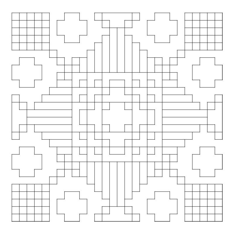
You readers have been so responsive and enthusiastic about the new 8-way design that we published last month. Thank you so much for your interest and supportive remarks. A number of you have asked for more information on expanding patterns. That is a subject that I have touched on several times over the years we have been doing these posts, but I am always happy to return to it. This article is going to focus more on design, rather than on specific projects. In our January 1st post of this year, we showed how to rotate a simple one-and-a-half inch pattern on quarter-inch graph paper to make a symmetrical three-inch design which could be repeated over and over again to make it as large as you wished — up to the size of a patchwork quilt top, for instance. Each of the little squares in the design could represent a single stitch on canvas or even-weave fabric, a much larger square of fabric, or even a floor tile. Let's revisit one of those designs. Instead of taking one of the little squares as the basis of our design, this time let's consider the entire three-inch square as a single, repeatable part of our design.

Center design for the 8-way needlepoint
Central square from the 8-way needlepoint

Alphabet chart for the design
If you are going to follow along with me directly, you will need quarter-inch graph paper, a sharp pencil, an eraser (preferably a kneadable one, to get into the small squares), a straight-edged ruler or triangle, and a selection of colored pencils that can be erased. You can use pens or crayons, but they will not correct easily and can make the process frustrating. Or you can use an alphabet letter for each color written in plain pencil and fill the colors in later.


Central square in light blue, turquoise, and deep violet
The first thing I did was to center the design on my graph paper so I could work around it in all directions. The next thing I did was to change the color scheme of the design, leaving out the white, which is not a color. (You may want to use black, white, or gray in your design.) I chose to make this design in analogous colors (colors next to each other on the color wheel) because I wanted to make some points about color combinations. Analogous colors reflect wavelengths of colored light that are closely related.  Since these colors are closely related, we are pretty well assured of a pleasant design. I chose blue-green, blue, and blue-violet for my color combination, but you need not use those colors if you want to try others. For a trio of warm, bright colors, you might choose red-orange/orange/yellow-orange (the exact opposite of the three I chose), for example.  For more about color combinations, see our "Pigments and Palettes" article. A word of caution about colors. What I see on my screen in the office is not necessarily what J.D. sees on his screen in the workshop or what you will see on your device. And if you are printing something out, there are even more possible differences. That is why I identify the color range that I am using each time.

Central square in royal blue, medium violet, and aqua
Notice that I have used one light color, one medium color, and one dark color (a tint, a tone, and a shade) in each design. I do this to make it easier to place each color when I begin ‘growing’ the design. Each color is in the same set of squares on all three versions of the design; only the intensity of the colors changes. As you can see, which color is emphasized most does alter the design — a fact you will need to consider not only when growing your design, but also before choosing the yarns, fabrics, paints or other materials for your final project. Changing the positions of the colors as well as the intensity will give you even more varied results. I ‘grew’ all three of the blue-green/blue/blue-violet designs. You can see illustrations of the set at the end of this article.

Central square in aquamarine, medium blue, and lilac
Now that you have chosen both your color combination and your plan of light/medium/dark placement, you are ready to 'grow' the design. The simplest way to grow this design is to treat it the same way we did the little 6×6 square to get the 12×12 one we have now. If you want to proceed in this fashion, you may want to cut out your chosen 12×12 square and place it at the lower right-hand corner of a new sheet of graph paper. You can copy the pattern from your screen or print it as many times as you need it. You can then reproduce it immediately to the left, directly above right, and diagonally to the left of your original design. From there you can expand the design in any direction you desire.

Here is an outline pattern of the design to download.

Downloadable geometric design
Click here to download

Detail of mosaic from Ur, circa 2500 BCE (public domain photo)
Detail of mosaic from Ur, circa 2500 BCE
This design technique is called tiling. It is an ancient art process used primarily for creating inlays and mosaics. It was used in Mediterranean civilizations long before those of the Greeks and Romans. The earliest known mosaics were made in Mesopotamia before 2,000 BC (BCE)  Just last month there was news of a remarkable mosaic discovered in the ancient city of Hippo.

J.D. preferred the sample design with the light blue/turquoise/dark violet combination, so I tiled it first. Once I had a completely correct 4-part design, I reproduced it in colored pen for J.D. to photograph. I went through the same process with the other two samples. Somewhere in the midst of all this, he slipped up behind me and snapped this picture of my worktable, with the designs in progress. (He says he wanted to show you how much work I do before I publish anything for my readers. I think he just wanted to show what a mess my worktable usually is!)

Annake at work designing
Annake at work, designing


Expanded center square, stage 1
Now I turned my attention to the original black-line design to see how it would work as a 4-way or 8-way bargello design. Once again I placed the 12×12 pattern with the empty squares in the center of my graph paper and began to expand the design. I did this in plain pencil so I could erase any lines I didn't like. I worked strictly with lines and shapes at this point. (Although I planned to use some of the analogous colors in my final design, I intended to incorporate a variety of warm-color contrasts to the design, and I didn't want to be influenced by colors at this stage.) Since the top, bottom, and sides of the design were flat, I decided to begin there. I extended the lines that formed the sides of the squares outward in a stepped pyramid pattern of varying lengths. Once satisfied with one side of the design, I repeated it on the other three sides.

Outline of completed design
Then I turned my attention to the corners. Instead of closing the corner to make it the center of a design like those already completed, I opened it out with a stem-like addition and spread the arrowhead-like ends.  I returned to the north/east/south/west areas of the design and repeated and capped the pyramids with a small motif that I had used around the original center..Then I looked for ways to connect the corner designs to the expanded side designs. I decided not to connect them completely, but to leave areas where the background color could fill in around the shapes. The small center shape of the design was used in a detached fashion and repeated around the entire pattern in places where groupings seemed too empty.

Once the pattern was complete,  I went about filling in the colors.  I used many of the blue-green, blue, and blue-violet colors again that I had used in the trio of original designs — but sparingly. The feeling of the new design was rather heraldic for me, so I decided to incorporate reds and golds liberally in the final version. You can see the result at the top of this post. I left the background white so that the color details would be clear. I have saved an electronic copy of the design, however, and am planning to 'flood' the background with other colors later in order to compare the results. I also have some ideas for varying the central design. I haven't decided yet on what form of needlework I will make with this design. The design will probably change somewhat as I translate it for the medium in which it will finally appear. I'm already considering using a metallic thread, floss, or yarn in some areas — an antique gold or perhaps a copper tone. I will show the more interesting of these experiments in future posts.

I hope you have found this demonstration and discussion useful, and that it has encouraged you to experiment with designs of your own.  If you would like us to feature your design or designs on this blog, you can e-mail them to us at annakes_garden@yahoo.com .

As always, have fun!

tiled versions of analogous color design squares
Tiled versions of the analogous color design squares above

 Creative Commons LicenseThis post by Annake's Garden is licensed under a Creative Commons Attribution-NonCommercial-ShareAlike 3.0 Unported License.

Sunday, October 29, 2017

Questions & Answers, Autumn 2017

autumn crocus
Autumn crocus in bloom
For those of you who expected this post to be another still life lesson, I want you to know that Part IV is under construction and will be posted later this fall. The final article in the still life series (Part V) should be available before the end of the year. For those of you who don't favor still lifes (or have grown tired of them), the next art form will be Landscapes. Like still lifes, they can't get up and walk away, but they change a great deal because of the seasons, weather, time of day, and the presence of animals, people, vehicles, etc. In the meantime, there are questions to be answered and promised projects to be presented step-by- step. Keep watching for them. Here are a few of the current questions:

Can you show me a picture of the four-leaf clover design and the shamrock you made from the corner heart pattern?

I would be happy to do that. These were also mentioned in the April 10, 2017 post. Actually, the idea for them was suggested by J.D., who observed a sketch I was doing of the corner heart as a four-way design and made the connections to four-leaf clovers and shamrocks. It is always valuable to get another person's point of view. Here are the charts for both:

clover & shamrock patterns
Four-leaf clover & shamrock patterns


These may be done in either floss or tapestry yarn, depending on the background fabric. The outlines are done in dark green back-stitch. The leaves are filled in with a lighter green cross-stitch. The blue dots on the four-leaf clover indicate spaces where the background fabric should show through. The stem of the shamrock is done in dark green satin stitch. The shamrock, which is not a clover (it belongs to the oxalis family), has leaves that are spaced a little further apart, so I gave it a slightly more open appearance. But it is easy to modify the clover pattern to be done in the shamrock style, or change the shamrock to be done in the clover style.

Hey, J.D., how about you slow down and stop grumbling for a minute and explain something to me. I still don't understand what is so great about dandelions! Aren't we supposed to kill them on sight?

Okay, I’m calm again – after writing and discarding about a thousand words of impassioned tirade, I really am calm again. . . So, why would you want to “kill them on sight”? On the pro side, they aren’t toxic: as I’ve written previously, they are eminently edible and useful. And while I’m certain there are folks around who are allergic to dandelions, they are rare enough that I’ve never met any. Second, the bees seem to like the flowers – and assuming that you want to continue to see vegetables in your local supermarket, you’d do well to keep the bees as healthy and happy as possible. Third, a lot of birds like them, too: we have little finches come through every spring that absolutely stuff themselves on dandelion seeds. I don’t know how I’d put a market value on those little birds, but I think they are worth having around.

On the con side, you really can’t win the battle with dandelions. I once read something to the effect that in any cubic yard of typical topsoil in the continental U.S., there are enough dandelion seeds to plant an acre as crops. And that nice green lawn you’re trying to chase the dandelions out of is likely made up of grass species (probably bluegrass, or maybe Bermuda grass) that are completely inappropriate for the area you are trying to grow them in, requiring inordinate amounts of water and fertilizer which the tougher, more adaptable dandelions are just going to make better use of than the grass.

Now if, in the face of these arguments, you still have an uncontrollable urge to destroy innocent little yellow flowers, or just a pathological need to look out over unbroken swaths of uniform green, please do us all a favor and consider artificial turf. Hey, I’m totally serious: there are some pretty environmentally friendly products available these days. They don’t require much maintenance – no electricity or gasoline to keep them mowed, nor chemical fertilizers to make them grow, nor herbicides to keep out the dandelions; they don’t use up precious water resources; and they’ll free up your time for other pursuits – maybe meditation, which is bound to be better for your blood pressure than trying to kill every dandelion you see.

And mine as well.

Did you ever get a title for the bear and bee needlepoint picture (May 21, 2017)?

Yes, we did. We chose a reader's suggestion and decided to call it “What Kind of Sunflower Are You?”


Why didn't you use the set of objects J.D. did in his article for your still life? And why didn't you copy the things in the picture you chose like they were in the photo?

J.D. made many more photographs than the ones he chose for his article on arranging still life pictures. I particularly liked the one shown at the top of Part III. I liked the linear arrangement, the fact that the end objects were facing in opposite directions, and the fact that some objects overlapped others to give a perception of distance. The arrangement allowed me to teach several principles in the same project. I never intended to copy the textures of the objects, but rather to show patterns that suggested textures. Each object gave me a chance to make one or more points about the stitching (as given in the tips that followed the pictures). The patterns allowed me to contrast the different shapes, as well as comparing horizontal, vertical, and diagonal stitching, and all-over designs versus an isolated motif. Finally, with a little photographic magic from J.D., I was able to contrast delicate and bold outlining. I think the total design did everything that I intended for it to do. I hope you readers think so, too.

photo & embroidery still life collage


I like the tiny embroidery patterns you show from time to time (March 10, 2017). I have three kids under school age and I like to embroider small designs on their clothes. Do you have some more of them that you can share? Thank you.

I love to hear about mother-child projects like that! And you are very welcome. Below are some more for you. Since at least one of your children is probably past the toddler stage, some of these are slightly larger patterns to fit on larger clothing. They can be done like blackwork, with each line representing a single short, straight stitch. The patterns can also be modified to do in tent stitch with back-stitched details (good on the kind of canvas you can pull out when you have finished stitching) or in counted cross-stitch also with back-stitching. (See also the post for February 14, 2017.) The size of your design will depend on the kind of canvas or cloth that you are using. The colors are only suggestions.

Thank you for asking for more designs. I imagine other mothers will thank you, too. I will try to remember to put new ones in more frequently from now on.


small needlework design samples
Some more small needlework design samples

 Creative Commons LicenseThis post by Annake's Garden is licensed under a Creative Commons Attribution-NonCommercial-ShareAlike 3.0 Unported License.

Monday, August 21, 2017

Still Life in Needlework, Part II

needlepoint of a basket of strawberries
A simple needlepoint still life
First of all, let me say that I was delighted by the positive response to the first post in this series. I hope you will continue to be as enthusiastic about those that follow. Let's begin where we left off last time.

After the fall of the Roman Empire, still life painting lost its popularity until about the 16th Century in Europe. The genre was probably most popular in Spain and Holland. The main art centers in Spain were Italian-influenced Seville and Madrid, site of the royal court. In Spain, the credit for renewed interest in still life usually goes to Juan Sanchez Cotan, who painted very realistic fruits and vegetables hung from strings against a jet-black background. Like many painters who followed him, he painted so realistically that people reached out to touch the objects in his paintings, believing that they were real a style we now call trompe l'oeil, meaning “fool the eye”. The greatest artist of the period, Velasquez, painted tables of delicious-looking food. Even Goya and El Greco did studies in still life. Most followed the use of the black or very dark backgrounds, which can be dramatic.

If you are working on any kind of needlepoint or tapestry canvas, black backgrounds are easy to make. You simply do all the design of your picture, no matter what the subject, and then fill in the background with a simple tent stitch in black that doesn't draw the eye away from your central design. You can see the effect in the geometric bargello design below. Working on dark or black cloth is more difficult a problem we will take up later.

Four-way bargello, "Hearts Afire"
Four-way bargello, "Hearts Afire," with black tent stitch background
Today I am going to take you step-by-step through a simple still life composition. The background is #7 plastic canvas. I chose this because the work will show up well in photographs. Also, the materials are inexpensive something to consider until you are sure that you want to make one of these projects. The yarns are acrylic leftovers from some of my knitting and crochet projects. (If you do the design on needlepoint canvas, monk's cloth, or Aida, the detail will be finer, the stitches smaller, and the curves more rounded. You will need to use finer yarns or flosses.) The needle is a blunt tapestry needle with an eye large enough to accommodate the largest yarn. I used continental (tent) stitch throughout because it is the simplest stitch that we will use for these activities.
 
prepared canvas for fruit needlepoint still life
Prepared canvas for needlepoint still life
 I found the center point of the canvas and drew the vertical and horizontal center lines through it lightly in permanent marker (red lines). I marked those same centering lines on my design sketch. Finally, I traced my pattern onto the canvas with a permanent marker and removed any excess ink with a tissue. Now I am ready to begin stitching.


step 1 for fruit needlepoint still life
Step 1


STEP 1: I outlined the shapes of each of the fruits with one or more rows of stitches in the defining colors. Features that did not require much modeling like stems and leaves were filled in completely.


step 2 for fruit needlepoint still life
Step 2


STEP 2: The shapes were filled in completely with continental stitch. Additional colors were used where they were needed.


(I'm sorry that I can't show you my “live models”. I should have had J.D. photograph them. I get hungry when I work, so as soon as I completed one of the kinds of fruit, I ate the fruit. By the time I finished Step 2, I was left with a few leaves and a tangle of grape stems! Not a very interesting picture!

But J.D. has become very interested in the still life project. He has been collecting interesting objects and photographing them from different angles, in different lighting conditions, etc. We will share some of those with you in a future post. Here's a sample of his work:

Photo still life, "No Rhinestones"

step 3 for fruit needlepoint still life
Step 3
STEP 3: The tablecloth that the fruits are arranged on is worked and a shadow of the banana is suggested with straight horizontal lines. Shadows of colored objects always contain a hint of the object's complementary color. The yellow banana's complementary color is violet, so a violet-toned yarn was used for its shadow. The leaves also cast shadows, but they are much thinner than the solid banana and move with the slightest breeze, so their shadows are less well-defined. They are indicated here where the blue stitches are over-stitched with one strand of dark red (green's complement) yarn. Knowing and applying these simple facts will make your embroidered compositions more lively and realistic. The other complementary colors are: red/green, red-orange/blue-green, orange/blue, yellow-orange/blue-violet, yellow-green/red-violet.

finished fruit needlepoint still life
Finished needlepoint still life


STEP 4: The remainder of the background is completed. I visualized an old plaster or stucco wall behind the arrangement. To get that effect, I chose a color of yarn that was halfway between a dark ecru and an antique gold.


This simple pattern is very versatile. With very small changes in the lines of the original design, you can make extensive changes in the finished picture. Here are some examples to consider:


  • Remove the center curve and change the peach to an apple;
  • Do a red apple with green grapes or do a green apple with red grapes;
  • Make the pear yellow, red, or light brown;
  • Add more leaves or omit the ones that are there;
  • Change the banana to an ear of corn or a crookneck squash, the peach to a tomato, the pear to an avocado or an eggplant;
  • Replace the grapes with a head of cauliflower, leafy green lettuce, or blue kale;
  • Use a variegated yarn for the tablecloth, make it striped, or give it more texture with a patterned stitch like Hungarian or Parisian;
  • Use a light color for the tablecloth, but work the upper background in solid black like the Spanish artists did.

I'm sure you can think of other variations.

Not all still lifes are made in color. Think of all the black-and-white media for making pictures: pencil, charcoal, gray-toned pastels, pen and ink, block prints, etc. Here is J.D.'s photograph as a pencil drawing (left) or a mixed charcoal and pastel rendering (right).

BW photo variants of photo still life
Black and white variations of "No Rhinestones"
When we return with Part III of this series, I will introduce you to a design on fabric with floss that is done in a black-and-white technique called Spanish blackwork. If you are not familiar with blackwork, I recommend that you read some of my early posts that described the technique particularly those of October 6, 2013 and January 27, 2014. Use our search engine to find these posts.

Play with the pattern and combinations to find ones that you like. As always, have fun!


 Creative Commons LicenseThis post by Annake's Garden is licensed under a Creative Commons Attribution-NonCommercial-ShareAlike 3.0 Unported License.

Contact Us

Name

Email *

Message *

Blog Archive