Showing posts with label collage. Show all posts

Monday, February 10, 2020

The Non-Colors and Metallics: All About Color, Part III

Gray scale in five steps
Gray scale in five steps, from black to white

Technically, black is not a color, but rather the absence of color. If we are talking about light, there isn't any. (For more background, see All About Color Part I and Part II.)  If we refer to pigment, black has absorbed all the colors. Theoretically, if you want to make black pigment, you can do so by combining the 3 primary colors, the 3 secondary colors, or the 6 tertiary colors in the right proportions. Most of us just buy the black materials. 

Raven sculpture
Raven sculpture from J.D.'s collection
Culturally, black has been handicapped by negative connotations, particularly in Western cultures. It is associated with death and mourning,  When I was a child, people still placed black mourning wreaths on the doors of homes where someone had died. In old Western movies, the "good guys" could always be identified by their white hats, while the "bad guys" wore black hats. In some cultures, black cats, dogs, and birds like crows and ravens were messengers of disaster.  Black signifies night, the unknown, mystery and intrigue. We talk about "black moods" caused by depression or suppressed anger.  "Black magic" indicates witchcraft.  A "black mark" against us is harmful to our reputations.  Even when opinions and customs change, such expressions linger in the language.

Ancient Egyptian painting (public domain)
Ancient Egyptian agriculture
On the other hand, the "little black dress" is the height of fashion —  sophisticated (and slimming). Black satin, velvet. and lace are romantic fabrics. If we are out of debt, we are "in the black". Black automobiles and other vehicles are extremely popular.  A black tuxedo evokes elegance and important occasions. Black print is still the easiest to read. (Please take note, manufacturers of who think printing contents and directions in pale yellow on light blue is even slightly effective!) I think the ancient Egyptians had the right idea. They celebrated black. It was the color of the soil in the Nile delta, which gave them life, health, and prosperity.  Black is indeed beautiful.

Red, Red Rose needlepoint in progress
Annake's "Red, Red Rose" needlepoint, in progress


A black background makes other colors in a composition appear lighter, and brighter, making them appear to advance toward the viewer.  Artists who made good use of this effect were the Dutch still life painters who painted large, fanciful floral bouquets against deep black backgrounds.  I like using the technique in needlepoint.


Wrought iron wine rack
Black does not "clash" with colors. This makes it great for trimming, framing, hanging, etc.  It is a mainstay in many kinds of needlework I use black back-stitching in all sorts of needlework and make many samples of blackwork diaper patterns (for instance, see this post or this one.) Wrought iron furniture and accessories can be used indoors just as well as on patios.

White light is the presence of all colors. White pigment is the absence of all colors. It is useful for all sorts of backgrounds, from paper, canvas, and walls to picture frames and mats.  White wicker furniture is also fashionable indoors as well as outdoors.  White garments are associated with celebrations — weddings, christenings, graduations, etc.  White statuary and ceramics are elegant.  Many kinds of needlework are done on white canvas or linens. Colors appear darker on white than they do on other colors.  The colors that we call black and white are often just very dark or very light values of primary, secondary, or tertiary colors.

Variety of white materials
In Western cultures, white symbolizes innocence, from a baby's christening dress to a bride's gown. But in many Asian and some African countries, white is the color of mourning. A white flag is the signal for surrender;  a white feather, a sign of cowardice. A frightened person is "white as a sheet". To cover up something unsavory, we "whitewash" it. Again, we usually buy white fabric, paint, or yarn instead of trying to bleach the raw materials.

Begin with black and gradually add white and you get gray. Begin with white and add black to it gradually and you get gray. "True" gray is 50% black and 50% white. "Cool" grays have a bluish or greenish tint.  "Warm"  grays have a reddish or yellowish tint.

Cool gray vs. warm gray


Barred owl print by Annake
"Barred Owl",  print by Annake
Gray also has negative connotations — gray skies, gray hair, gray clouds, ashes, lead. We talk of "gray areas" where there is confusion and inactivity and problems often don't get solved. It is considered a dull or depressing color.  In Nature, however, gray is a color that camouflages and supports gray wolves and whales, elephants, tree bark, fur, feathers — and on and on.


Snow leopard print by Annake
"Snow Leopard", print by Annake
An art instructor in a class I took in Panama called me a "color freak" and said that if something didn't have color in it that I didn't want to look at it. How wrong she was! Most of my serious artwork is done in #2 pencil, grades of graphite, charcoal, pastels, diluted ink, ashes — anything that gives me the effect that I desire. To me, gray is the color of structure — the contours of flesh and muscle, the bones beneath the skin — and of surfaces — the softness of fur,  sleekness of feathers, coarseness of bristles, roughness of scales, sharpness of spines.  Gray is the most tactile color I know.


The Tiger Vanishes, print by Annake

You certainly don't need color to recognize the message in The Tiger Vanishes.

Poinsettias in gold and silver
Finally, I would like to say something about metallics.  This might refer to metal objects used to decorate a room, frames or hangers for artworks,  objects grouped for a still life painting or photograph — even to the settings for jewelry. But they also refer to metallic thread or floss, fabric, trimming, foils and paint. The first working of metals is usually credited to the ancient Middle East. Ancient cultures in that area, Egypt, and areas in and around the Aegean Sea used gold, silver, copper and bronze.

Inca gold (public domain)
Pre-Columbian 24k Inca gold
Gold is a warm, shiny color. Gold (or gold-colored) ribbon, thread, rick-rack, beads, foil, etc., can enhance many kinds of compositions. In painting, golden objects have bright yellow highlights and darker yellow or orange overtones. Remember that objects — particularly shiny, reflective ones — cast shadows in their complementary colors. Therefore, a golden object will have a violet or blue-violet tinted shadow. Pure gold is very soft. My husband brought home a gold charm from the Orient.  I was surprised and disappointed to find out how soft it was and how little handling it took to blur its features. In order to be used for coins and jewelry the gold must be alloyed with a harder metal, usually silver. Pure gold is designated 24 k (karat); most jewelry is 14k to 18k.

Hammered copper pot
Hammered copper pot
Copper is a very warm-colored metal with reddish and orange overtones. It was produced by smelting about 8,700 years ago in what is now Serbia, and is one of the most versatile metals. I like copper pots for decorating and copper wire for embellishments. Copper's shadows should contain blue or blue-green tones.


Cast bronze belt buckle
Bronze is an alloy of copper, tin, and occasionally other elements. It has many commercial uses. Artistically, it is very popular for casting large statues, smaller figurines, and trophies. Remember that Olympic medals are awarded in gold, silver, and bronze. Bronze was widely used in the Near East and the Aegean civilizations, gradually spreading as far as Scandinavia by about 2,300 BC (BCE). It was such a popular metal in Europe from at least 2,800 BC (BCE), to 1,200 BC (BCE), that this period was called the Bronze Age.

Brass insignia (US Army)
Brass is essentially an alloy of copper and zinc, widely used in some kinds of musical instruments.  Although it is used less frequently for jewelry and designer items, it is also warm. Brass can take a fairly high polish, but when it is placed next to gold. the difference becomes obvious. Its use as uniform buttons for military and police officers has led to the nickname for higher officials — who have more insignia and braid on their uniforms — to be referred to collectively as "the Brass". I use brass buttons occasionally for decorative purposes.

Silver concho
Silver concho
Silver is cool and shiny; it is widely used in jewelry, serving utensils, coinage and medals. Silver buttons and trims of various kinds can be used on garments or needlework. One art form in which gold and silver foil (very thin sheets) are used, and copper foil is becoming popular, is scratchboard. A picture or design is incised in very fine lines on the foil so that a black background shows through. A heavier copper foil can be used in embossing.  The foil is placed over a mold of fairly hard material and then pressed over the mold with an embossing tool.  All kinds of foil, including the decorative ones used by florists, can be used in collages.

Pewter tankard
Pewter tankard
Pewter is made of tin and lead. It was used widely in dishes until the toxicity of lead was realized. I love the soft look of it, only slightly reflective. Look at this pewter tankard.  Think of the challenge in portraying it accurately with graphite and pastels.

Embrace the non-colors!


Wnter Scene print by J.D.
"Winter Scene", print by J.D.

 Creative Commons LicenseThis post by Annake's Garden is licensed under a Creative Commons Attribution-NonCommercial-ShareAlike 3.0 Unported License.

Saturday, November 23, 2019

Postponed Projects, and Progress

Dustbowl Afternoon, mixed media by J.D.
"Dustbowl Afternoon", mixed media by J.D. - finally finished!
Today I am going to give a progress report on work that was set in motion before we became immersed in a busy art/craft show and charitable work season that is still keeping us quite busy.  I do not have the time I need to keep up with all my projects, but I have completed a couple and am making progress with others. J.D. gave you some idea of the activities we are involved with in an earlier post, so I am going to focus on specific pieces of work.  Part of this explanation will be in the form of questions and answers.

Are you featuring any more women artists at this time?

Yes, I am — in two ways.

Frida Kahlo, USPS stamp
First of all, we have another commemorative stamp. This one features Frida Kahlo.  Born in Mexico in 1902, she was involved in the post-revolutionary times when Mexico was trying to adjust and develop a real sense of its nationalism. She showed artistic talent at a very early age, suffered polio as a child, determined to study for the medical profession. Her dreams and her body were shattered in an automobile accident while in her late teens. Sadly, that was to leave her in constant pain for the rest of her too-short life.  She began painting again while confined to bed, using an apparatus that let her paint on a canvas directly above her.  Later she became very politically active, especially in affairs concerning both Mexican and Native peoples. She was an out-spoken feminist.  She married, divorced, and re-married famous painter Diego Rivera. Theirs was a stormy marriage.  Frida's many self-portraits show both her physical and her emotional pain, but also an extreme determination not to give in to that pain.

She was considered a surrealist painter — and Surrealism was very popular at that time — but she denied it, saying that she only painted HER OWN reality. She was strongly influenced by Folk Art and included many costumes and artifacts in her paintings. Today, I think she would probably be grouped with the Magic Realists. She died at the age of forty-seven.  She sold very few paintings during her life, although she painted portraits on commission. Today her paintings are worth a fortune.

Second, the way I am featuring contemporary artists is to show a project I have done that has been inspired by one of the artists I mentioned previously. This project was inspired by the African paintings and prints of British artist Tilly Willis.

Did you finish the project you designed of the Women's World Cup soccer players?

Soccer players, original sketch
It is still in progress on my work table. With shows every weekend, I'm running behind with some of my projects. but it is progressing when I have time to work on it. This has been  quite a challenge for me. Those of you who are familiar with my work know that I like to work on a fairly large scale and put in a lot of detail. It was quite a change to go to a small scale with simply shaped pieces. Also, while I am working constantly with felt in making my puppets, everything is hand-stitched. To do that on this project would have obliterated the finer details. I  have had no experience with fabric glues, so I still need to do  some experimenting to get the right combinations of fabric and glue. But it has been fun and informative so far and I will certainly try more of these in the future.

Fabric version of WWC soccer players, in progress


I can tell you had Tobin Heath in mind for the U.S. soccer player, but who was your model for the Dutch player?

I did indeed have Tobin in mind when I drew the U.S. player. After all, she went into this year's Cup with titles from more different competitions than any other player on the team. She has great form and I love her intensity.

Netherlands flag
Netherlands flag
The Dutch player doesn't represent any one player on the team, but rather is a composite. I didn't know as much about the team and only saw their last two games in their entirety. I must admit I had some mixed emotions watching the final. Of course I was cheering for the U.S. team, but I had to admire the Dutch team, too, and it was hard to see them lose.

Windmill embroidery design
By the quarter finals, I had ancestral roots in six of the countries of the teams involved and three other countries that did not get that far. But my deepest connections are with the Netherlands. I am "Double Dutch" — Frieslander on my father's side and mainland Dutch on my mother's.  Of my European ancestors (I also have Native American ancestry), the Dutch were the first to come to America.  They settled here in the late 1600's — influenced by Peter Stuyvesant — and remained for a long time, while New York was still New Amsterdam, before moving westward. When our family traveled in Europe many years ago, the Dutch people were the most welcoming and helpful of hosts, even bringing out family cradles — and once a beautiful Louis XV crib — for our youngest, who was just a baby. One hotel manager's wife volunteered to babysit all three children so my husband and I could have a special meal of foods from the former Dutch East Indies at a nearby restaurant.

************************

Original design with white background


Now let's consider the project I started on a post from last month. I mentioned that I wanted to "flood the background" of the design — which I had left white — with other colors to see how they compared. J.D. did this electronically.  Here are the ones we liked best:

Original design with various colored backgrounds
Original design with a variety of colored backgrounds


Needlepoint, early stages
I have completed the original design in tent stitch on #10 canvas, which made the design quite a bit smaller than the original sketch on quarter-inch graph paper. However, I think the closely stitched design shows up more vividly than the paper design. I had already added dark and bright red and bright and antique gold to the central design on the original pattern to balance all the blues, greens and violets.  Now I added a few stitches of red-violet and re-shaped the white "brackets" on the four sides.  I moved the corner designs to areas about three inches from the center of the canvas, connecting them with lines of the antique gold. I was dissatisfied with the open ends of the purple-&-aqua motifs on the sides of the central medallion, so I closed the ends with and arc of stitches and filled in the entire center of the shape I had created. At that point, I stopped working on the design itself and filled in the white areas of background out to the edges of the completed part of the design.

I am describing the colors as I see them on my canvas. It is virtually impossible to match yarn exactly to the colors of colored pencils and marking pens and get the identical visual effect. Furthermore, the colors you see on your screen are probably not exactly the same colors I see on my canvas. They are not even exactly the same colors J.D. gets on his camera images or his monitor. So I try to name the colors as I proceed so that you can make your own decisions about what you like and do not like.

Using a strong light to check stitching
Something that I do repeatedly when I do canvas work is to hold the canvas up to a strong light periodically as I stitch. This immediately tells me if I have missed a stitch anywhere. It also shows me of areas where stitches may look thin enough to let some light through. If these are just random stitches, I choose a needle with the appropriate color of yarn or floss and stitch over the thin stitches, pulling the doubled stitch down firmly.. Sometimes, however, a whole line of stitches looks thinner than those around it. Before you stitch over the whole row, try this. Run a strip of the yarn or floss under stitches on the back of the canvas, along-side the thinner stitches. Check them with the light again. Often this simple act will correct your problem. If you are working with heavy yarns or flosses, it may be a good idea to separate some strands and use them to fill in stitches, rather than to double its thickness — which may be more noticeable than the thinner stitches.

Needlepoint, later stages
Because I liked the symmetrical areas of white background, I moved the small 8-pointed motifs in bright gold farther out from the center, beyond the second array of motifs. I still wanted to use them, however, and to make them stand out against the white background. First I placed them symmetrically around the portion of the canvas that was already worked. (I left the corners open because I had not yet decided whether to extend the corner motifs.)  Then I edged each one with a row of stitches in the emerald green yarn used in the stripes at the sides of the central design. Still leaving the corners open, I filled in around the new motifs with the white background yarn. Then I did extend the antique gold rows of stitches to the corners of the completed area.

I made the ends of the antique gold lines into arrowhead-like points similar to those that complete the central square of the design. I then looked around at the collection of colorful yarns I had used in the design and decided to use them, one-at-a-time, for borders until I ran out of canvas. So that's what I did. As you can see, i have modified the original pattern considerably— but I did warn you that I probably would do so. If I were to use the pattern on a different kind of project, such as a rug, I would modify it in an entirely different way.

Finished needlepoint

Make something unique with your own color choices.


 Creative Commons LicenseThis post by Annake's Garden is licensed under a Creative Commons Attribution-NonCommercial-ShareAlike 3.0 Unported License.

Saturday, August 31, 2019

Inspiring Women Artists, Autumn Art, and A New 8-way

U.S. postage stamp of a Grandma Moses painting
Homage to an artist of the past
I have frequently advised you to look at the work of various artists, past and contemporary, to get inspiration for your needle art. I would like to  steer you to some very contemporary women painters. You can find their work online. I'll give you a brief analysis of how their work has inspired me to do some new pieces in different kinds of needlework. Look for the mention of more of these artists in future posts, along with my projects that they inspired. If you have other artists, past or present, whose work you think I should be looking at, please drop me a line at annakes_garden@yahoo.com.

Our first artist is Tilly Willis (www.tillywillis.com). She is a British citizen and a well-known portrait painter there. She has traveled extensively in Africa and done many studies of life in the countries she has visited. Her compositions have been made into color prints. Their style is quite different from the detailed work she does as a portrait artist. This pleased me greatly because i have always maintained that it was not necessary for an artist to be limited to a single style. Her pictures of people going about their daily tasks are made up of stylized two-dimensional flat shapes in vivid colors against a simple background, They are very expressive, both in outline and in gesture.

soccer players preliminary design sketch
Soccer players preliminary design layout
I plan to do something similar in simple tent stitches. I am going to plan my picture by cutting the simple shapes from colored construction paper that I can move around on my canvas until I have them placed just where I want them, like a collage. Then I can trace all the elements onto the canvas and begin to stitch. Considering the success of the U.S. Women's Soccer Team, I thought they would be a good subject for this project. The accompanying photograph will show you what I mean. I will show you the finished composition in a future post.

Untitled tissue paper collage by Annake
I realize that many of you do not think of collage as a major art form, but you would be mistaken. It is a major contemporary art form with large artwork and installations in both two and three dimensions. This is an art form where women probably outnumber men, but there are still many male collage artists. (Remember, Picasso and Braque introduced collage.) If you have become interested in this art form, I suggest you check out some of the many artists listed in Collage Artists of America online. There is a list of upcoming exhibitions. If you get a chance, try to see one of them. I think you will be impressed.


Autumnal Prophecy, collage by Roberta Bellofatto
"Autumnal Prophecy", collage by Roberta Bellofatto

A good area for collecting
A good area for collecting...
A different kind of collage is the "nature walk" collage — one of my favorites.   The idea is to go on a nature walk and collect leaves and flowers to press,  and small "found objects" like feathers, tiny seashells, etc., that can be glued to a prepared background. These are the perfect times to do one, when leaves are changing color and plants are producing seeds. Remember that you are not allowed to collect such things in most state and all national parks or on private property without permission. If you live in a city high-rise, you may not be close to places where such things can be collected. Or you may not feel safe taking your group for such a walk because of heavy traffic or other hazards. Sometimes just looking around familiar backyards or an uncut vacant lot will give you plenty of material.

Canvas boards
Canvas boards
Since the items you may collect are heavier and bulkier than those we have featured in earlier collage posts, you will need heavier back-ground material than poster board or cardboard, or else the picture will not lie flat when it is finished. Individual packs of 8" X 10" canvas boards are good for individual artworks, but you will need larger ones for small groups working together. Mat board and heavy corrugated cardboard are alternatives, especially if cost is a major concern. For a permanent installation, Masonite can be used. It is dark in color and should be painted before use.


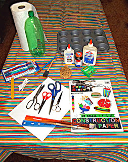
collage tools and materials
Some collage tools and materials
The boards can be used plain, pre-painted, or covered with one or more tissue paper sheets. If you have access to colored crepe paper, it can also be used, but be advised it "bleeds"  color into the composition, while tissue paper does little or no "bleeding". Check our earlier post for a list of materials that you will need. Have a pile of newspapers and paper towels for pressing the plant materials and general clean-up. Select your work area and assemble your materials in advance.

Found objects for collage use
The next step is an excursion to collect the grasses, leaves, seedpods, etc. for the compositions. Small children will need supervision and should be taught to ask an adult before collecting plants and other materials. Everyone should have a collecting bag, An adult should have a pair of pruning shears to detach small branches or cut tough stems. Delicate materials like feathers and fragile plant parts that should not be pressed may be stored in the crisper drawer of a refrigerator until used. Everything else should be placed between layers of newspaper on a flat surface and dried thoroughly before attaching them to the canvas. Canvases may be prepared in advance or on collection day, whichever works best for you.

At the beginning of this section is a picture of a completed collage to give you an idea of what can be done quite simply. Make sure materials are thoroughly dry. Use the white glue full-strength to secure the three-dimensional materials to the board and let them dry. Delicate materials should be attached with the half-and-half glue/water mixture. Brush the area of canvas first. Tweezers are useful for placing tiny stems and branches. Carefully place the delicate materials on that area and gently brush the mixture over them until they are covered completely. (The milky-looking glue mixture will dry clear.) Let that layer dry.

Brushing on the glue and water mixture

Add tissue paper over the top if you like, brushing it (both bottom and top surfaces) with the glue mixture to hold it in place. To get a glossy surface, you will need several all-over coats of the half-and-half mixture, dried between applications. A hand-held hair-dryer can speed up the drying, but it should be wielded by an adult and not held less than a foot away from the surface or the surface may buckle and warp. Spaced dryings are preferred. The finished picture should be hard and glossy to the touch. Now you are ready to frame the picture if you like.

Preliminary sketch for 8-way bargello
A few months ago (May 5, 2019) I did an article in which I showed some alternative ways to use a small all-over pattern to make different kinds of needlework. I expressed a desire to use it as a 4-way or an 8-way bargello project. One of the easiest ways to make an 8-way design is to superimpose one 4-way pattern on another 4-way pattern. That is essentially what I have done here. My idea was to "marry" a 4-pointed star design with a strong diagonal one without sacrificing either one. This design (see the end of this post) has more colors in it than any of my other designs.  I added some different colors to make it more varied, while retaining its autumnal feel. However, the colors you see on your monitor may not be the exact colors I see on mine. It would be best if you choose your own colors for your design.

unusual 4-way bargello by Annake
 An unusual 4-way bargello by Annake
It is designed to be a typical bargello pattern, but it is versatile enough to be used in a number of different techniques. It is important for you to decide which technique you want to use before you begin shopping for materials The simplest way to use this would be a tent stitch design. For this, count the squares in your design carefully. You will need a minimum of needlepoint or plastic canvas with one square of mesh for each square of the design, plus an extra vertical row because tent stitch is slanted. If you plan to surround the motif with a background larger than the one I have left blank on the pattern, add another row of canvas squares for each row of background. The next easiest technique would be latch-hook. Each square of the design would require one square of mesh. add additional rows for background, plus at least 3 rows on all sides to turn to the back of the finished work and secure.  Finally you could do the motif in cross-stitch on needlepoint or plastic canvas, monk's cloth or aida cloth, or checked gingham. You will need 2 rows of "holes” for each cross stitch or one printed square on the gingham.

In a 4-way or 8-way bargello, each square represents 4 upright stitches, each over 3 threads of needlepoint canvas. (Unless you can get plastic canvas by the yard, it will not be wide enough for this project). This pattern is not for beginners. If you have never done any bargello, I suggest you use our 'Search My Blog' gadget in the sidebar to look up past articles on bargello and choose a simpler design for your first project.  If you have done some bargello patterns, I still suggest having some scrap canvas at hand to work out any trouble spots that you may find before you have to take out a number of stitches.  And count and measure before you begin! Depending on the size of your canvas mesh, this can be a fairly large project. I'll show mine in a future post.

Downloadable 8-way pattern


Our latest Teachable Moments project, "Teachable Moments: The Moon", is now available on our Extras page (see the tabbed menu above this post.) While it was designed for use by teachers or parents, others may find it useful as a companion piece for our Skyscapes 3 post (July 11, 2019).


 Creative Commons LicenseThis post by Annake's Garden is licensed under a Creative Commons Attribution-NonCommercial-ShareAlike 3.0 Unported License.

Thursday, May 16, 2019

Painting with Paper

Autumn Cityscape, collage by Annake
A few days ago we posted our Spring Question and Answer article. The second half of it was devoted to answering a grandmother's plea for art activities for her grandchildren over summer vacation from school. You may want to read it either before or after today's post — or both. This activity is good for group projects, senior citizens, and people rehabilitating from strokes or arm injuries, as well as for children and teenagers.

Today's topic is collage.  The name comes from a French word meaning "to glue".  This is a legitimate art form. Most people associate it with Picasso and Braque at the beginning of the 20th Century, but it is much older. About the year 1200 (C.E.), Japanese artists were making albums of poetry and decorating them with woodcuts and delicate paper collages.  A number of 20th century and contemporary artists have made collages from various materials — some even large enough to qualify as sculptures.

I am going to take you step by step through a simple tissue paper collage.  Because I keep my samples as teaching tools, I will use 8-inch by 10-inch canvas boards, not construction paper or poster board for backgrounds. I use a half-and-half mixture of white glue (Elmer's Glue-All®) and water to attach the paper.

Tissue paper collage step 1
Gluing om the background
I use a small flat brush, but you will find a number of alternatives in the post mentioned above. The tissue paper comes in large packages of several different colors or patterns from an everything-for-a-dollar store. I paint a section of the canvas board completely with the glue mixture. Then I lay a torn strip of tissue paper on the glued section and brush the surface of it with the glue until it lies flat. Overlapping the strips gives the collage texture and mixes colors to make new ones. I continue until I have covered the board completely. (Because I am using canvas board, I turn the loose ends of the paper to the back of the board and glue them down.)

Tissue paper collage step 2
Tearing tissue paper pieces
I let it dry while I tear pieces of the other colors of tissue which I plan to use for my "paper painting". Tearing the paper with a twisting motion gives me some concave edges and some convex ones. This takes a little practice, but don't discard any pieces that don't have curves. You can use them all. If I am planning to overlap colors, I often tear two layers together. Today I am overlapping red paper pieces and it saves time to tear two layers at once. I use a plastic cookie container to hold a variety of colors. (This can be filled in advance.)  These irregular pieces can also be used instead of strips to make the entire background.

Conquistador collage
Let me show you a piece made many years ago by an adult student who has become a lifelong friend. She first put down a layer of pink tissue pieces. Then she started to cover this with a red layer, working from the outer edges toward the center.  She found that she had enclosed a shape that made her think of a picture she had seen of a Spanish conquistador.  After consulting references, she drew the outlines of this figure on the background and went over the picture in detail with black ink. (Today she would use a fine-line marker.) This is one of many ways to enhance a torn-paper collage. The fact that this picture has hung on walls for several decades demonstrates that these collages are very durable.

I practice the placement of my red pieces until I get the arrangement I want, then glue a few pieces down at a time. Now I have most of the petals of my flower and can use smaller pieces and other colors to make the center.  Notice that there has not been any drawing involved in making the picture.  Once the center is complete, I can apply the remainder of the petals.  Some overlapped pieces of blue and green tissue suggest a stem and leaves. A longer stem supports a just-opening bud. This time I let the entire collage dry overnight. (You may not be able to do this if you are working with a group, but try to do it if at all possible, even if it means a delay until the following week.) Place the remaining glue and water mixture in a jar with a tight-fitting lid.  Wash whatever you have used for brushes thoroughly or discard and replace them.

If the surface of the collage is completely dry when you press on it, give it a substantial coat of the glue mixture. When that is completely dry, it should be firm and shiny and make a small sound when you tap it with a fingernail. It should not be sticky or soft in places.  If you wish, you can further decorate the surface with permanent black or colored markers. The finished collage can be mounted for display.  Mount it on white, black, or colored poster board, with margins of about two inches, wider at the bottom than at the top and sides. Your artists may want to put a label on the bottom margin with the title of their picture and their name.  (If you have used canvas board or another heavy material as the base of the collage, poster board may not be strong enough and you may need a heavier material.)  Children in fourth grade and beyond can do this kind of collage if they have the opportunity to study live flowers, good artificial flowers, or good photographs.

finished poppy collage
Finished poppy collage, labeled and mounted


lighthouse collage
Lighthouse collage
Our next kind of collage is a cut-paper collage. As the name suggests, the paper is cut with scissors rather than torn. Torn-paper and cut-paper techniques can be combined, as they are in this picture of a lighthouse and the cityscape at the top of this article. The torn paper is used primarily as a background and the cut paper is used to define important shapes. In this picture the clouds and rocks are torn paper and the lighthouse and other features are made with cut paper.  Some outlining has been done with very fine lines in some places and heavy ones in others. In the city collage, the entire background was done with torn tissue paper, overlaid with cut paper. All the building shapes and the straight-line shapes were cut out, using a more opaque paper for the darkest shapes.

Another kind of collage that is popular with teenagers and adults is the theme collage. This one can be done on construction paper, but I prefer poster board. The collage is made with pictures cut from newspapers and magazines. It is usually based on a single word cut from a publication or spelled out with alphabet letters that have been glued to the background. It is good to have some words that have been cut out in advance, but the artists may choose to make their own. (You may need to set some "ground rules" about what words are and are not appropriate.)  Pictures may be used whole or cut into pieces. If you are using poster board, small objects like buttons, coins, or charms can be glued on for further decoration.  If you have used construction paper for the collage, you may want to mount it on a piece of poster board as described above.

Space themed collage

Tear, cut, and glue!


* For a somewhat different approach to collage, you might want to look at Annake's work in our March 27, 2019 post.       - J.D., Annake's Garden Gnome

 Creative Commons LicenseThis post by Annake's Garden is licensed under a Creative Commons Attribution-NonCommercial-ShareAlike 3.0 Unported License.

Contact Us

Name

Email *

Message *

Blog Archive