A painting, whether super-realistic or abstract is made up of shapes. To be interesting, the shapes should have rhythm, variety, and an element of surprise or unpredictability. That's quite a balancing act!
Rhythm implies repetition; too much repetition is boring and the viewer loses interest.
Variety suggests a collection of differing shapes, but this may be confusing or even irritating to the viewer. (Haven't you ever seen clothing or upholstery material that you felt was too ‘busy’ for your taste or been in a room that was so cluttered that you didn't feel comfortable in it?)
Surprise means something unexpected introduced into the scene, but it probably should not be something so incongruous that it takes a viewer's mind completely away from the picture as a whole.
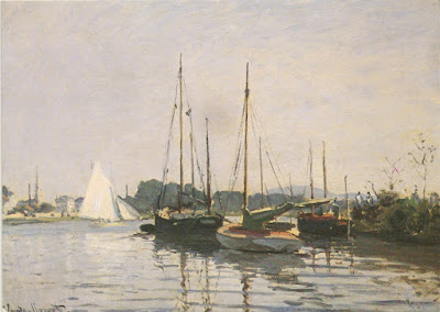 |
| Claude Monet, sailboats |
Look at the harbor scene above and notice how well the artist has used his shapes. See how the strong vertical shapes of the masts and the fainter diagonals of the rigging rhythmically break up the horizontal areas of the water, the line of trees, and the passive sky with its barely suggested clouds. The shapes and colors of the boats' hulls add variety, as do the ripples that break up the mass of the water and provide a second area of rhythm. The bright white sails of the boat in the background give us that element of difference and focus our attention. The artist was Claude Monet, leader of the Impressionist movement. Although he is not known primarily for marine paintings, he did a number of them. (Another one of his is shown at the top of this article.) He was fascinated by the effects of light on water and continued to use them in his paintings throughout his entire career.
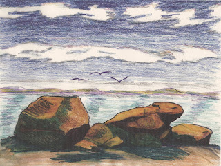 |
| Sketch of an approaching storm, by Annake |
There are some generalizations that we can make about shapes and areas in a composition (always remembering that rules are made to be broken.) The large horizontal areas of sea and sky are generally considered as negative spaces and passive shapes unless something active, like a storm, plays out against them. In the preliminary sketch to the right, the clouds and the wavelets beginning to form on the surface of the water are active, carrying the energy of the fast-approaching storm. Vertical and diagonal shapes are generally considered to be active and positive. Something like a tree is more "active" than a nearby boulder. If a scene is dominated by horizontal areas and vertical shapes or lines, diagonal shapes like the white sails on the boat are often added to the scene for contrast. Curved shapes like rolling hills are more passive; turbulent curved waves or breakers are very active. Too many passive shapes can make a composition seem dull, even though it is attractive in other ways.
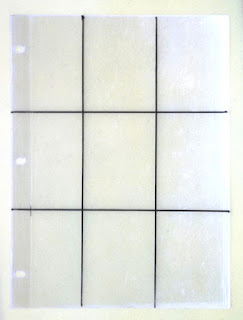 |
| Rule of Thirds grid tool |
An arc can be a powerful shape in a composition, particularly if it is at the edge of a point of interest, such as one of the focal points where the "Rule of Thirds" applies. This plastic overlay, which we showed first in
Part V of the Landscape series, works just as well for seascapes as it does for landscapes. We show it here the portrait position (in contrast to the landscape position we presented the first time). If you have not yet made this handy tool, now is a good time to do so. You only need a sheet of clear plastic, a ruler or other straight edge, and a marking pen. Divide the plastic sheet into thirds, both vertically and horizontally, and mark the four points of intersection. Your primary point of interest in a composition should be at or near one of these points. A secondary point of interest, if you include one, should be at or near the point diagonally across from the primary one.
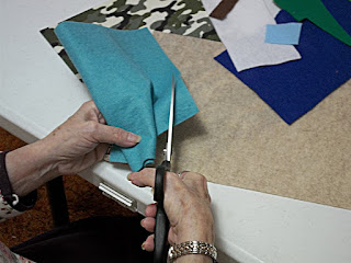
A shape that may be interesting by itself can get lost in, and be neutralized by, other shapes unless it is supported by color and contrast. If a shape that you are using is distracting from, or not contributing to, your composition, try moving it. If that doesn't work, remove it. This is especially true if you are doing a composition in applique. Before you stitch
anything to a background, be sure that the shapes that you have chosen to cut out are really contributing to the design. When you are satisfied with the arrangement, pin it in place and check it one more time before you begin to stitch. View it from a distance as well as at close range. If you decide that a piece isn't right after you have sewn it in place you may be unwilling to remove it, even though it weakens the design.
I know that some of you are concentrating on lakeside or riverside scenes, rather than true seascapes. You can certainly put sailboats, motorboats, rowboats — even rafts and inflatables — into those compositions to give variety and points of interest that counterbalance the landscape and water.
 |
| Claude Monet, "The Bridge at Argenteuil" |
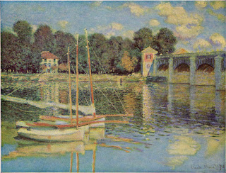
Here is another Monet painting, obviously portraying an inland waterway, which may give you some ideas. Notice how the boats cover the primary point of interest at the lower left (when the plastic overlay is in the horizontal position), while the towers on the bridge are close to the secondary point of interest, diagonally at the upper right. The bridge itself moves away in a slightly diagonal line, and the arches and reflections introduce another rhythm. A more passive rhythm is created by the variety of shade trees in the background. The other building in the scene occupies a place close to the point of interest on the upper left, but is less "positive" than the other two.
It is all too easy to get so interested in the smaller positive or "active" features of your composition that you neglect the larger negative or "passive" parts of it. But they are equally important to the success of your design. You have just seen me making shapes and I have emphasized the importance of their arrangement for applique projects. They are also important for embroidery projects where the background fabric(s) will show between the areas of embroidery. In my tapestry work I often do three-dimensional, even padded, stitching on top of a background of tent stitch or other essentially flat stitches, so I'm always planning my backgrounds first. Here is a simple technique that I use when I am working on an unpainted canvas. I have used it successfully as a teaching technique with school-age children as well as older students.
 |
| Examples of materials needed for the exercise |
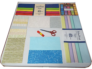
First collect all the colored paper that you can find: stationery, poster paper, wrapping paper, tissue paper, colored newspaper advertisements, etc. You will need scissors and a glue stick or other adhesive. Cut a piece of heavy paper, poster board, or cardboard in the size and shape that you want for your final design. Work first with the two large ares of your seascape. Will the sky be light blue, bright blue, dark blue, light gray, dark gray, or sunset colors? Cover the area you have designated as sky with the appropriate colored paper. Do the same thing with the part of the picture that you have reserved for the sea. When you are satisfied with the proportions of these two areas, glue them to the background.
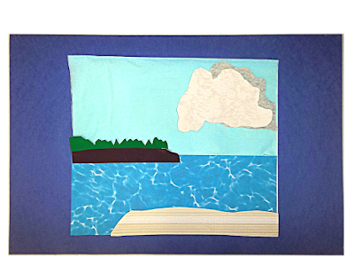
Think about ways that might make these areas more interesting. Can you put in tall, impressive clouds or sweeping, diagonal ones? Is there an island or headland in the area where sea and sky meet? Is it rocky, with hard shapes, or soft and rounded? Is it grass-covered or does it have trees? Are the tress broad-leaved trees, evergreens, or palms (each has a different outline)? What is at the bottom of your picture? Rocks, a sandy beach, a jetty? Cut pieces of paper in the shapes and colors of the appropriate features and place them on your background,
but do not glue them to the background.
 |
| Mock-up of a background using cut shapes |
Now cut out the positive, active features that you planned your composition around. Position your pieces where you think they will be most effective. Again, do not glue them to the paper. Then reconsider the shapes you put in during the second stage of this process. If the pieces do not contribute to the design, move them. If they still don't help, remove them. Glue in place the features of this group that you want to keep. Now reconsider the entire composition. Are your positive pieces completing the design the way you intended? When they are doing that, glue them in place.
Congratulations! Now you have a good "working model" and are ready to begin creating with your choice of materials.
Keep up the good work!


 This post by Annake's Garden is licensed under a Creative Commons Attribution-NonCommercial-ShareAlike 3.0 Unported License.

No comments :
Post a Comment
Post a New Comment Below -- We Love Feedback !!!