 |
Dolls in ethnic dress (Photo by J.J.)
|
Today, with ethnic clothing and jewelry becoming more popular and special interest groups identifying themselves with banners and logos, color is more important than ever. In this article we explore human responses to the major colors. A pigment squeezed from a tube onto a palette and not mixed with another one is the only color that is entirely neutral. Once applied to a surface or mixed with another color, it acquires meaning. We will explore two very important colors which technically are not colors at all. From a scientific standpoint, black is the absence of color, while white is the presence of all colors. There are both positive and negative connotations attached to all colors.

White is usually associated with purity, cleanliness, good hygiene, sterile surfaces. These have have been exceptionally important during the pandemic. White is the color most brides choose for their wedding gowns and parents for christening garments. Snowflakes and fresh snow are a welcome white. Fluffy white clouds promise a pleasant day. Crisp white tablecloths and napkins lead to expectation of a good meal. The white page waiting for words and the white canvas prepared for color can represent pleasant anticipation. White spaces may seem more spacious than they are. A new super-white paint is causing a great deal of excitement.
 |
Fresh snow (photo by J.J.)
|
 |
Damaged, dirty white wall (Public domain photo)
|
Yet white can have negative meanings. It is used as a mourning color in many parts of the world. It can have a touch-me-not remoteness. As a background it can make some bold colors look garish or pale ones look weak or dull by comparison. White surfaces don't stay white and may require a great deal of effort to keep clean and undamaged. That blank page or canvas can be daunting with a deadline looming when you have no inspiration. Some people find white bland or sterile, while others react to it as cold or stark. Since I use walls to display art and craft-work, I make the surfaces warmer than white with cream or ecru.

Red is an attention-attractor. It is visible against most backgrounds, especially if illuminated. That's why it is employed as stop-lights and DANGER signs all over the world. It symbolizes strength, energy, and physical courage. It is a warm color associated with blood. Many sports teams use it in logos or on uniforms. It was long considered a masculine color, but that is no longer so true. It is a stimulating color, capable of raising pulse rate and even making a person feel that time is passing faster than it really is.

On the other hand, it is also associated with anger and violence — even bloodshed. Yes, it is possible to physically "see red". I learned that when I was eleven and saw a boy gleefully stuffing a whimpering puppy into a small ground-pipe. My whole vision turned red. I raced to rescue the puppy, determined to tear the boy limb from limb. Fortunately for both of us, his big brother had longer legs than mine. He shouted for me to save the puppy and sent his brother home with measured blows from his belt. The puppy was whimpering, shaking, and bleeding from several cuts. I finally got it out of the pipe and carried it to its home. It was immediately taken to a veterinary. It survived, but with a permanent limp. I was so shaken by my own reaction that I worked very hard from then on to develop strong self-control over my actions.

Pink is a special tint of red. It is associated with femininity, romance, love, physical beauty, delicacy, and — by extension — the continuation of the human species.
From the male point of view it has often been considered demeaning to masculinity. It has been interesting, therefore, to notice that the English Premier Football League (that's "soccer" on this side of the Atlantic) has apparently been experimenting to see if some colors tend to weaken the performance of athletes by forcing them to play in certain colored uniforms. Goalies, especially, have been noticeable in pink, a sickly yellow, and lavender. This has been going on most of the season. I tend to ignore it. One morning, however, I was confused by the action on the field until I realized that the referee and his crew were wearing vivid purple uniforms. My immediate reaction was: "That's just wrong!" But I soon got used to it and it didn't appear to affect the game.
 |
Sunset photo by J.J.
|
Orange is generally viewed positively. It is a good "attention-getter". It expresses energy and enthusiasm. Strong and bright, it implies happiness. Found in sunrises and sunsets, it glows with beauty and vigor. It makes us think of the smell of citrus fruits. It is most likely to be seen in autumn, when it is associated with autumn leaves, pumpkins, and — of course — Halloween. Nevertheless, it can be controversial. People usually love it or dislike it. Sometimes it seems too bright, to the point of being overwhelming. Others find it harsh or crude.
 |
Elegant leather loveseat (public domain photo)
|
Brown is regarded as a part of the orange color family. Its association with natural earth gives it a sense of solidity, security, strength, dependability and comfort. It is an integral part of Nature. We associate it with the soil in our gardens, the ground under our feet, the warm fur of our pets. But brown can be sophisticated, too. There is at least one shade of brown that complements almost every color. This makes it important for clothing, rugs, upholstery, etc. In marketing, it suggests reliability (think UPS, Hershey's chocolate, etc.)
 |
"War Machines," photo by J.D.
|
Yet it can also provoke negative emotions. This is especially true when it is used in large amounts. It may remind people of the desert, which can be stark, vast, empty, devoid of life. Or it may summon up a sense of fatigue associated with the endless work of tilling the soil.
Yellow can be a controversial color. Its connection with sunlight is undeniable and provides associations with light, warmth. activity, stimulation, strength. It appeals more to extroverts than to introverts, promoting self-confidence and self-esteem. Many psychologists believe it is the strongest of all the colors in its influence — both positively and negatively. Personally, there are yellows I don't care for, but they don't upset or depress me.
Conversely, people who already suffer from low self-esteem may find it cause for what self-esteem they have to plummet, even to medically dangerous levels. It has long been associated with cowardice, for example. It may promote anxiety and feelings of failure. Introverts may find it depressing or discouraging.
 |
Healthy rainforest (public domain photo)
|
If any of the colors promotes balance, it is green — the color of growing plants. I grew up on a farm, took botany courses, worked in the college herbarium and have been planting things all my life. Of course green is my favorite color! It represents renewal, growth, strength, endurance, health. And don't forget balance. That is a much more important psychological concept than people realize. This pandemic has unbalanced populations, civilizations, cultures, economies and — most important — lives. Eventually there will be new balances, but they may be very different from what we experienced before.
The case against green features such concepts as monotony, long stretches of sameness, blandness, stagnation. One very real problem is invasive non-native species. There are far too many places where such species, both on land and in the ocean, have taken over an area and overwhelmed native species. There must be a constant battle in such places to eradicate or at least control such species. Fires, floods. and droughts create similar problems.
 |
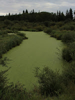
Invasive kudzu near Atlanta (public domain photo)
|
Blue is considered an intellectual color. Just as red is associated with the body, blue is associated with the mind. We don't expect a physical reaction to blue like the visceral one that often goes with red. Blue symbolizes seriousness, study, thoughtful consideration, calmness and concentration. It is generally conceded that more people choose blue as their favorite color than any other hue.
On the negative side, blue may be considered aloof, unfriendly, disinterested, haughty, or boring. Blue objects may seem farther away than they are. I like light blues, and wear all shades of the color, but I have a distinctly physical reaction to dark blue rooms. They make me feel physically cold. I could never spend any length of time in a dark blue room, nor would I have one in my home or workshop.

Violet is another of the controversial colors. It is situated between blue and red on the color wheel and the blue-violets are distinctly cooler than the red-violets. Violet tones are made by mixing blue and red and the proportions of each determine the appearance and effect of the hue. From a positive viewpoint, violet may represent spirituality, luxury, status, introspection, wisdom. But when we lived in Panama many women wore violet as a mourning color. Because it is the closest color to the end of the spectrum — next are ultraviolet emissions not visible to the naked eye — it is sometimes associated with time, space, and the Cosmos itself. Negatively, it may produce a feeling of anonymity, inferiority, or exclusion.
 |
Murex shell (public domain photo)
|
You are probably familiar with the phrase "royal purple".This refers to a dye, made from the bodies of certain mollusks, that was used to dye the clothing and possessions of ancient royal families. It was so expensive to produce that it was actually worth more than gold. No one outside family members was allowed to wear it or use anything dyed with it. The punishment for breaking that rule could be imprisonment or death. The first rulers who were supposed to have worn garments dyed with royal purple were the semi-legendary King David and his son, King Solomon. Just recently a sizable piece of cloth in extremely good condition was unearthed at an archaeological site south of Jerusalem. Scientists had already found fossils of the marine mollusks and ceramic containers colored by the dye. Now they hope to find out how the fibers were spun and woven. Radiocarbon dating has already confirmed that the cloth dates back to the time of King David.

Grey is physically neutral. It is the only color which has no psychological properties. But that doesn't mean that everyone reacts to it in the same way. On the plus side, grays can support just about any hue. But, unless the tone is right, grey may dampen the effect of the other color. When the world turns grey, we are instinctively conditioned to prepare for the coming night or the looming storm. Grey may be associated with monotony, depression, worry, weariness or old age.

Black is treated differently in various parts of the globe. In much of Europe and North America it is a "power color". Priests, government officials, prominent men in all walks of life wear black business suits and tuxedos. Women choose "the little black dress" for important occasions, thinking it is slimming (it isn't) or that it will get them noticed (it makes them unobtrusive). An extreme cut, new style, or bold dash of color is necessary to be showy, even on a red carpet. Many designers and clothiers use black to advertise.
It is often the color of sorrow and mourning. It is associated with mystery — even magic. It certainly has negative connotations. Consider the negative meanings of the following terms: blackball, blackmail, black market, black mood, black-hearted. The greatest mystery of all is the vastness of outer space, where black holes swallow stars.
 |
NASA Computer simulation of a black hole "eating" a star
|
Look for Part II later this year. Be colorful!

 |
And sometimes, black is comforting...
|
 This post by Annake's Garden is licensed under a Creative Commons Attribution-NonCommercial-ShareAlike 3.0 Unported License.


No comments :
Post a Comment
Post a New Comment Below -- We Love Feedback !!!